G&A

The News 03.16.2021

News from the worlds of exhibition design, interior design, and environmental graphics.

The secret life of museums during lockdown; “we miss our visitors” | COVID study finds that museums are safer than any other indoor activity | Covid-19 has driven millions of women out of the workforce | Smithsonian scales back its $2 billion expansion plan | Congress authorizes two new Smithsonian museums: the National Museum of the American Latino and the American Women’s History Museum — hoorah! | Steal this job: museum exhibit designer | Or build your own museum in a box | Researching a sustainable kitchen countertop | Should we revisit the term “master bedroom”? — and committing to “going into the basement” | I Love Typography’s favorite fonts of 2020 | Lessons learned about team projects | A treasure trove of exhibition design inspiration: past winners of the SEGD global design awards | Benchmarks for online museums | And while poking around the onlines, I found that an exhibit I designed is on Google Street View Arts & Culture! Here are some screenshots from Pacific Exchange: China & U.S. Mail, which was on view in 2014/2015 at the Smithsonian National Postal Museum:

theexhibitdesigner_pacfic-exchange-npm-google3.jpg
theexhibitdesigner_pacfic-exchange-npm-google1.jpg
theexhibitdesigner_pacfic-exchange-npm-google2.jpg

It’s a little “uncanny valley,” but also really neat to see an old friend. (Previous blog coverage, here and here.)

SEGD tour of National Museum of Health and Medicine

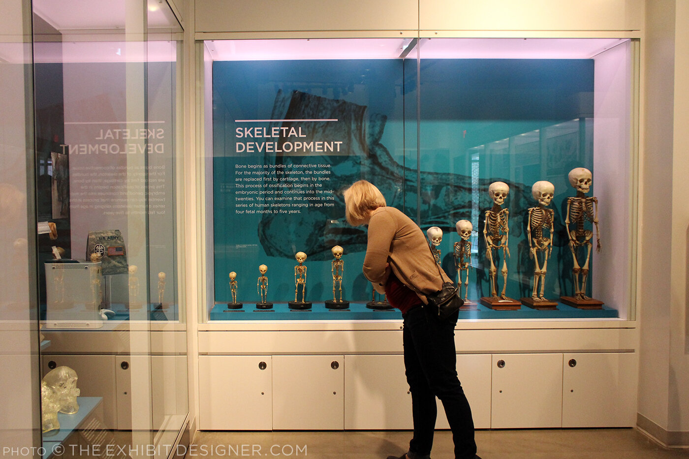
On Sunday I attended a tour of the very cool National Museum of Health and Medicine, now located in Silver Spring, Maryland. NMNH is a Department of Defense museum first established in 1862 as the Army Medical Museum, “a center for the collection of specimens for research in military medicine and surgery.”

the-exhibit-designer_SEGD-NMHM-tour1

The tour was organized by the Washington, DC chapter of SEGD (formerly the Society for Environmental Graphic Design, now the Society for Experiential Graphic Design) and led by members of the museum’s staff and the design team from Gallagher & Associates. (I used to be a designer at G&A.)

the-exhibit-designer_SEGD-NMHM-tour3

There was a crowd in attendance so we were split into two groups. My group was led by graphic designer Liza Rao (responsible for the museum’s fantastic colors and typography), and Andrea Schierkolk, NMHM’s public programs manager. It was a treat to hear reflections from both sides; what they love and what they love less; things that work great and things that didn't turn out as expected. It was also a treat to see some of my former colleagues.

the-exhibit-designer_SEGD-NMHM-tour4
the-exhibit-designer_SEGD-NMHM-tour5

The museum is divided into three major exhibits: Collection That Teaches (purple), Anatomy and Pathology (turquoise), and Advances in Military Medicine (brick red). Crisp white casework and glass shelves give the exhibit a “lab-like” look that I enjoyed, and the bold shots of color look great against the mostly tan, cream, and yellow objects on display — yes, most of those objects are corporeal remains. This museum is not for the sensitive of stomach.

the-exhibit-designer_SEGD-NMHM-tour2
the-exhibit-designer_SEGD-NMHM-tour7

The exhibits were designed precisely for the current objects on display, yet they are still changeable — graphics can be slid in and out as objects are rotated or stories are updated.

the-exhibit-designer_SEGD-NMHM-tour8

Thank you to our new DC SEGD chairs, Liza and Chris, for the great program — keep them coming, please!

the-exhibit-designer_SEGD-NMHM-tour6

Post updated in January 2021 with minor text edits. This post was originally published at theexhibitdesigner.com on 16 March 2016.

Pacific Exchange, open at the National Postal Museum

Work shown was completed while I was a designer at Gallagher & Associates.

It’s open! Okay, old news. It opened well over a month ago, on March 6. I had also planned to post about the opening reception, but that was March 20, so — old news there as well. In any case, the reception was lovely, with Chinese food served and tinkling glassware and everyone dressed quite nicely.

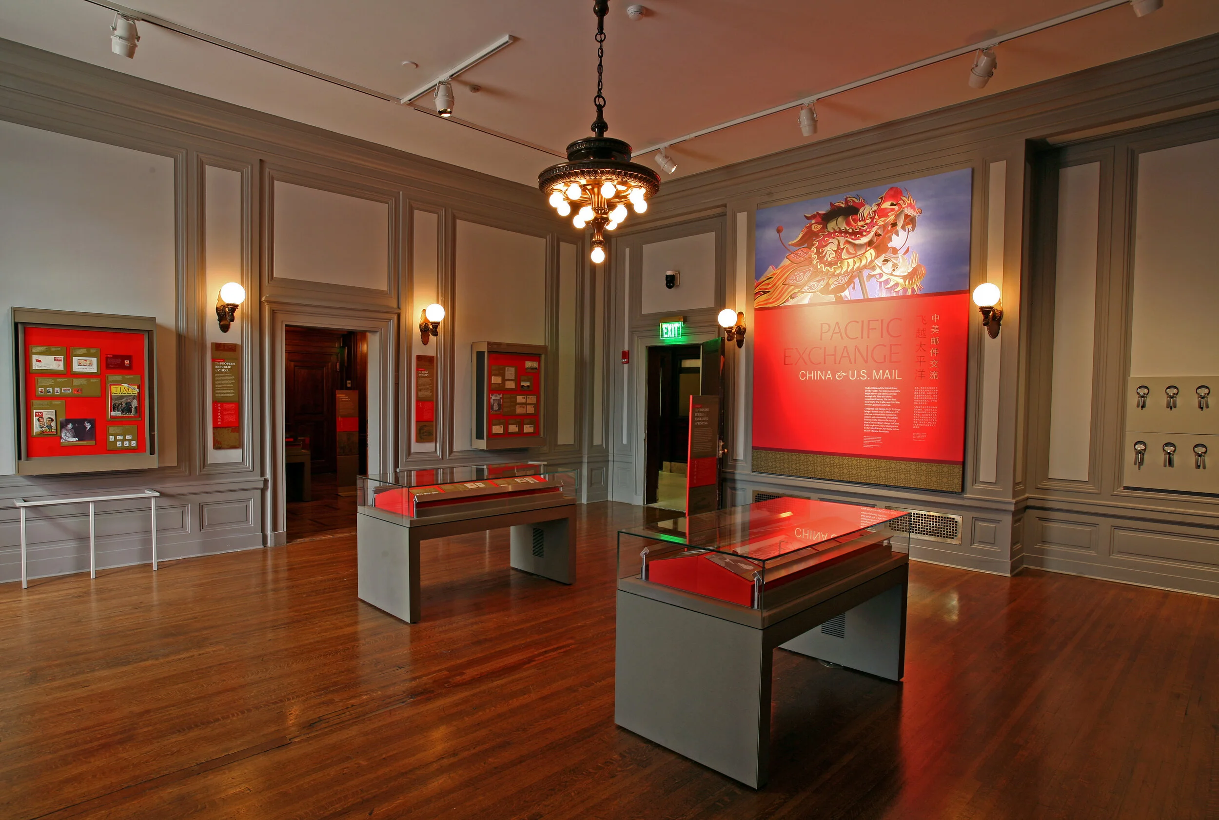
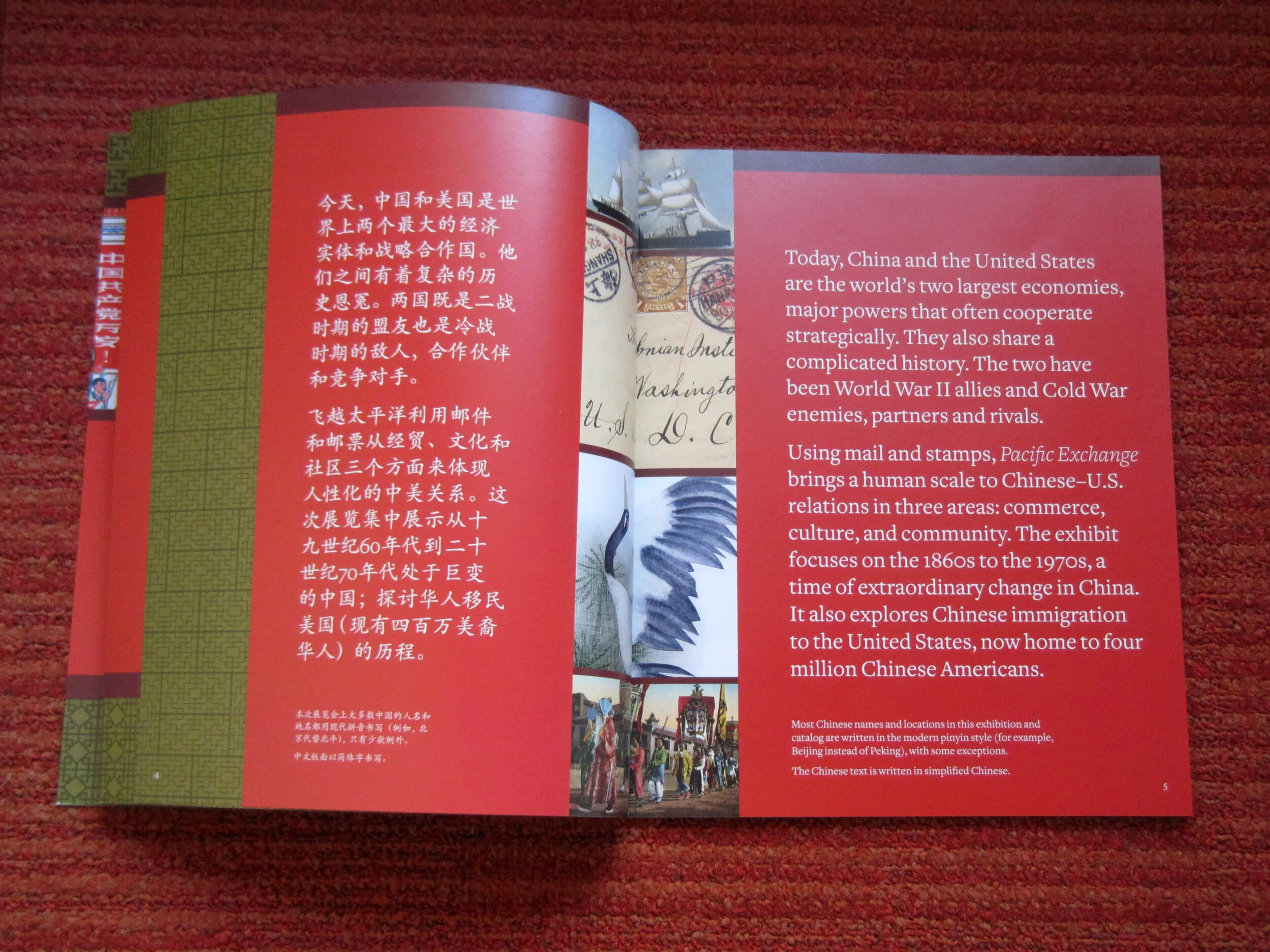
Pacific Exchange: China & U.S. Mail is the second exhibit to be on view in the Postmasters Suite gallery at the Smithsonian National Postal Museum. From the exhibit website: Using mail and stamps, Pacific Exchange brings a human scale to Chinese–U.S. relations in three areas: commerce, culture, and community. The exhibit focuses on the 1860s to the 1970s, a time of extraordinary change in China. It also explores Chinese immigration to the United States, now home to four million Chinese Americans. (Thank you to James O'Donnell of the Smithsonian for the above photo.)

Upfront: I am a bit of a stamp nerd. I have a small collection of Olympics stamps, mostly international, from the 1960s and 1970s. (You have to focus when collecting stamps!) So I really enjoyed working on an exhibit about philately.

This was my swan song at Gallagher & Associates. I handled the design myself, from designing the exhibit’s visual concept to laying out production files for all of the graphics. I also designed the exhibit plan and artifact case layouts. Even though this is a small exhibit space, it had more than 100 artifacts, so making [nearly] everything fit comfortably was a bit of a challenge!

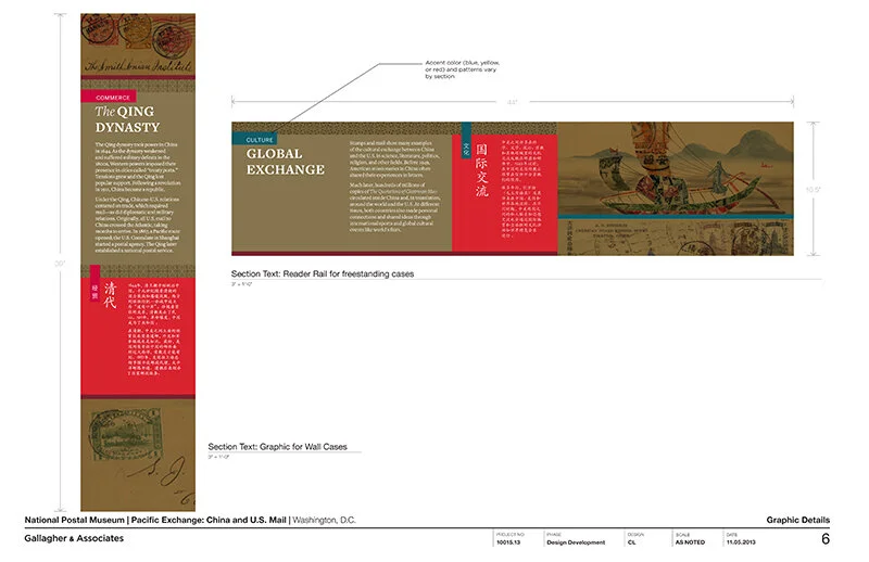
The design drawing above is an example of how a case layout looked during design development, and below are those same cases, made real:

PacificExchange_commerce-cases2.jpg

Graphics were digital output mounted on sign blank, trimmed to edges, with a matte overlaminate. The wall-mounted and freestanding graphics were backed with 1/2" MDF painted Benjamin Moore “Bonfire” to match the primary exhibit red (Pantone 1795). The freestanding graphics had duplicate panels on either side of the mdf — a panel sandwich which was held in place by adjustable metal sign bases. The Smithsonian Office of Exhibits Central printed and built the graphic components. Blair Fabrication built the case furniture.

PacificExchange_culture-case2.jpg

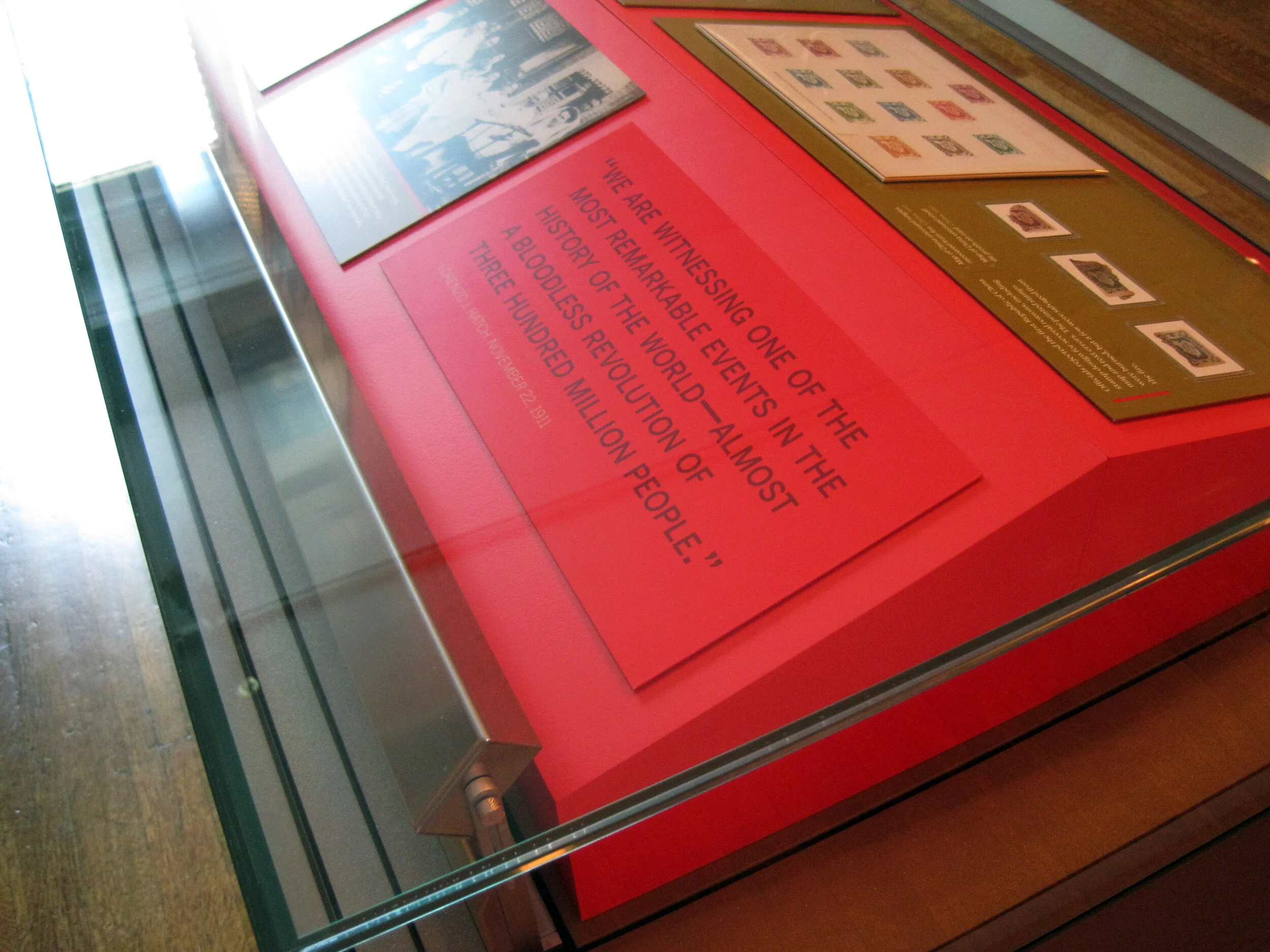
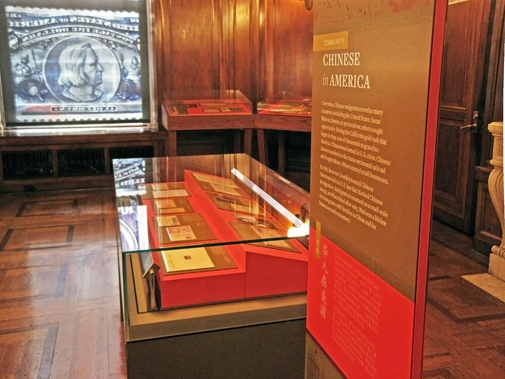
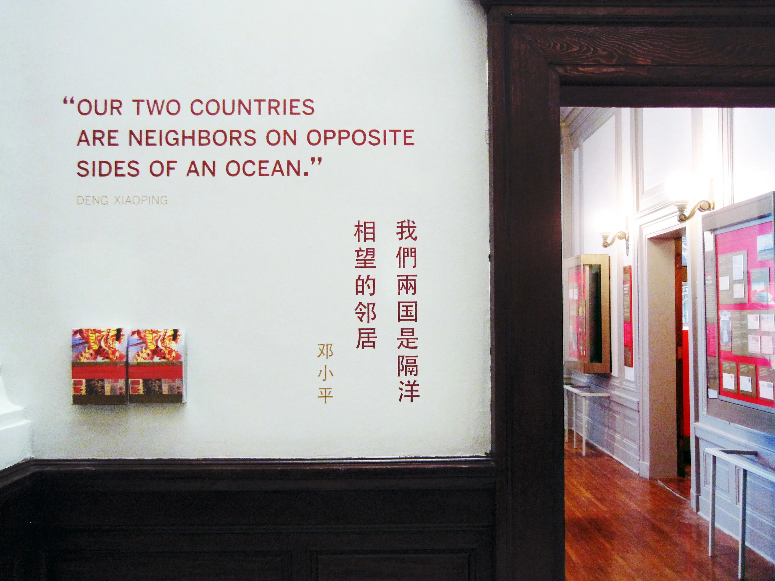
Most of the exhibit text is in English and Chinese, a design challenge I enjoyed. In the artifact case below, some of the artifacts were loans that had to be displayed flat. The other half of the plinth has a 15° rise to create a comfortable reading angle.

I arrived at the color palette after some research into significant colors in Chinese culture. I used red and gold as the dominant exhibit colors, with a deeper maroon red for accent. I used a third red, one with pink undertones — red, is the color of prosperity and good fortune, among other meanings — for the Commerce section of the exhibit; yellow, the color of heroism, for the Community section; and blue-green (or qing), to give a feeling of Chinese history and tradition, for the Culture section. I also drew distinctive vector patterns for each section.

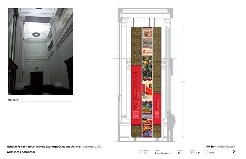
The element that most people extol is the group of banners in the entrance. There are three individual banners and they’re more than 20 feet tall! EPI Colorspace printed and installed them. (Install photos here.) They were printed on “Brilliant Banner” 12 mil. polyester banner fabric. The fabric has a very subtle canvas texture that wasn’t what I originally intended — I wanted a silken look for the banners — but the color saturation and printing quality was so good that I went with EPI’s recommendation.

PacificExchange_entrance-timeline.jpg

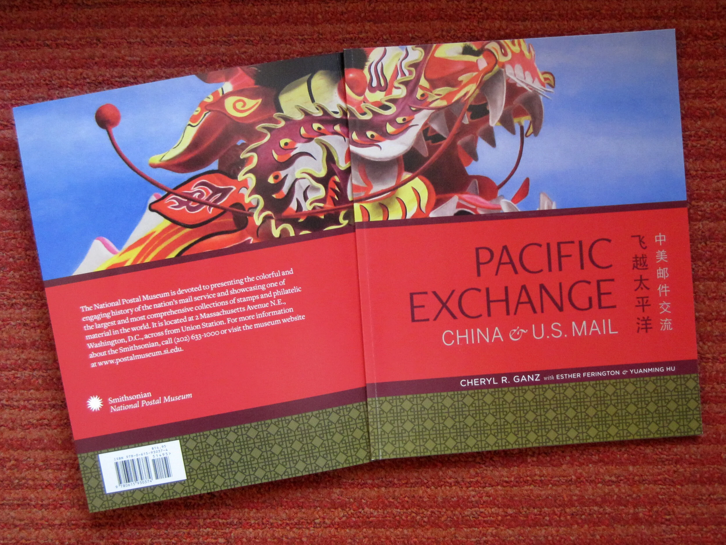
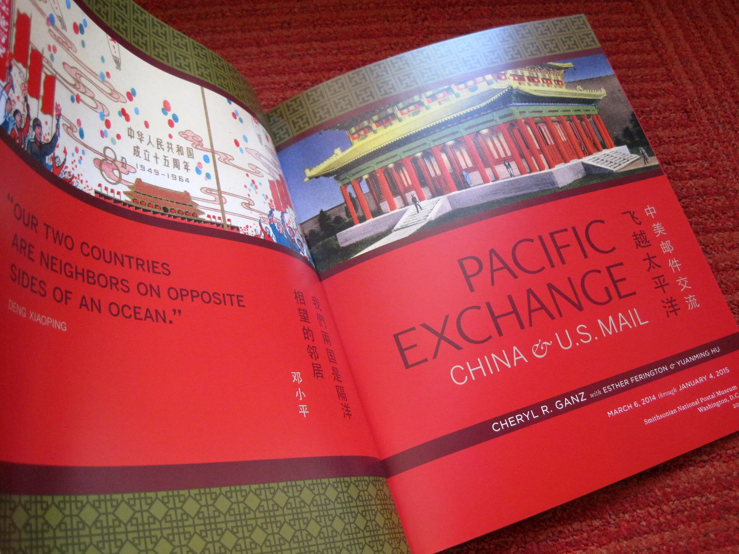
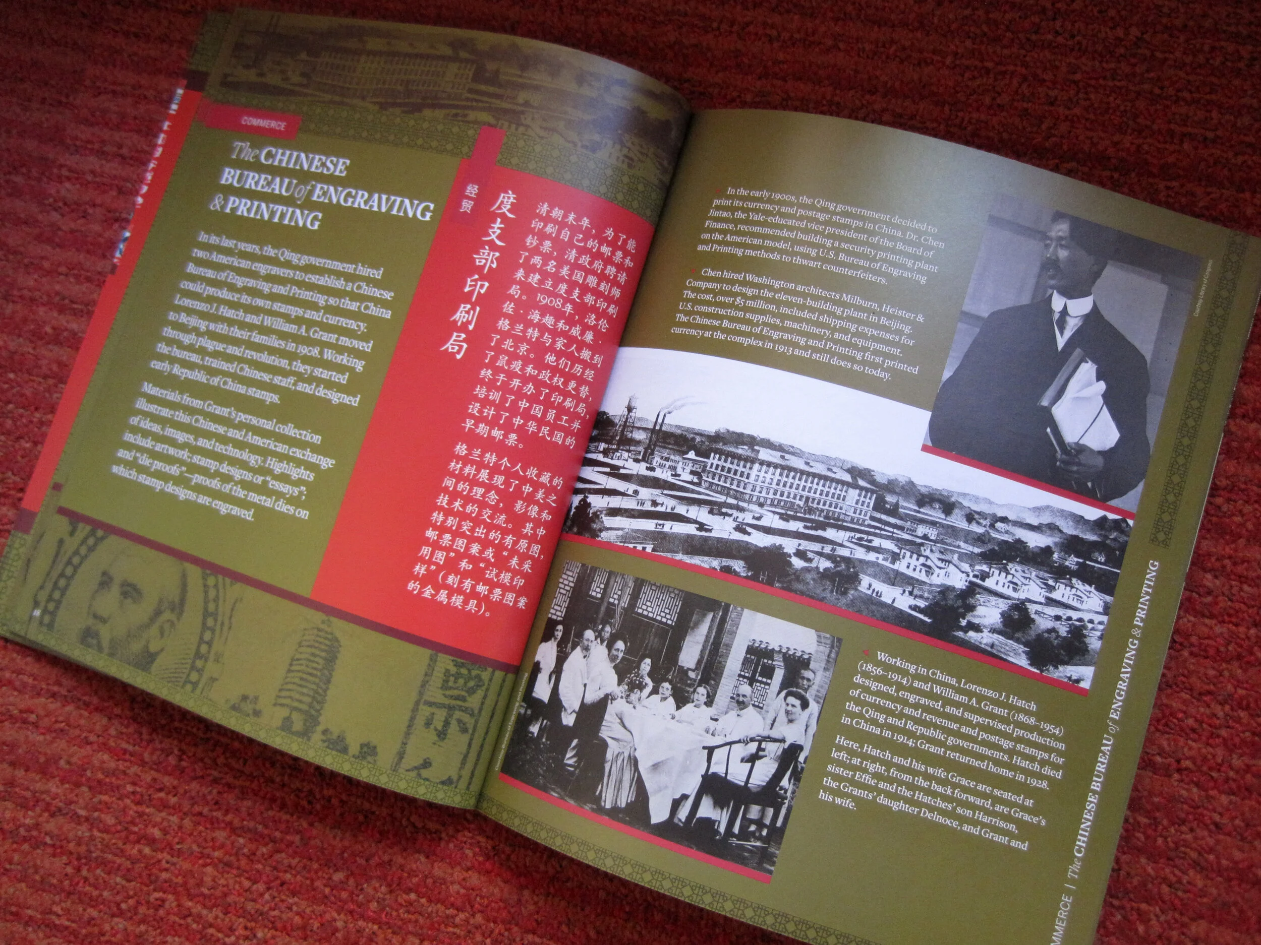
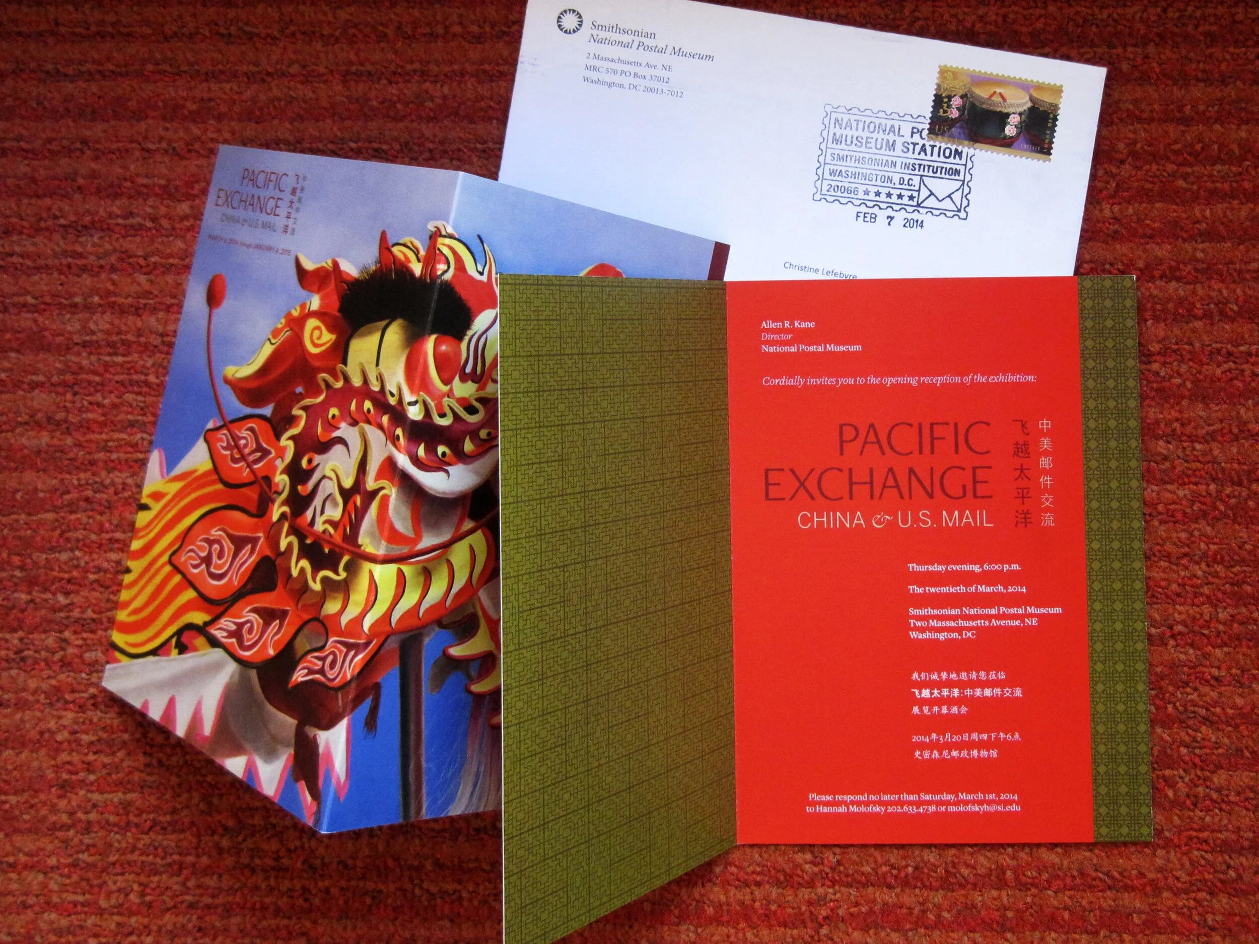
I also designed a few of the related print graphics: the exhibit catalogue, a postcard, and the invitation to the opening reception.

The exhibit has been well-received overall and I’m thrilled with how everything turned out. If you’re in DC between now and January 4, 2015, please check it out!

Post updated in January 2021 with minor text edits and additional photos. Broken links have been fixed. This post was originally published at theexhibitdesigner.com on 26 April 2014.

Pacific Exchange install

Work shown was completed while I was a designer at Gallagher & Associates.

I stopped by the Smithsonian National Postal Museum to check in on the installation of Pacific Exchange. I’m excited for the exhibit — my last project Gallagher & Associates — to open next week, on March 6.

While I was onsite, EPI Colorspace was there installing the large-format graphics. I’m very satisfied with the quality. Above, one of the EPI crew installs the hanging hardware for the set of three banners that introduce the exhibit. To the right is a fourth banner with the exhibit title.

After the banners were unfurled they were checked and checked again to ensure that they hung plumb. (Success!) The major graphics for this exhibit were in both English and simplified Chinese. Below: The windows to the right of the banners belong to the educational loft; we had some spectators!

Below: A detail of the weight and stitching at the banner’s bottom.

Above: Within the exhibit’s main room there is another dramatic introductory moment, this time produced in fabric stretched over a wooden frame and hung with heavy-duty D rings. There were happily no problems with measurements and everything went up easy peasy — I had my fingers crossed because there are odd cabinets with door knobs and molding behind the graphic. The EPI crew said I must be lucky.

Below: Graphics wait to be installed within the window openings between the gallery and the lobby.

Above: Work zone!—and three of the completed artifact cases. Below: Installed artifacts. More photos to come when everything is complete!

Post updated in January 2021 with minor text edits. Broken links have been fixed. This post was originally published at theexhibitdesigner.com on 27 February 2014.

Fun projects for the National Postal Museum

Work shown was completed while I was a designer at Gallagher & Associates.

I spent the end of summer through early fall wrapping up construction administration work for the newly opened Stamp Gallery at the Smithsonian National Postal Museum. (Designed by Gallagher & Associates.)

I inherited the project from a departing colleague and had very little to do with the design of the exhibit, but I did design the museum’s gallery guide, a fun little project.

I have also been working on a temporary exhibit for the Postal Museum called Pacific Exchange, about China–U.S. relations “through the lens” of stamps and mail. The opening is set for March and I am excited. I’ve really enjoyed the content and being able to give a good amount of attention to a small exhibit. Here’s a sneak peak of the design development:

Post updated in January 2021 with minor text edits. Broken links have been fixed. This post was originally published at theexhibitdesigner.com on 19 November 2013.

The FDR Museum is open!

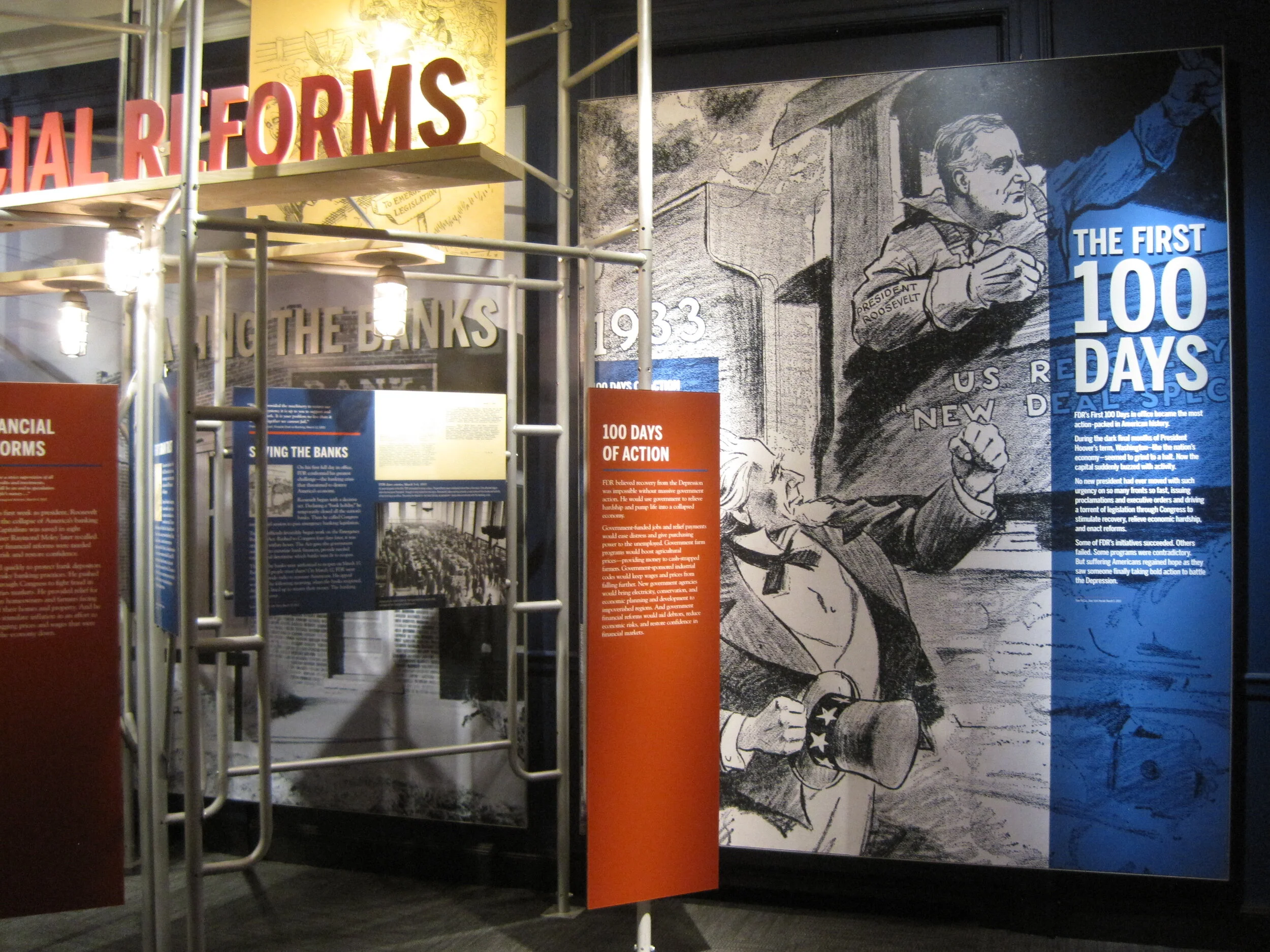
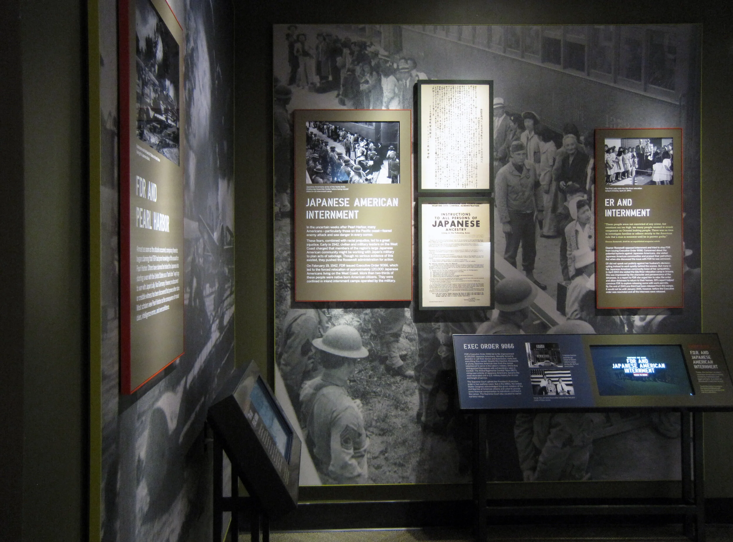
The Franklin D. Roosevelt Presidential Library and Museum was rededicated on Sunday June 29 and is now open to the public. The New York Times published a flattering review and we are thrilled. Here we (the Gallagher team) are at the gala reception, with the museum’s chief curator:

Post updated in January 2021 with minor text edits. Broken links have been fixed. This post was originally published at theexhibitdesigner.com on 3 July 2013.

FDR Museum, part 4: rear-lit and neon

Work shown was completed while I was a designer at Gallagher & Associates.

To wrap up my series on the design, fabrication, and installation of the Franklin D. Roosevelt Museum, a close look at the first exhibition gallery.

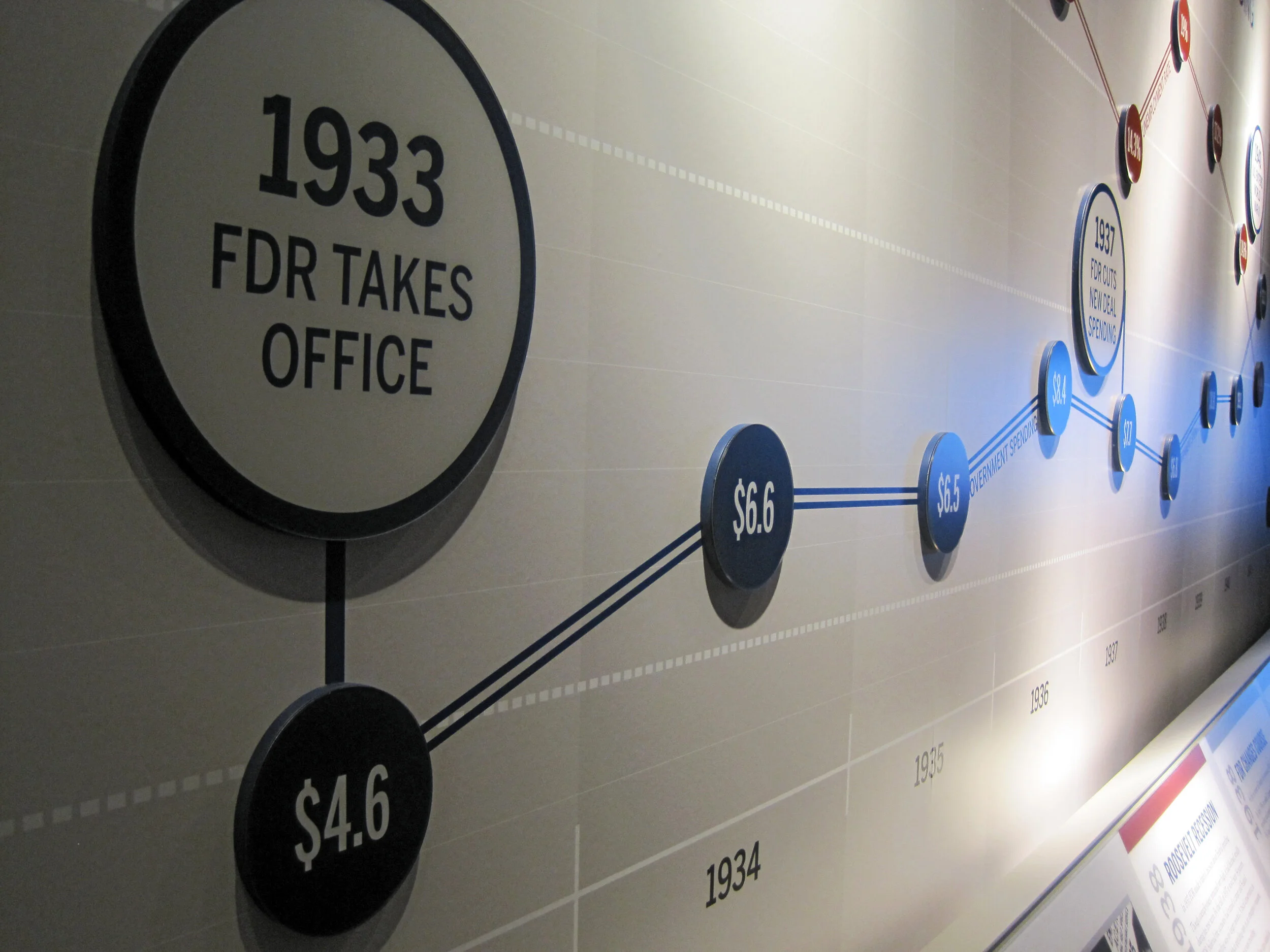
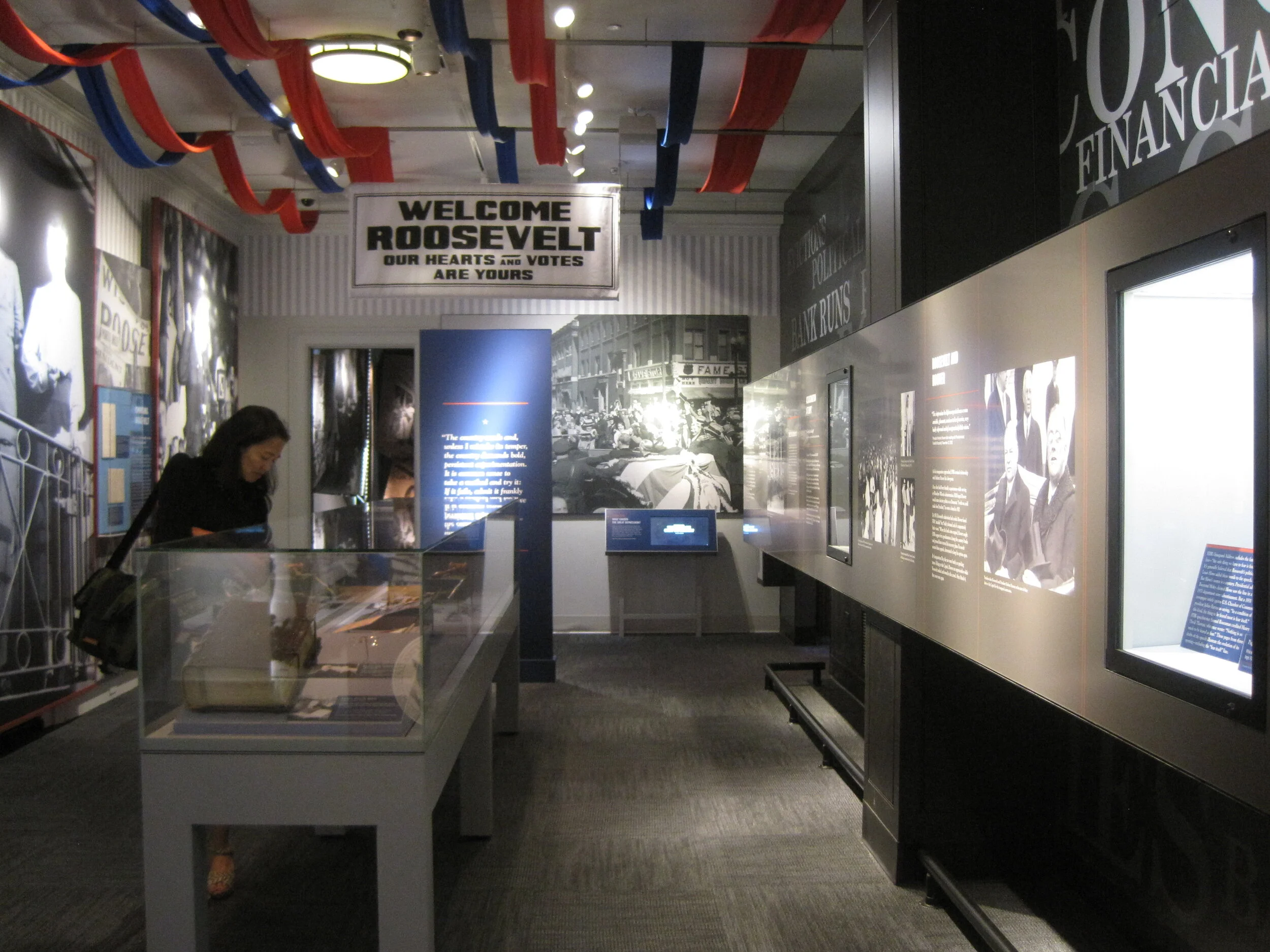
The first gallery sets the stage for FDR’s presidency: the Great Depression. The focal point here is the neon-illuminated “FEAR” wall. Text is silkscreened onto the glass panels and rear-illuminated with LED pads. The red color comes from the custom “UMEMPLOYED” neon letters; the mural image in the back is a black and white photographic print.

The FEAR letters are applied to the rear of the glass. I wanted them to be translucent — to allow the mural image to show through and create depth — and also be as richly black as possible. The fabricators, Explus, provided a variety of production samples to try to achieve the effect I was after. Printing the letters on a transparent film and applying it to the glass, in particular, was unacceptable as I wanted a uniform transparency (no streaks, no dots).

Explus created a self-adhering vinyl by applying Sentinel OptiClear Adhesive to the face of the gel sheet (Rosco Cinegel Neutral Density N.9 Gel Extra Wide) and die-cutting it. I was happy, but the fabricators had some difficulty with cutting and applying the gel sheets. Their graphics manager told me that if they were to do something like this again they would use a standard window tint that has the application adhesive already on it. Here’s the sample:

Turning to the wall opposite:

The background mural is printed on DreamScape, as I mentioned in a previous post. Most of the murals in this museum were applied to backers, framed, and cleat-hung to the wall, but this particular one was applied directly to the wall and its edges captured with flat aluminum strips.

The framed graphics are digital prints with an overlaminate, mounted to sign blank. They were applied onsite to an MDF backer panel and aluminum frame. (The backer and frame are screwed to the exhibit wall; the graphic is applied with VHB tape.) Explus welded the frames’ corners before painting them, and that made a huge difference in the appearance of them. They are nicely finished and high-quality.

Post updated in January 2021 with minor text edits. Broken links have been fixed. This post was originally published at theexhibitdesigner.com on 25 June 2013.

FDR Museum, part 3: almost done!

Work shown was completed while I was a designer at Gallagher & Associates.

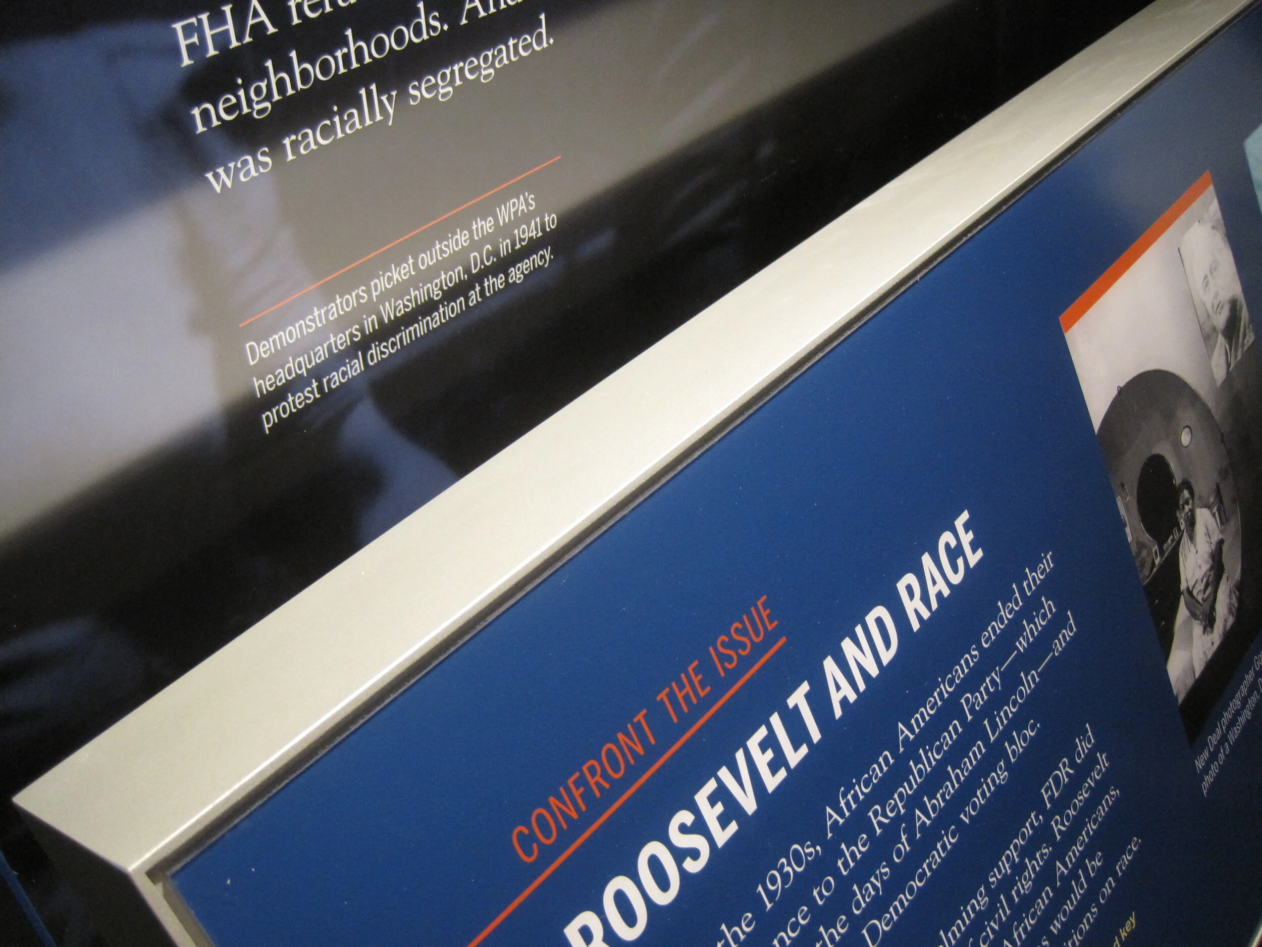
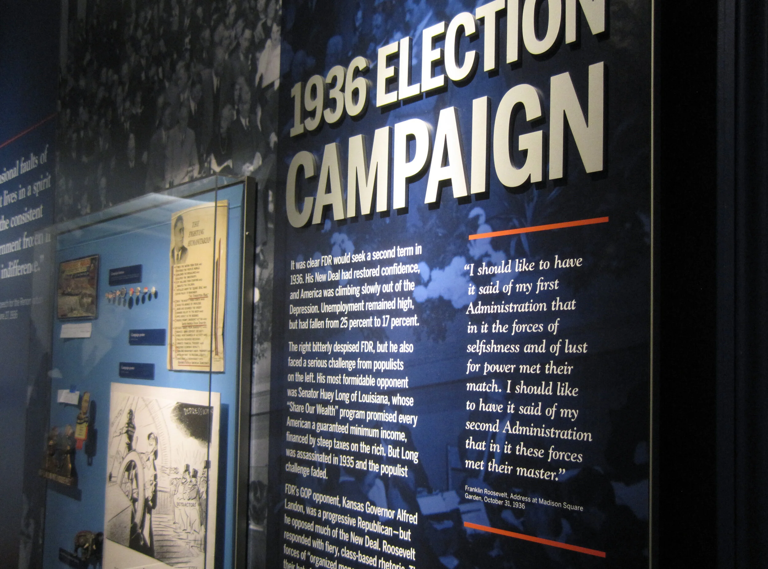
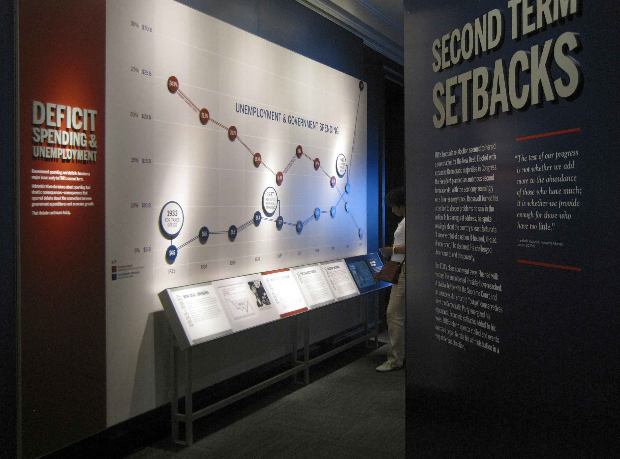
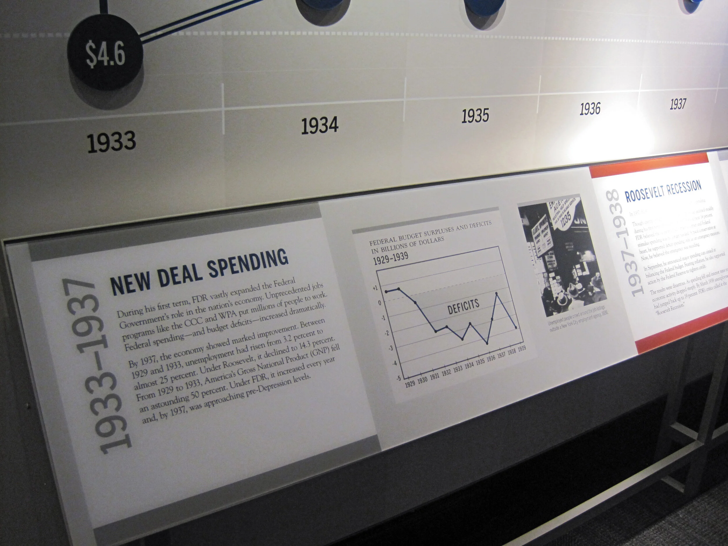
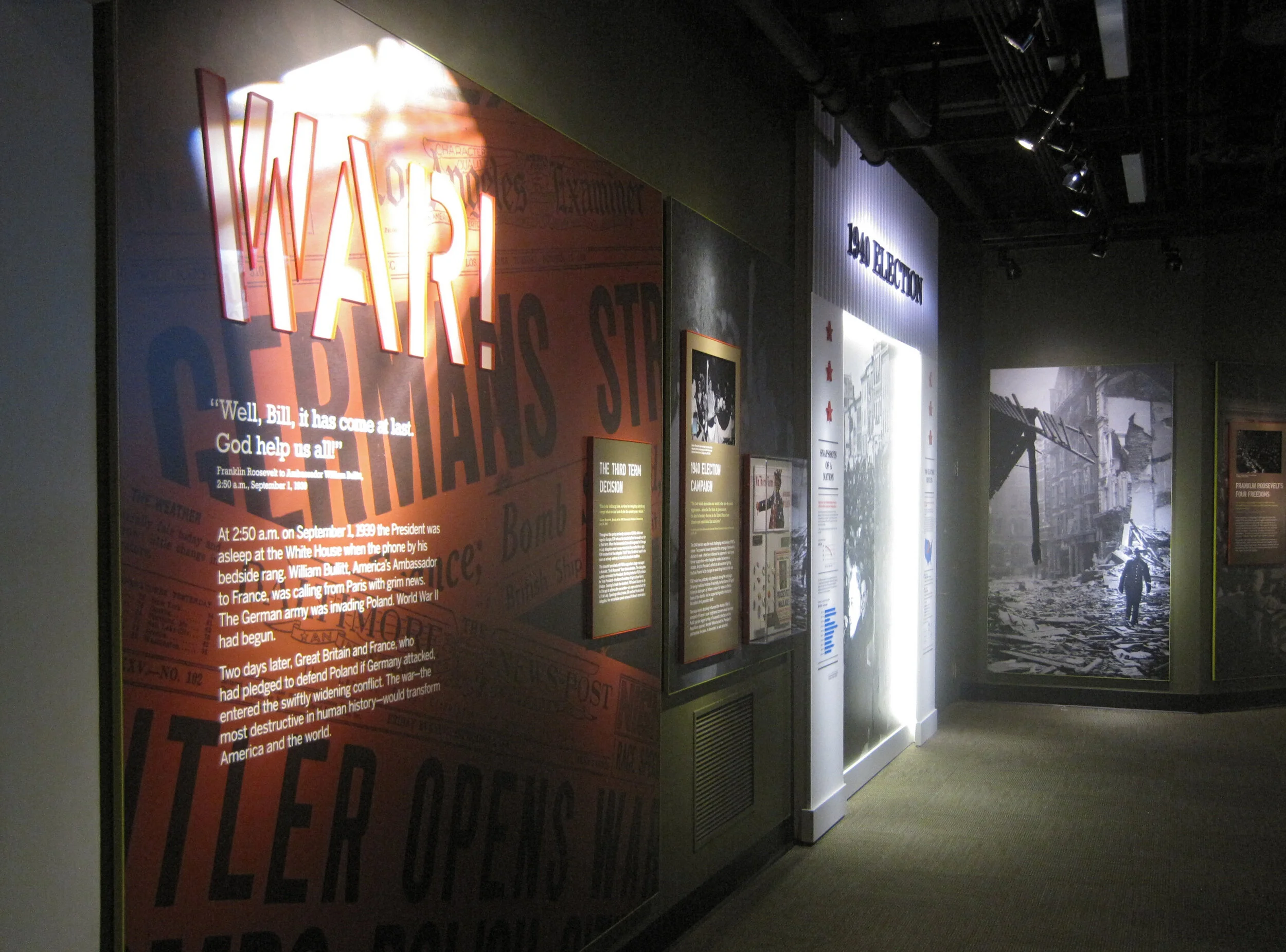
I am back in Hyde Park — installation continues! The exhibits are quickly coming together as the opening nears. Most of the graphics are hung, dimensional letters have been pinned (there are a ton throughout the museum — I went dimensional-letter-happy), and the interactives are being field-tested. I think it all is looking great. Some photos of the A New Deal gallery:

IMG_8087.JPG
IMG_7985.JPG
IMG_7806.JPG
IMG_8131.JPG

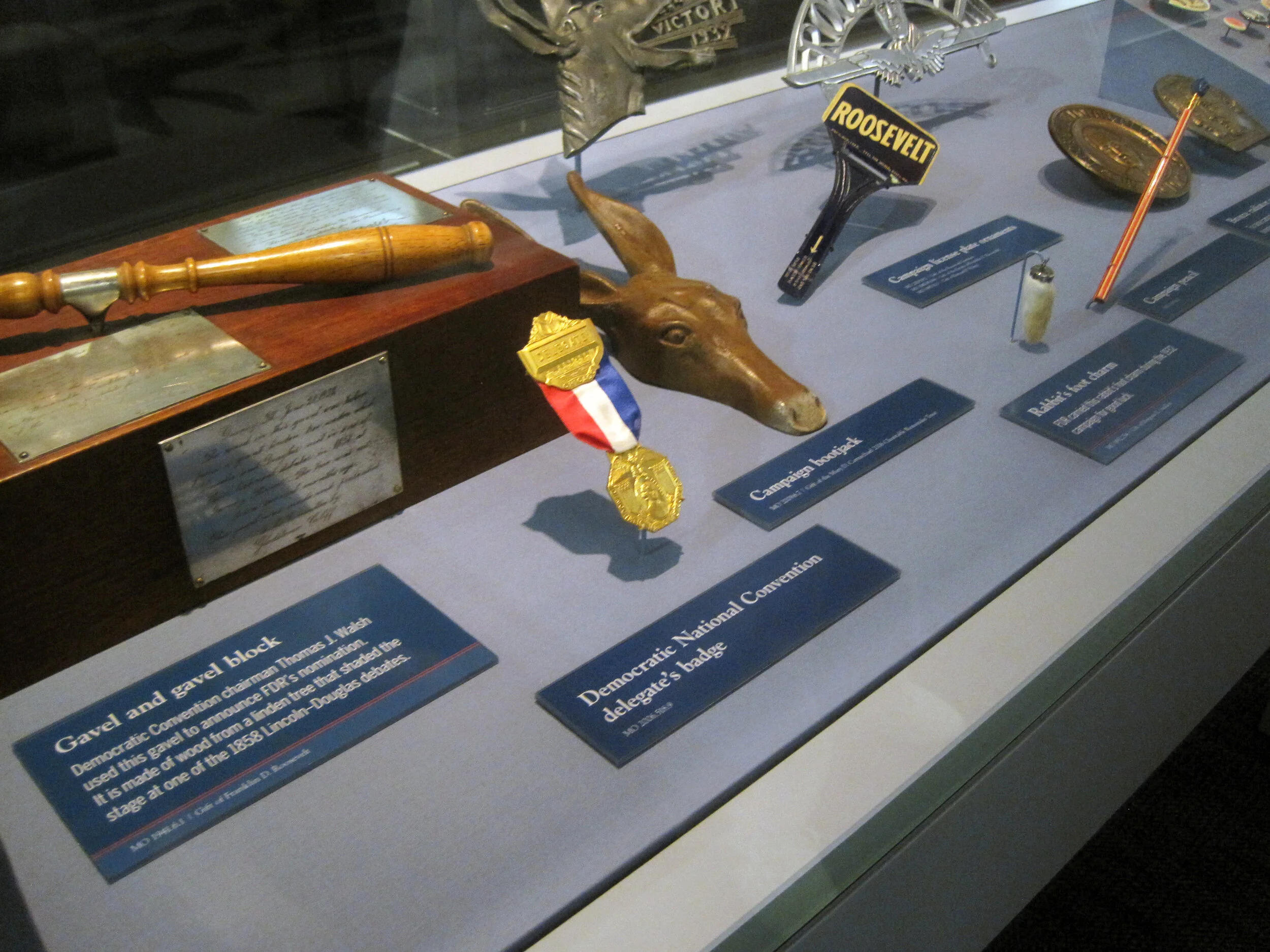
Artifact cases are being filled:

It’s a papier-mâché FDR sphinx!

IMG_8146.JPG

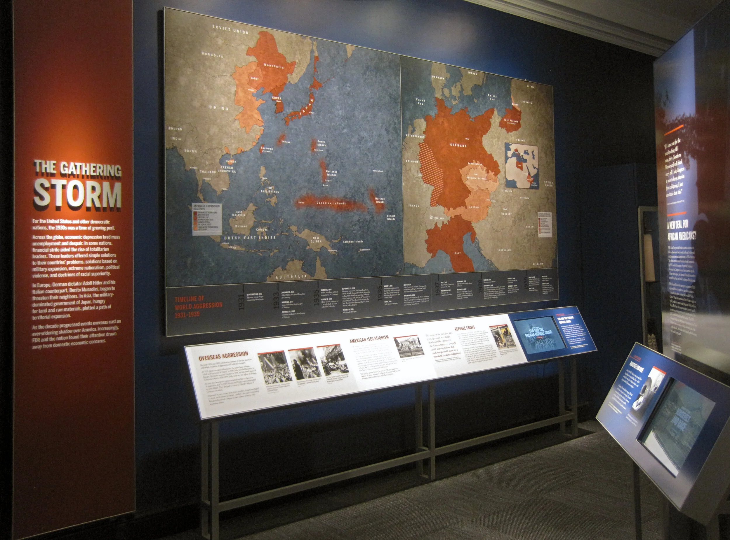
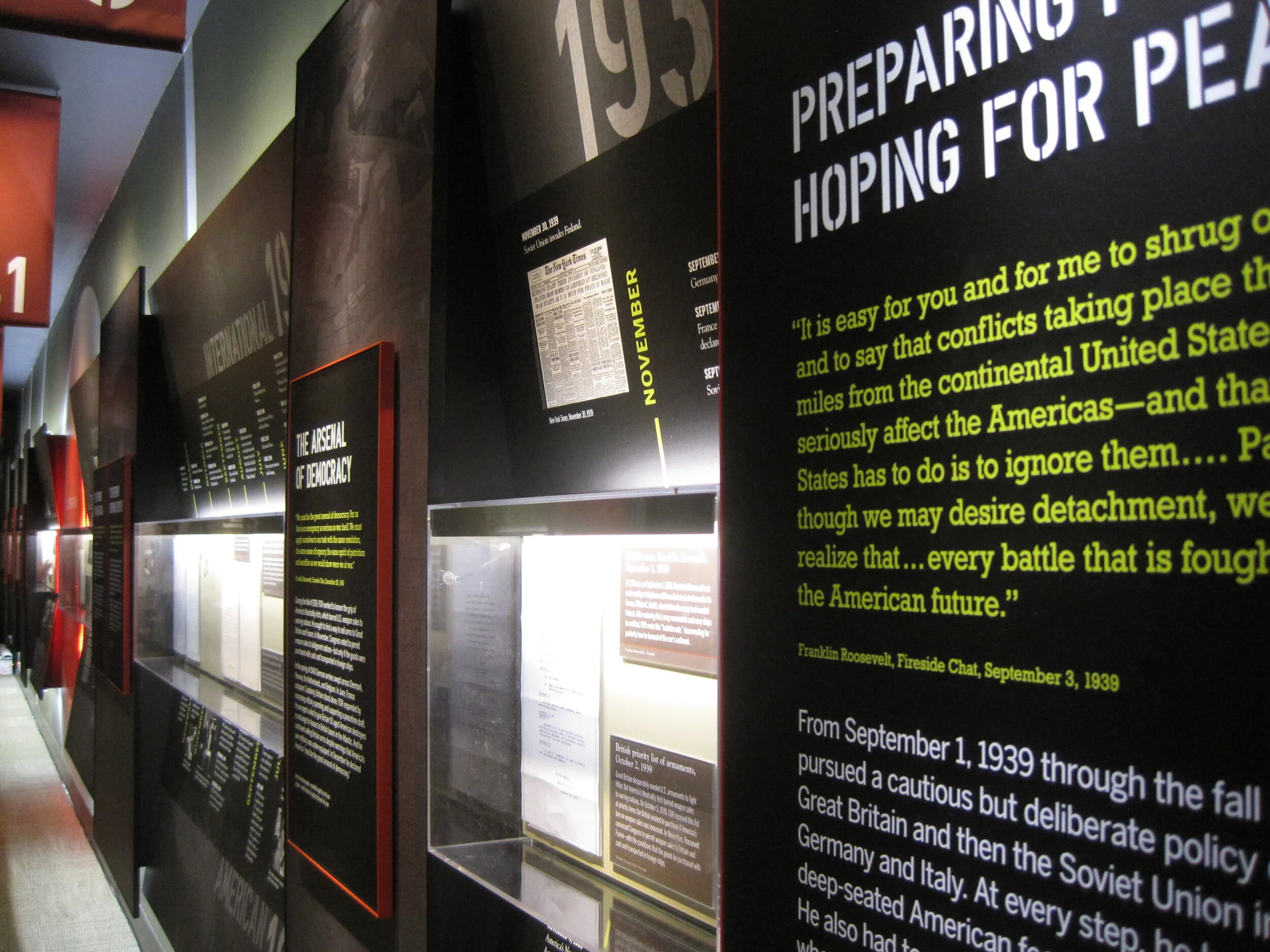
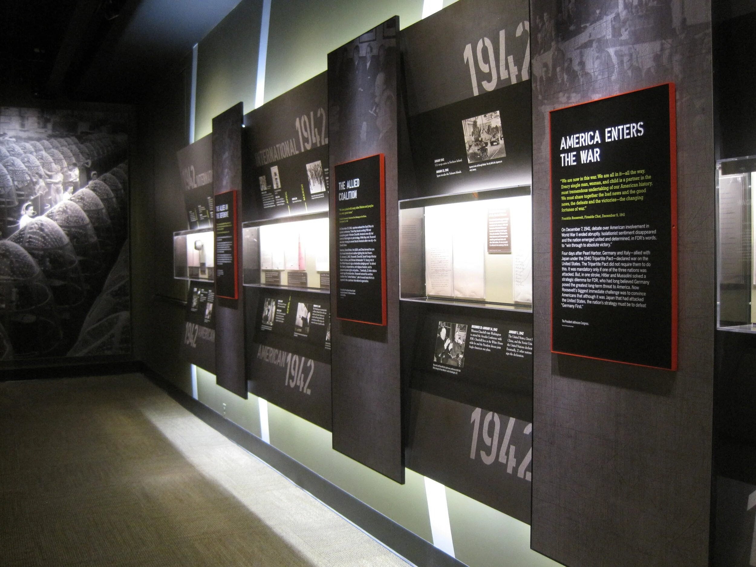
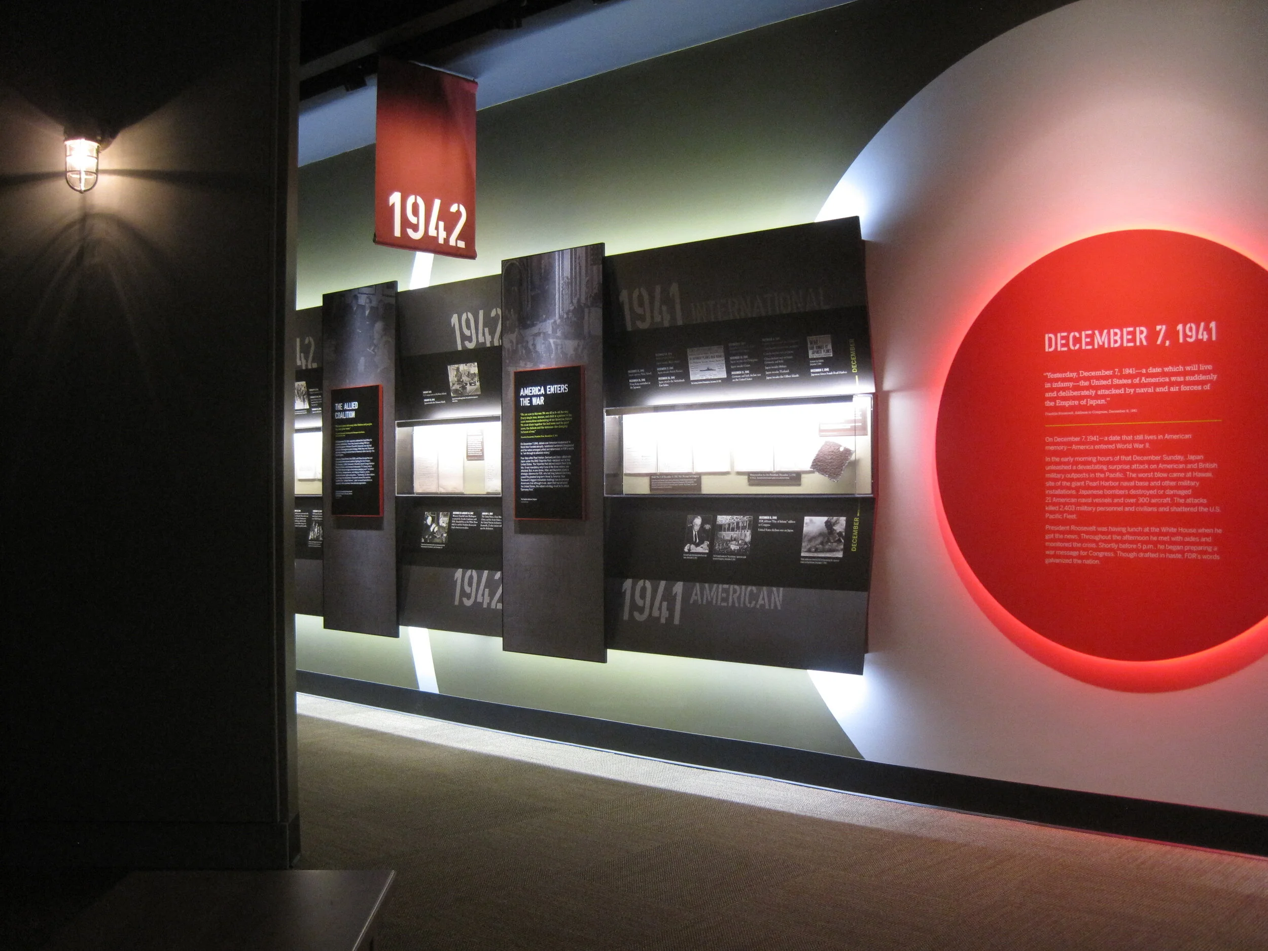
The World War II timeline is nearly complete (two weeks ago there wasn’t much hung besides the skeleton). What a bear that was to design!

IMG_7941.JPG
IMG_8168.JPG

I may have snuck into some New York Times photos while I was onsite. The critic and photographer were there, I was there ... who’s to say. We’ll see.

Post updated in January 2021 with minor text edits and additional photos. This post was originally published at theexhibitdesigner.com on 24 June 2013.

FDR Museum, part 2: installation continues

Work shown was completed while I was a designer at Gallagher & Associates.

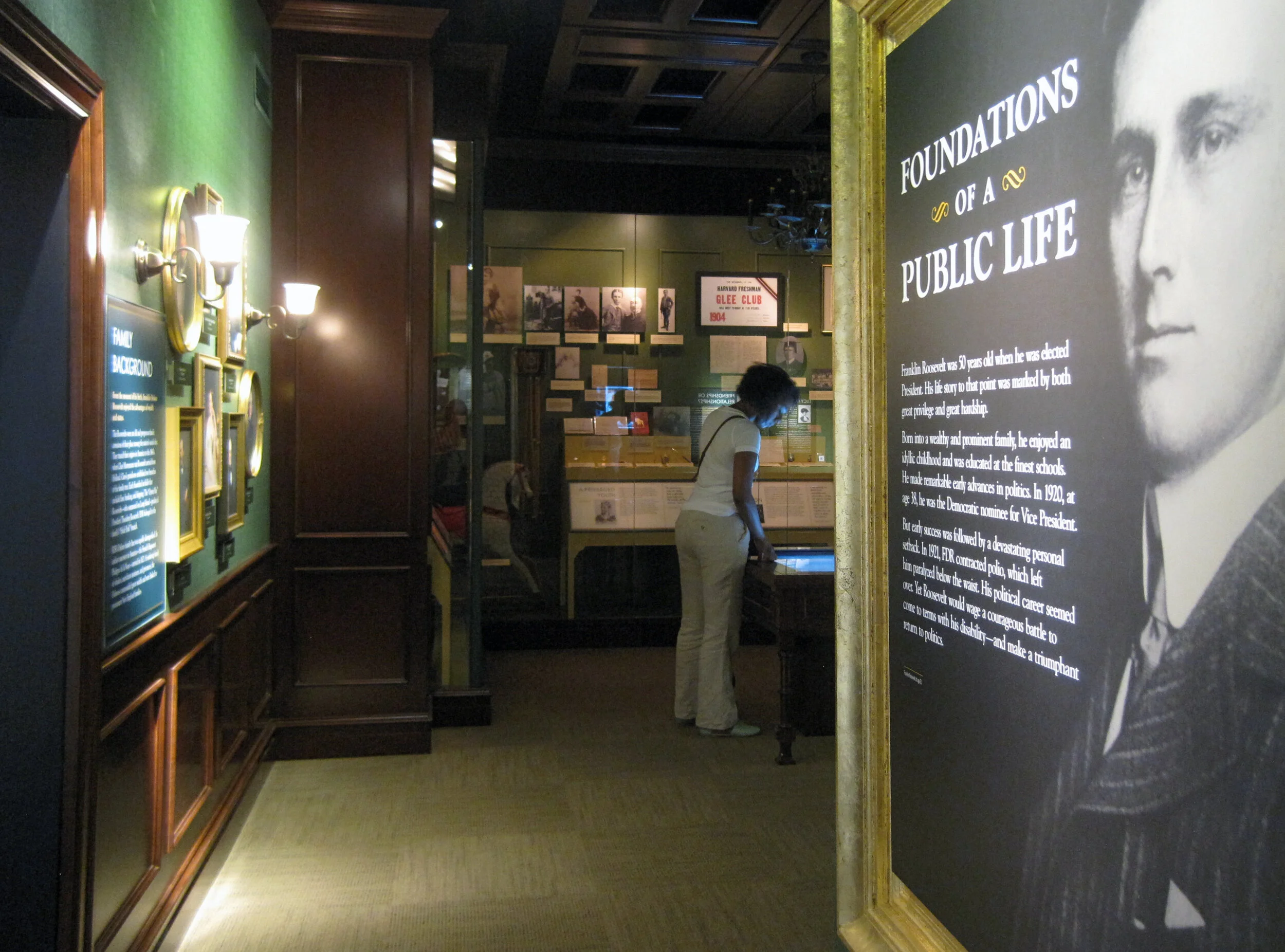
I was back onsite with the Gallagher team at the FDR Library this past week and took more photos of the exhibit installation. It’s exciting to see the various elements go up. The exhibits are dense and layered; it’s a big story to tell in a relatively small space. The exhibits are in the original — now renovated — library conceived by Roosevelt himself so we were restricted to the existing spaces while designing the new exhibits.

Most of the graphics still have a protective film layer and ID label on them. In other places there are backers awaiting graphics, brown paper-wrapped graphics sitting on the floor, and assorted construction detritus. But bit-by-bit it’s going up! And we all know that everything happens in the last week before opening anyway. ;)

Updated, to add a photo of the finished gallery, The Promise of Change:

IMG_8042.JPG

Updated, to add a photo of the finished gallery, Foundations of a Public Life:

IMG_8066.JPG

Below, left: These graphics will be installed into the WWII timeline, on the right side of the photo above. They are printed on Laserchrome, which I mentioned in my previous post — and they look incredible.

I also mentioned the DreamScape wallcovering; below is a shot of some installed murals. I think they look good. Once the text panels, dimensional titles, reader rails, etc. go up — it will look great. More, soon!

Post updated in January 2021 with minor text edits and additional photos. Broken links have been fixed. This post was originally published at theexhibitdesigner.com on 16 June 2013.

FDR Museum, part 1: under construction and opening soon

Work shown was completed while I was a designer at Gallagher & Associates.

For the past couple of years I’ve been working on the Franklin D. Roosevelt Presidential Library and Museum, in Hyde Park, New York and (holy cow) the public opening is less than a month away. With time dwindling, I am finally sharing some process photos: production samples, shop visits, and installation.

The library has been posting photos of the installation on their tumblr. (2021 update: their tumblr is still going strong!) The photo below comes from there; I grabbed it to highlight the graphic in the background. There are four of these structures throughout the museum, one for each of FDR’s elections.

The “election stats” graphics are silkscreened onto Acrylite P-95 with white vinyl film adhered to the second surface. Silkscreening on P-95 creates a subtle shadow, which at certain angles makes the text appear dimensional. (For this reason, it should also be done with caution.) Here’s a photo of the sample provided by Explus, the fabricator (the installed graphic above is waiting for its red dimensional stars to be attached):

Below, the main story panels, used in the World War II gallery, which I am especially happy with:

They’re built from 5/8" clear acrylic, which has been painted on the front surface with acrylic paint, with a “window” left free of paint. The text is printed onto the painted acrylic surface, and then the photo — a Laserchrome metallic print — is adhered to the second surface of the acrylic, within the window area.

The photo above gives you a sense of the depth and jewel box effect created by layering the photo behind the acrylic. And here’s a peek at the backside of the pane. The aluminum angle frames are painted with Matthews acrylic polyurethane paint:

For wall murals I spec’ed DreamScape wallcoverings in various finishes. Above is another photo from the FDR blog, showing a few installed murals (currently missing their dimensional titles, and the scaffolding structure that will be located in front). I’m pleased with the crisp image quality, especially on the rough textures, such as “Plaster” (below, on the left) and “Mystical” (on the right).

Post updated in January 2021 with minor text edits. Broken links have been fixed. This post was originally published at theexhibitdesigner.com on 3 June 2013.

The News 04.11.12

A compilation of design-related web finds.

Everyone’s been raving about Doug Aitken: SONG 1 at the Hirshhorn — because it’s awesome. I’ve visited twice and would (will) visit at least once more before it closes on May 13. You have to experience it in person.

My former firm, Christopher Chadbourne & Associates, announced their closure. This past summer I accepted a position with Gallagher & Associates, and moved to Washington, DC | In memory of the 100th anniversary of the Titanic’s sinking on April 15, dozens of exhibits about the ship have opened, including the the world’s largest, in Belfast; also: Fire & Ice: Hindenburg and Titanic at the Smithsonian National Postal Museum; Titanic: The Artifact Exhibition, everywhere; Titanic at the South Street Seaport Museum in New York, NY | The Union Pacific Railroad Museum’s Building America traveling exhibit is located in a traveling train car, naturally. The entire museum opens in Iowa in a month | Part 1 in a series of articles describing exhibit design, from Mark Walhimer at museumplanner.org | Blueprint, a guidebook to build your own history museum in the 21st century, from The Museum of the Future | Pinned Inspiration: ice ceiling; purple-sided lightboxes; German Expressionism at the MoMA; education center at the San Diego Children's Museum.

Post updated in January 2021 with text edits. Broken links have been replaced with archived URLs, courtesy of archive.org. This post was originally published at theexhibitdesigner.com on 11 April 2012.