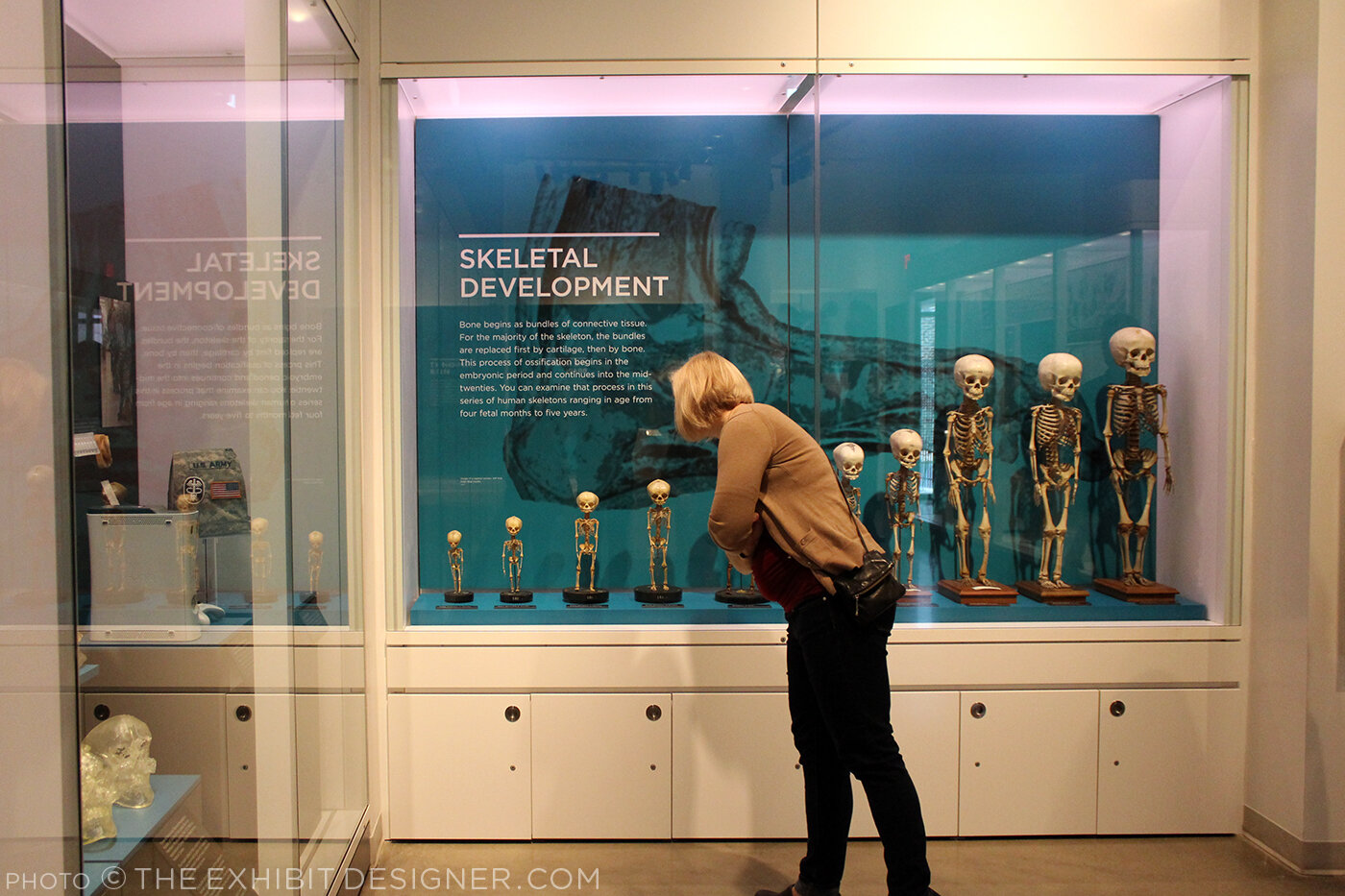
On Sunday I attended a tour of the very cool National Museum of Health and Medicine, now located in Silver Spring, Maryland. NMNH is a Department of Defense museum first established in 1862 as the Army Medical Museum, “a center for the collection of specimens for research in military medicine and surgery.”
The tour was organized by the Washington, DC chapter of SEGD (formerly the Society for Environmental Graphic Design, now the Society for Experiential Graphic Design) and led by members of the museum’s staff and the design team from Gallagher & Associates. (I used to be a designer at G&A.)
There was a crowd in attendance so we were split into two groups. My group was led by graphic designer Liza Rao (responsible for the museum’s fantastic colors and typography), and Andrea Schierkolk, NMHM’s public programs manager. It was a treat to hear reflections from both sides; what they love and what they love less; things that work great and things that didn't turn out as expected. It was also a treat to see some of my former colleagues.
The museum is divided into three major exhibits: Collection That Teaches (purple), Anatomy and Pathology (turquoise), and Advances in Military Medicine (brick red). Crisp white casework and glass shelves give the exhibit a “lab-like” look that I enjoyed, and the bold shots of color look great against the mostly tan, cream, and yellow objects on display — yes, most of those objects are corporeal remains. This museum is not for the sensitive of stomach.
The exhibits were designed precisely for the current objects on display, yet they are still changeable — graphics can be slid in and out as objects are rotated or stories are updated.
Thank you to our new DC SEGD chairs, Liza and Chris, for the great program — keep them coming, please!
Post updated in January 2021 with minor text edits. This post was originally published at theexhibitdesigner.com on 16 March 2016.


