ny2

Weekend in NYC: the Cooper Hewitt, Jewish Museum, more

I went up to New York City a couple weekends ago. My time was packed with museum visits, including my first to the Tenement Museum, at 97 Orchard Street in Manhattan’s Lower East Side. I took their Shop Life tour. The museum’s sixty- and ninety-minute-long tours are docent-led through restored tenement apartments. Most tours focuses on one apartment, one period in time, and one actual family; the Shop Life tour is slightly different in that it highlights multiple families, across time periods, who lived and worked in the basement-level shops. I highly recommend the museum for an engrossing, educational experience. (Summertime hint: the Shop Life tour is the only one air-conditioned!)

From top left, clock-wise: volunteers pull weeds on the High Line; the entrance to the "Shop Life" tour at the Tenement Museum (no photos allowed inside!); Fly By Night at the Brooklyn Navy Yard; Goshka Macuga at the New Museum

From top left, clock-wise: volunteers pull weeds on the High Line; the entrance to the "Shop Life" tour at the Tenement Museum (no photos allowed inside!); Fly By Night at the Brooklyn Navy Yard; Goshka Macuga at the New Museum

I also stopped by the New Museum, since I was in the neighborhood for the Tenement Museum, and truth be told, I was mostly perplexed (I’m not that hip, apparently). I paid another visit to the High Line, which has expanded and its plantings matured since I was last there. And I saw a performance of Duke Riley’s Fly By Night, in which, “at dusk, a massive flock of pigeons … elegantly twirl, swoop, and glide above the East River.” The pigeons wear LED anklets and respond to whistles and waving flags, flying overhead as commanded. The performance pays homage to the mostly forgotten culture of pigeon keeping and — with just another week to go — is being held at the Brooklyn Navy Yard, once home to the country’s largest naval fleet of pigeon carriers. I loved it.

theexhibitdesigner_new-york-met-breuer

At the Met Breuer, the Metropolitan Museum of Art’s new home for modern and contemporary exhibitions (in the Whitney’s former building), I saw the exhibition Unfinished. There was nothing ground breaking in the actual exhibition design, but the premise was compelling and a lot of the artwork was fantastic.

And I took in the Nasreen Mohamedi retrospective. (Just closed, on June 5.) After the jam-packed Unfinished, the meditative exhibition was a welcome respite.

theexhibitdesigner_new-york-met-breuer2

But hands down, my two favorite exhibits during this visit were at the Jewish Museum and the Cooper Hewitt.

theexhibitdesigner_new-york-jewishmus_burle-marx

At the Jewish Museum, I fell in love with Roberto Burle Marx. Burle Marx was a Brazilian artist who drew upon diverse cultural influences to reinvent the landscape architecture discipline. He incorporated abstracted, irregular forms, native plants (he was a passionate environmental advocate), and Brazilian modernism into his landscape designs. His work is incredible; visit this exhibition!

theexhibitdesigner_new-york-jewishmus_burle-marx-exhibit-cases

The exhibition design was spot-on, evoking the geometries and curves of Burle Marx’s landscapes and emphasizing the art on display. An interlocked massing of display cases in the center of the room dominated the exhibition space; an 87-foot-long tapestry (below, left), designed by Burle Marx for the Santo André Civic Center in 1969, provided a stunning focal point. His hand-drawn and painted landscape plans are wonderful to behold; some examples from the exhibition are shown below.

theexhibitdesigner_new-york-jewishmus_burle-marx-exhibit-displays
theexhibitdesigner_new-york-jewishmus_burle-marx2

A few blocks north, Beauty, the Cooper Hewitt Design Triennial was bustling. The wide-ranging contemporary design exhibition is a must-see for designers and artists.

theexhibitdesigner_new-york-cooper-hewitt-beauty
theexhibitdesigner_new-york-cooper-hewitt-beauty2

The exhibition design was minimal, just the simplest of reader rails and small text panels. The museum encourages use of “pens” that allow you to interact with the digitized collection on touchscreen tables and to save objects from the exhibitions to be accessed later. A nice benefit of accessing your visit online is that for each object, museum curators have selected related objects for further exploration. For example, the online entry for Atmospheric Reentry, designed by Maiko Takeda (above, left), led me to this hat from Cameroon and this “hairy” garden pavilion.

theexhibitdesigner_new-york-cooper-hewitt-beauty-reader-rails

Below is one of my favorite entries from the Beauty Triennial, Architecture is Everywhere, designed by Sou Fujimoto Architects. From the project description: “the project discovers architectural possibility in found objects and everyday materials. Simple artifacts such as a lottery ticket, an ashtray, or a ring of binder clips become intriguing structures when placed on pedestals with tiny human figures.” It was delightful.

theexhibitdesigner_new-york-cooper-hewitt-beauty3

Post updated in January 2021 with minor text edits. Broken links have been fixed. This post was originally published at theexhibitdesigner.com on 13 June 2016.

On view now! New York City: A Portrait Through Stamp Art

New York City: A Portrait Through Stamp Art opened — today! — at the Smithsonian National Postal Museum. I was delighted to design this temporary art exhibition.

Postal-Museum-stamp-art_90A0119_Fotobriceno
Postal-Museum-stamp-art_90A0167_Fotobriceno

… Along with some printed pieces: a postcard booklet (free for museum visitors) and special postal cancellation (available in the museum’s post office).

christine-lefebvre-NYC-stamp-art_postcards-unfolded-sm.jpg

The thirty pieces of original artwork on display are part of the Postmaster General's [extensive] Art Collection, and are arranged in six categories: Baseball, Broadway, City Life, Icons, Politics, and Music. The artwork was selected to “celebrate important citizens, events and iconic buildings that have defined New York City as one of the greatest cities in the world.” Who knew there were so many New York City-themed stamps??

christine-lefebvre_Smithsonian-Postal-NYC-Stamp-Art-1
christine-lefebvre_Smithsonian-Postal-NYC-Stamp-Art-2
CLD_NPM_NYCstamp-Exhibit8.jpg

The exhibition will be on view through March 13, 2017. If you want the distinct pleasure of seeing TWO of my exhibits in one museum, Freedom Just Around the Corner is also on view at the National Postal Museum for two more months, until February 15, 2016.
christine-lefebvre_Smithsonian-Postal-Museum-stamp-art_90A0161_Fotobriceno-sm.jpg

Post updated in January 2021 with minor text edits. Broken links have been fixed. This post was originally published at theexhibitdesigner.com on 10 December 2015.

The FDR Museum is open!

The Franklin D. Roosevelt Presidential Library and Museum was rededicated on Sunday June 29 and is now open to the public. The New York Times published a flattering review and we are thrilled. Here we (the Gallagher team) are at the gala reception, with the museum’s chief curator:

Post updated in January 2021 with minor text edits. Broken links have been fixed. This post was originally published at theexhibitdesigner.com on 3 July 2013.

FDR Museum, part 4: rear-lit and neon

Work shown was completed while I was a designer at Gallagher & Associates.

To wrap up my series on the design, fabrication, and installation of the Franklin D. Roosevelt Museum, a close look at the first exhibition gallery.

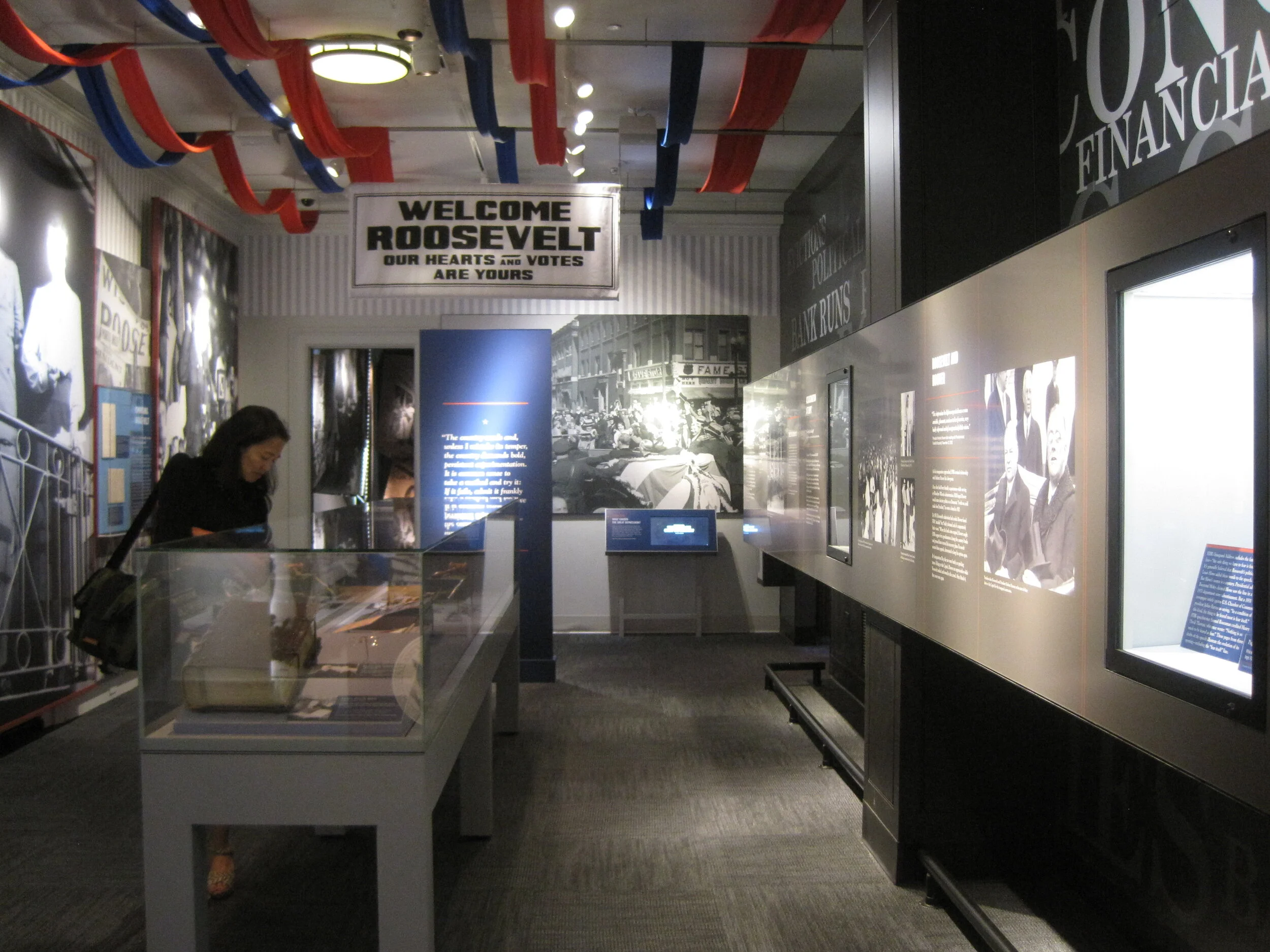
The first gallery sets the stage for FDR’s presidency: the Great Depression. The focal point here is the neon-illuminated “FEAR” wall. Text is silkscreened onto the glass panels and rear-illuminated with LED pads. The red color comes from the custom “UMEMPLOYED” neon letters; the mural image in the back is a black and white photographic print.

The FEAR letters are applied to the rear of the glass. I wanted them to be translucent — to allow the mural image to show through and create depth — and also be as richly black as possible. The fabricators, Explus, provided a variety of production samples to try to achieve the effect I was after. Printing the letters on a transparent film and applying it to the glass, in particular, was unacceptable as I wanted a uniform transparency (no streaks, no dots).

Explus created a self-adhering vinyl by applying Sentinel OptiClear Adhesive to the face of the gel sheet (Rosco Cinegel Neutral Density N.9 Gel Extra Wide) and die-cutting it. I was happy, but the fabricators had some difficulty with cutting and applying the gel sheets. Their graphics manager told me that if they were to do something like this again they would use a standard window tint that has the application adhesive already on it. Here’s the sample:

Turning to the wall opposite:

The background mural is printed on DreamScape, as I mentioned in a previous post. Most of the murals in this museum were applied to backers, framed, and cleat-hung to the wall, but this particular one was applied directly to the wall and its edges captured with flat aluminum strips.

The framed graphics are digital prints with an overlaminate, mounted to sign blank. They were applied onsite to an MDF backer panel and aluminum frame. (The backer and frame are screwed to the exhibit wall; the graphic is applied with VHB tape.) Explus welded the frames’ corners before painting them, and that made a huge difference in the appearance of them. They are nicely finished and high-quality.

Post updated in January 2021 with minor text edits. Broken links have been fixed. This post was originally published at theexhibitdesigner.com on 25 June 2013.

FDR Museum, part 3: almost done!

Work shown was completed while I was a designer at Gallagher & Associates.

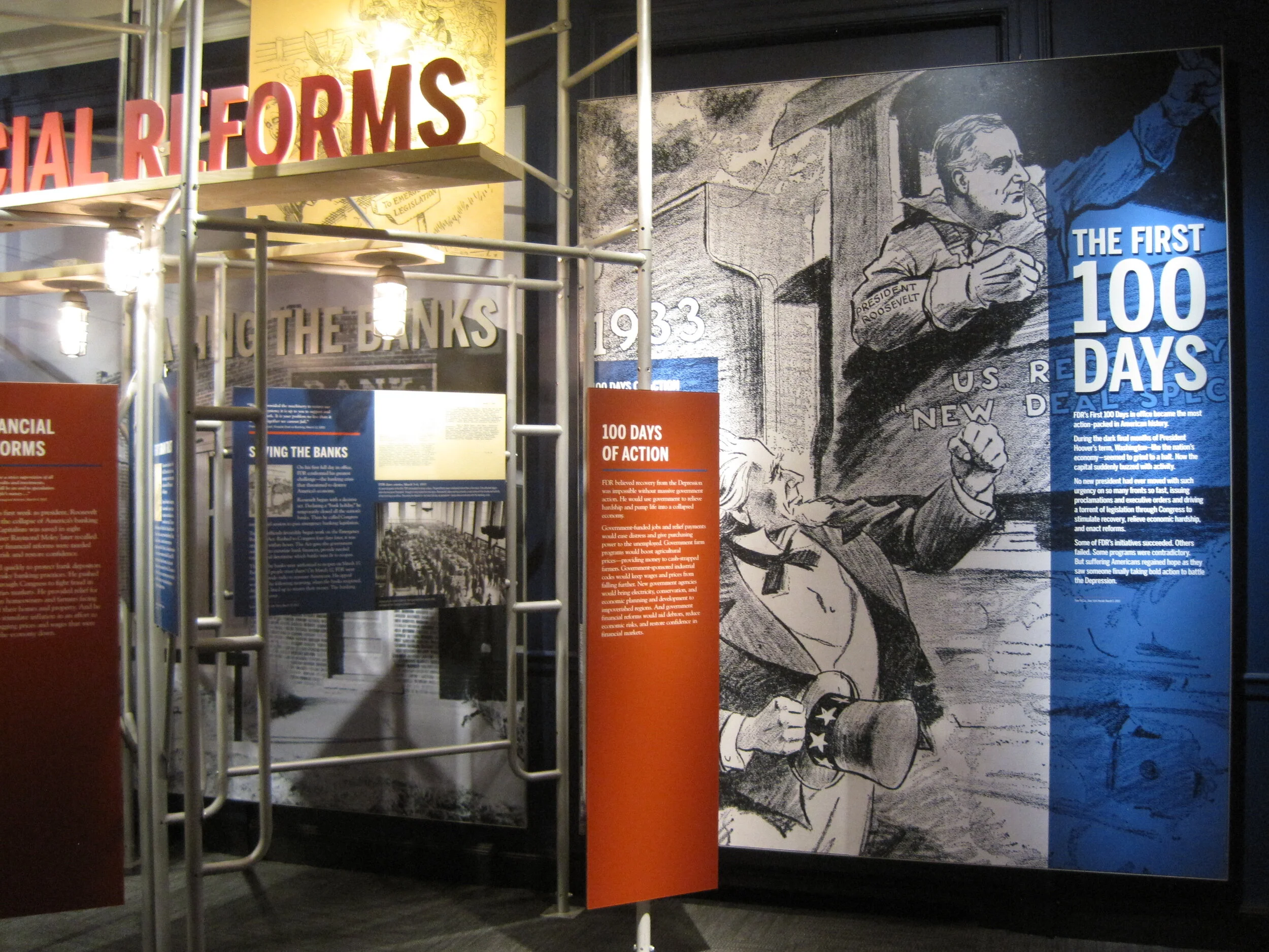
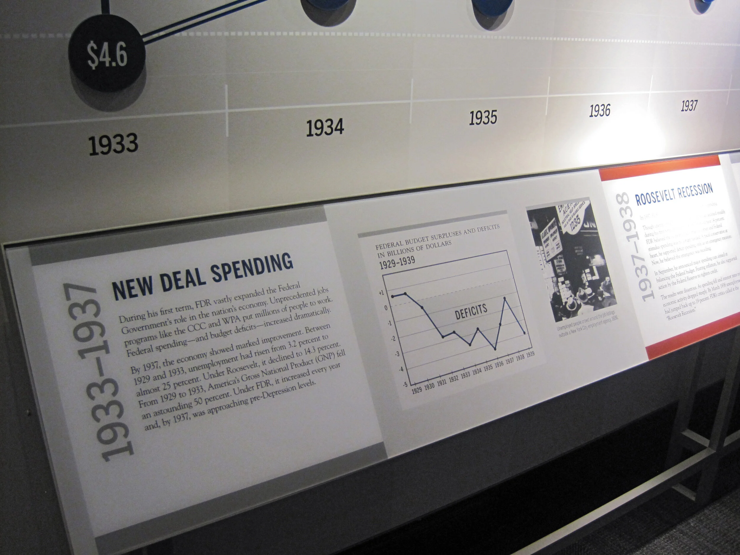
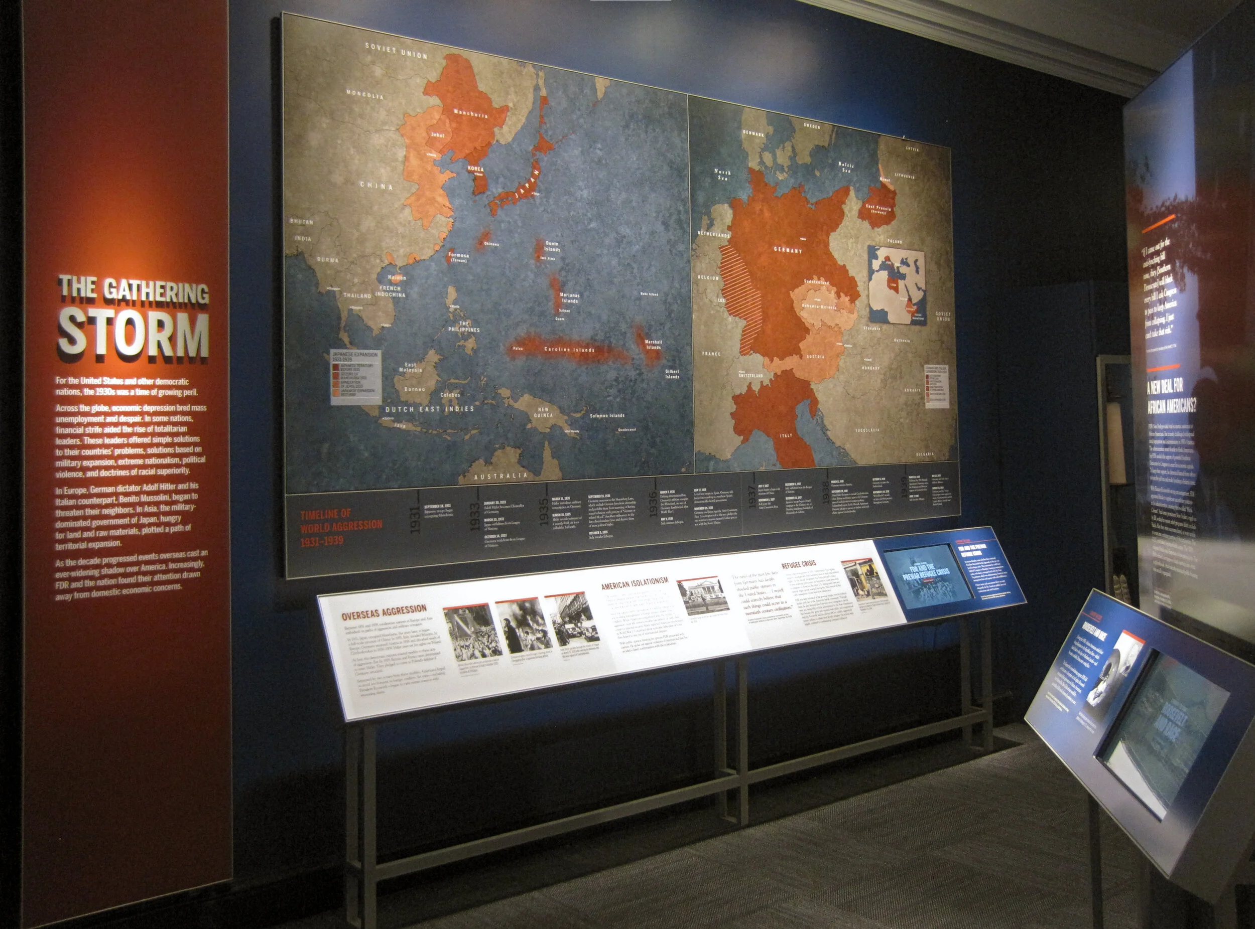
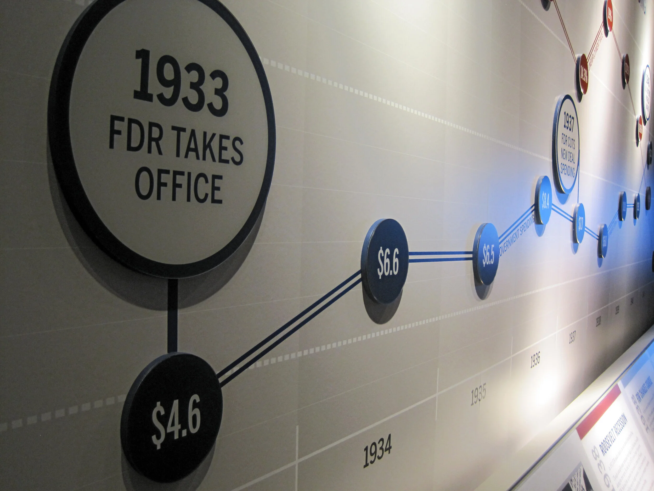
I am back in Hyde Park — installation continues! The exhibits are quickly coming together as the opening nears. Most of the graphics are hung, dimensional letters have been pinned (there are a ton throughout the museum — I went dimensional-letter-happy), and the interactives are being field-tested. I think it all is looking great. Some photos of the A New Deal gallery:

IMG_8087.JPG
IMG_7985.JPG
IMG_7806.JPG
IMG_8131.JPG

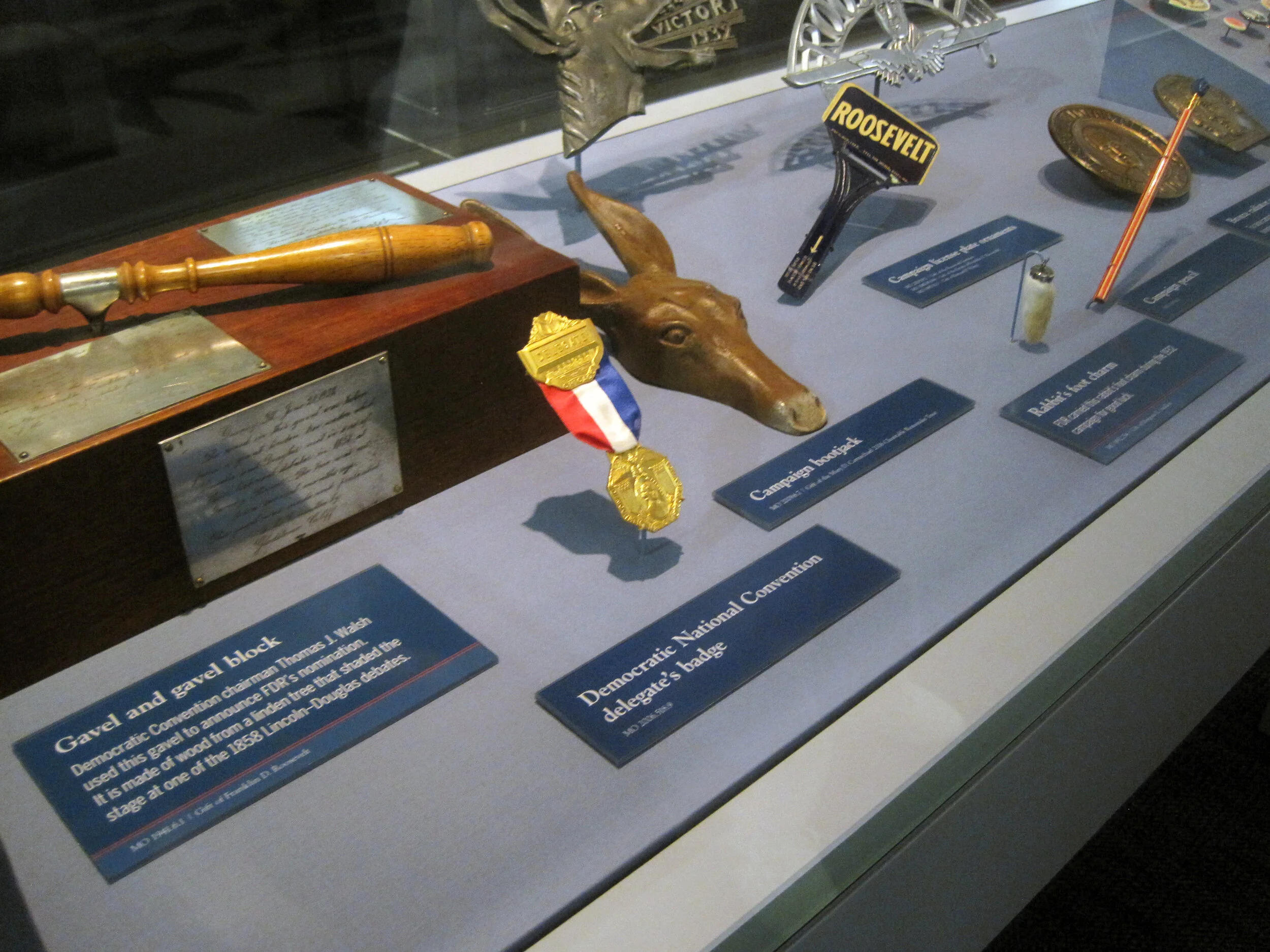
Artifact cases are being filled:

It’s a papier-mâché FDR sphinx!

IMG_8146.JPG

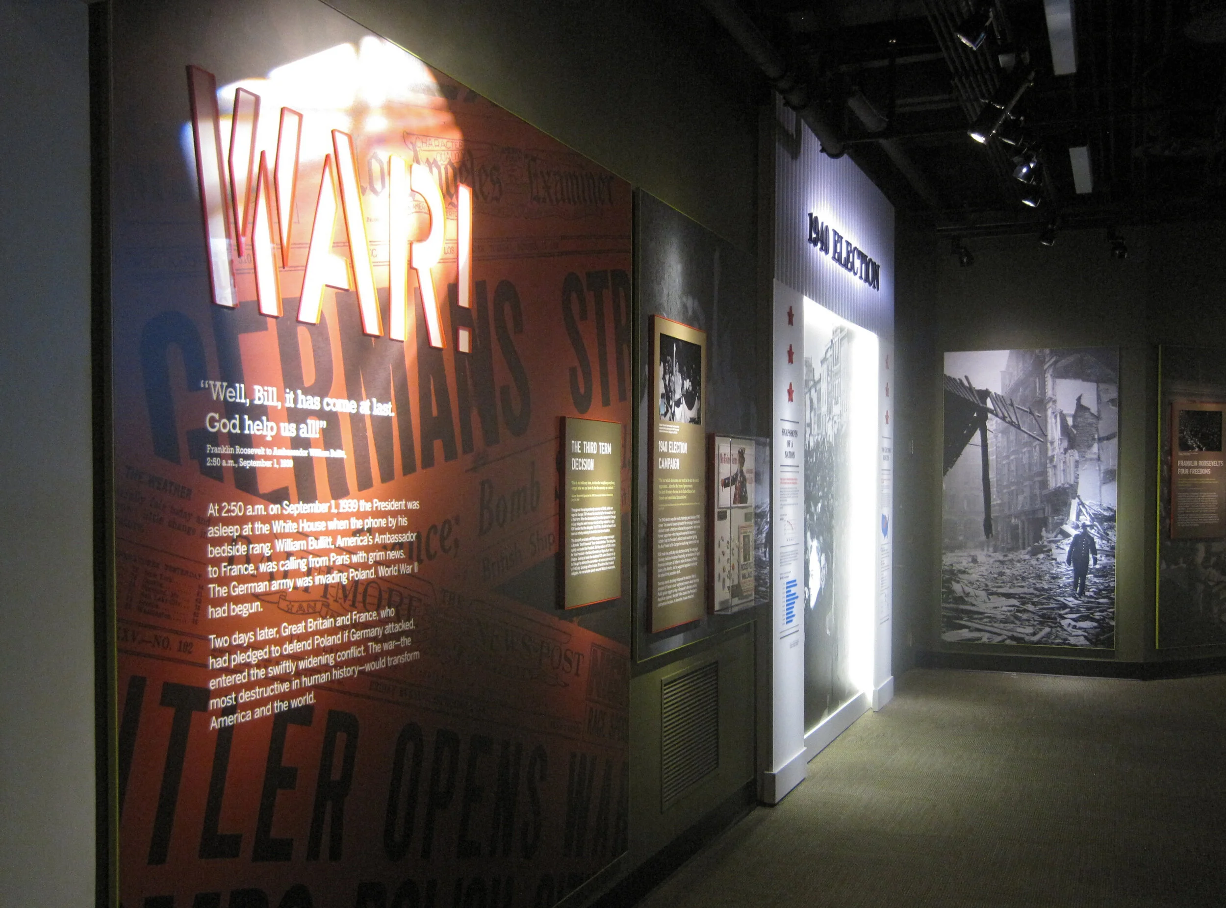
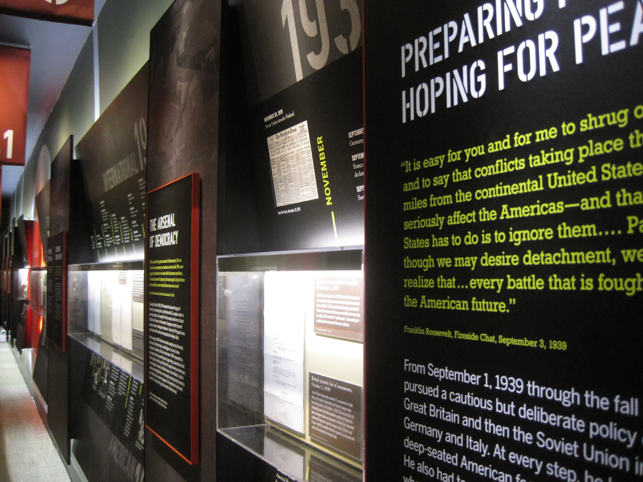
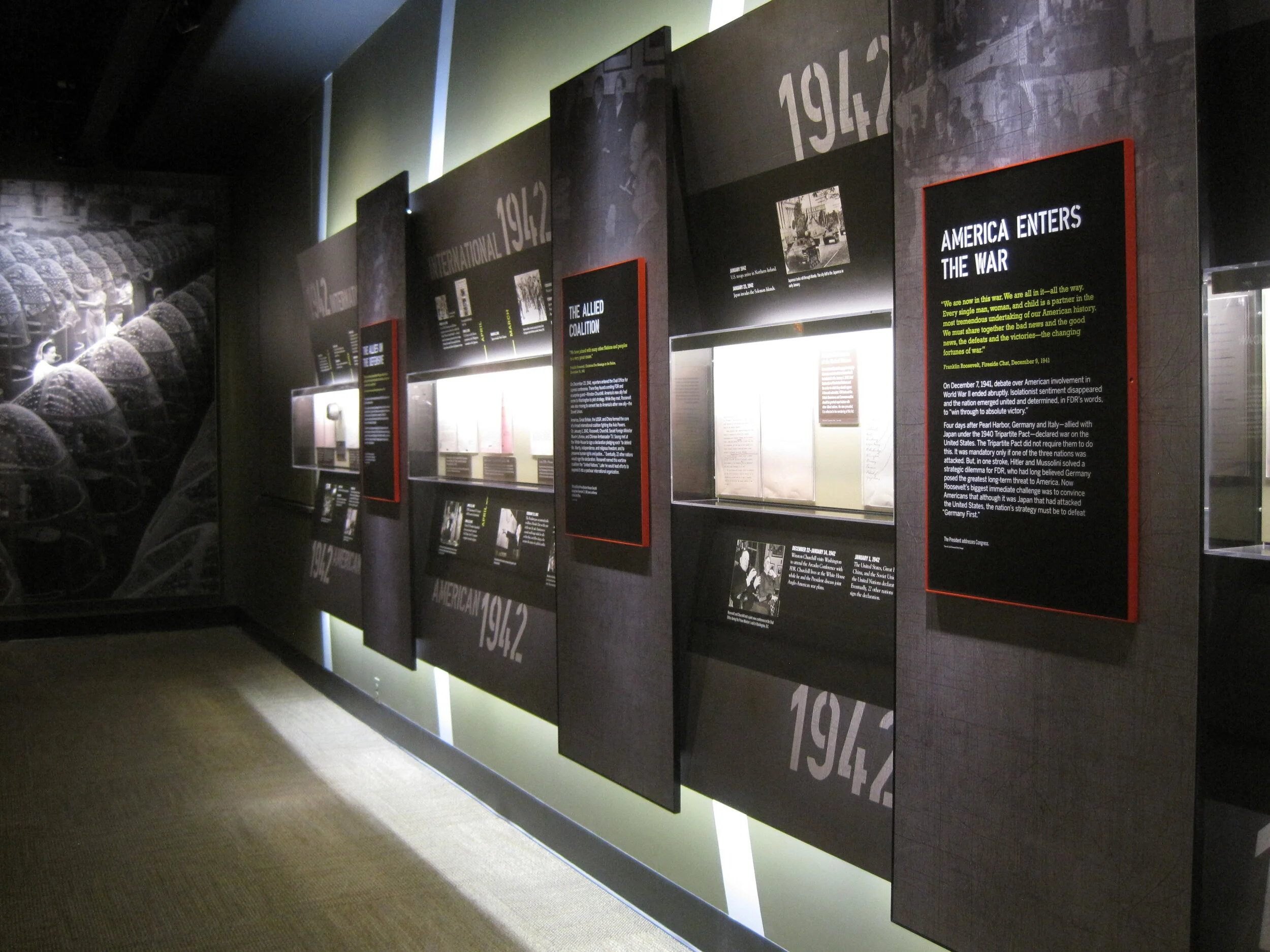
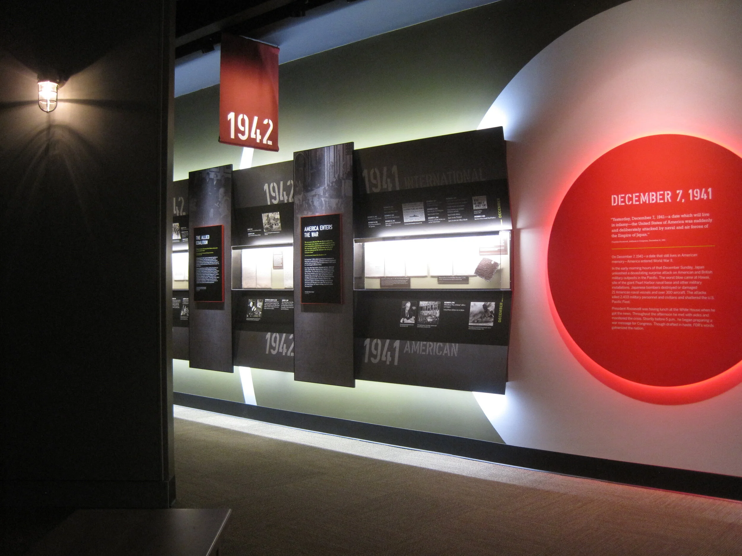
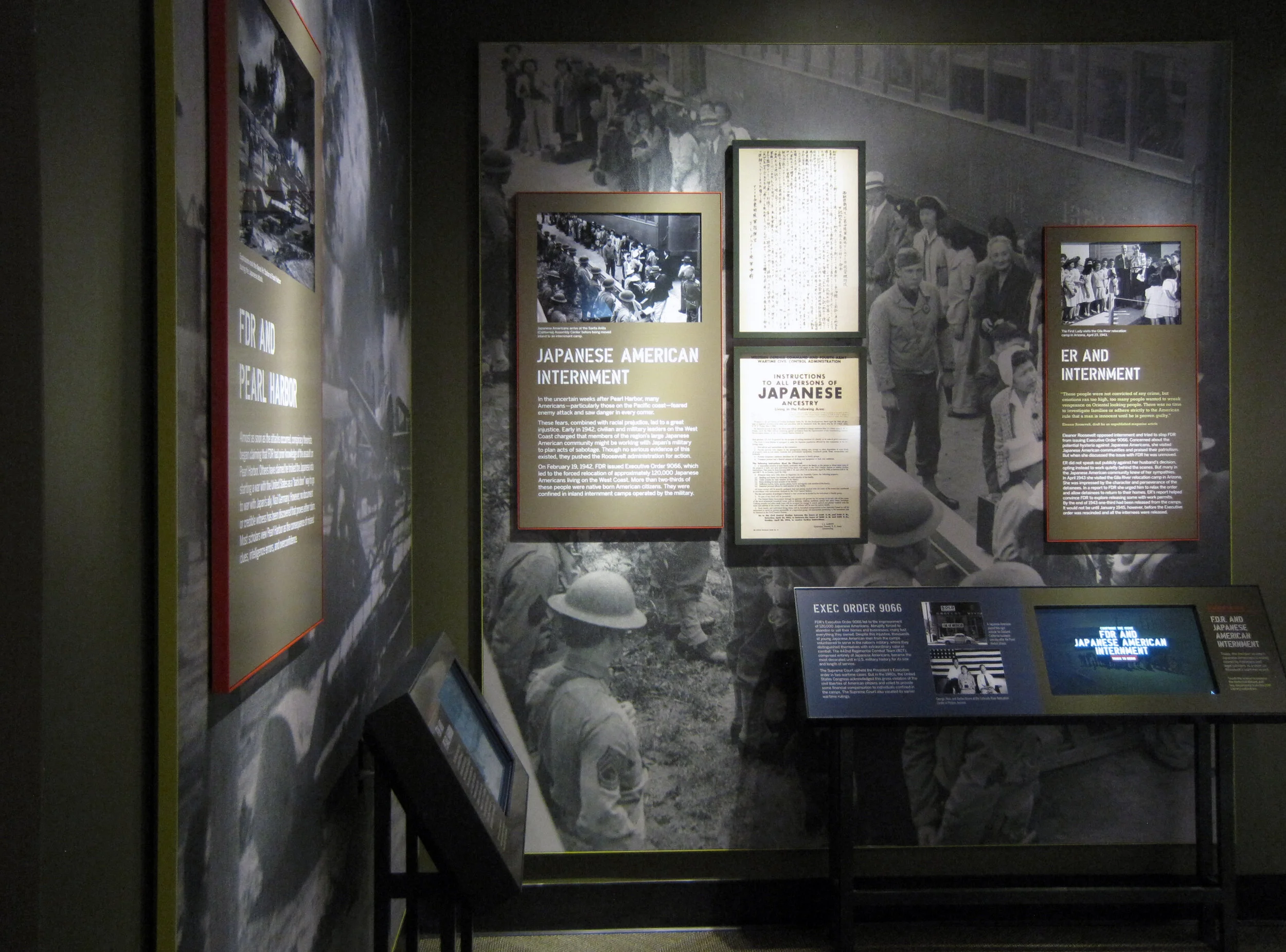
The World War II timeline is nearly complete (two weeks ago there wasn’t much hung besides the skeleton). What a bear that was to design!

IMG_7941.JPG
IMG_8168.JPG

I may have snuck into some New York Times photos while I was onsite. The critic and photographer were there, I was there ... who’s to say. We’ll see.

Post updated in January 2021 with minor text edits and additional photos. This post was originally published at theexhibitdesigner.com on 24 June 2013.

FDR Museum, part 2: installation continues

Work shown was completed while I was a designer at Gallagher & Associates.

I was back onsite with the Gallagher team at the FDR Library this past week and took more photos of the exhibit installation. It’s exciting to see the various elements go up. The exhibits are dense and layered; it’s a big story to tell in a relatively small space. The exhibits are in the original — now renovated — library conceived by Roosevelt himself so we were restricted to the existing spaces while designing the new exhibits.

Most of the graphics still have a protective film layer and ID label on them. In other places there are backers awaiting graphics, brown paper-wrapped graphics sitting on the floor, and assorted construction detritus. But bit-by-bit it’s going up! And we all know that everything happens in the last week before opening anyway. ;)

Updated, to add a photo of the finished gallery, The Promise of Change:

IMG_8042.JPG

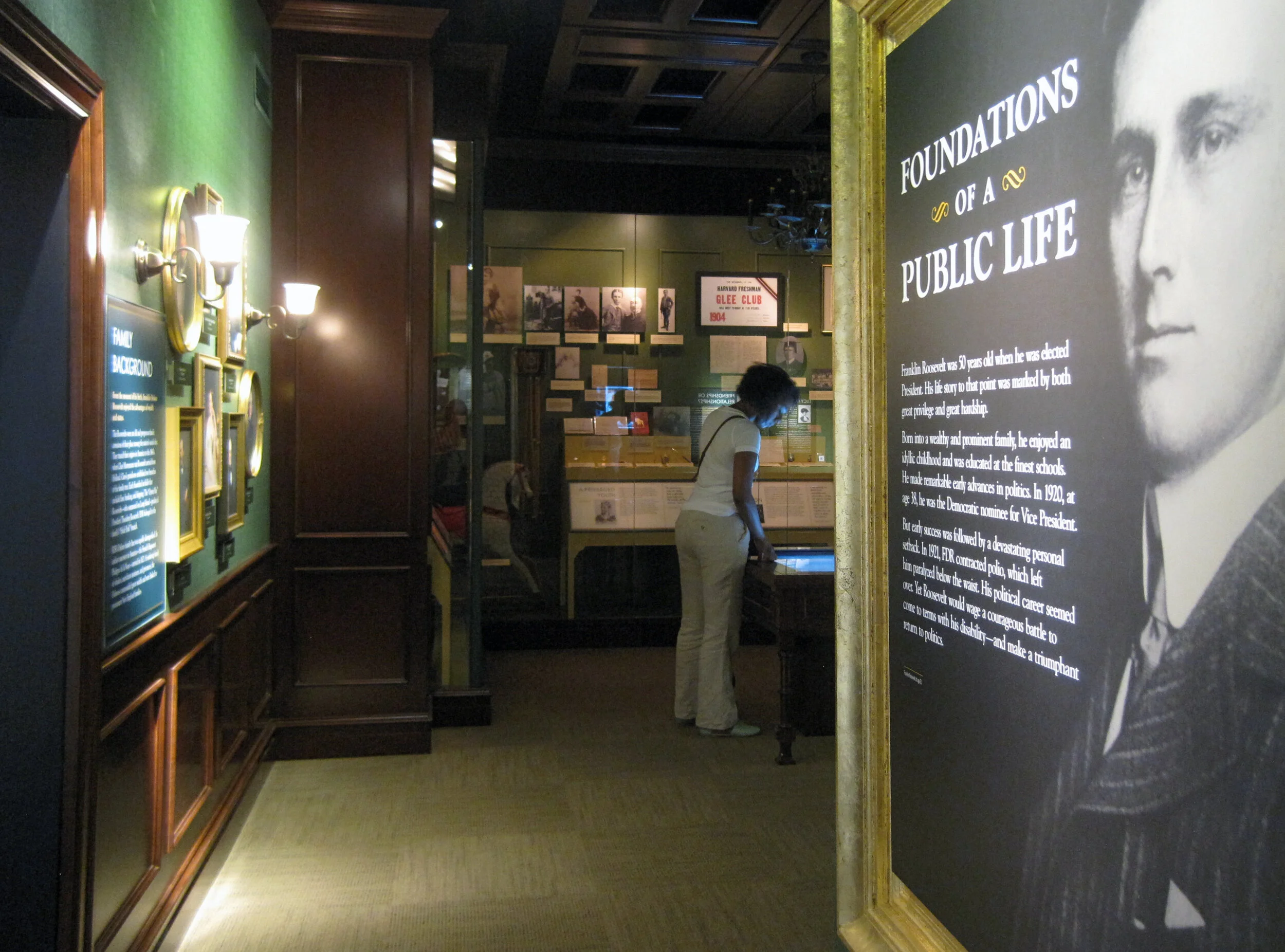
Updated, to add a photo of the finished gallery, Foundations of a Public Life:

IMG_8066.JPG

Below, left: These graphics will be installed into the WWII timeline, on the right side of the photo above. They are printed on Laserchrome, which I mentioned in my previous post — and they look incredible.

I also mentioned the DreamScape wallcovering; below is a shot of some installed murals. I think they look good. Once the text panels, dimensional titles, reader rails, etc. go up — it will look great. More, soon!

Post updated in January 2021 with minor text edits and additional photos. Broken links have been fixed. This post was originally published at theexhibitdesigner.com on 16 June 2013.