print design

On view now! New York City: A Portrait Through Stamp Art

New York City: A Portrait Through Stamp Art opened — today! — at the Smithsonian National Postal Museum. I was delighted to design this temporary art exhibition.

Postal-Museum-stamp-art_90A0119_Fotobriceno
Postal-Museum-stamp-art_90A0167_Fotobriceno

… Along with some printed pieces: a postcard booklet (free for museum visitors) and special postal cancellation (available in the museum’s post office).

christine-lefebvre-NYC-stamp-art_postcards-unfolded-sm.jpg

The thirty pieces of original artwork on display are part of the Postmaster General's [extensive] Art Collection, and are arranged in six categories: Baseball, Broadway, City Life, Icons, Politics, and Music. The artwork was selected to “celebrate important citizens, events and iconic buildings that have defined New York City as one of the greatest cities in the world.” Who knew there were so many New York City-themed stamps??

christine-lefebvre_Smithsonian-Postal-NYC-Stamp-Art-1
christine-lefebvre_Smithsonian-Postal-NYC-Stamp-Art-2
CLD_NPM_NYCstamp-Exhibit8.jpg

The exhibition will be on view through March 13, 2017. If you want the distinct pleasure of seeing TWO of my exhibits in one museum, Freedom Just Around the Corner is also on view at the National Postal Museum for two more months, until February 15, 2016.

christine-lefebvre_Smithsonian-Postal-Museum-stamp-art_90A0161_Fotobriceno-sm.jpg

Post updated in January 2021 with minor text edits. Broken links have been fixed. This post was originally published at theexhibitdesigner.com on 10 December 2015.

Freedom Just Around the Corner opens at the National Postal Museum

The exhibition I designed for the Smithsonian’s National Postal Museum, Freedom Just Around the Corner: Black America From Civil War to Civil Rights, opened yesterday!

CLD_NPM_Freedom-Exhibit1.jpg

Last night was its reception, with all expected fanfare including ribbon cutting and speeches, cocktails and finger foods. It was all quite nice — I do love exhibit openings. Here are some photos of the reception; thank you to photographer Bruce Guthrie for sharing them.

freedo_150212_001_stitch.jpg

Alongside the exhibition, I designed the catalogue, postcard takeaway, special postal cancel, and exterior banners. (Photos of the print design can be seen here.)

The women working the USPS table — who were selling commemorative stamps and giving commemorative cancels — heard that I was the designer and I ended up signing some books.

CLD-NPM-Freedom-catalog25.jpg

And, some photos of the exhibition. More photos can be seen, here.

CLD_NPM_Freedom-Exhibit5.jpg
CLD_NPM_Freedom-Exhibit16.jpg
CLD_NPM_Freedom-Exhibit23.jpg
CLD_NPM_Freedom-Exhibit7.jpg

Post updated in January 2021. This post was originally published at theexhibitdesigner.com on 13 February 2015. This updated post was combined with a similar post originally dated 19 February 2015.
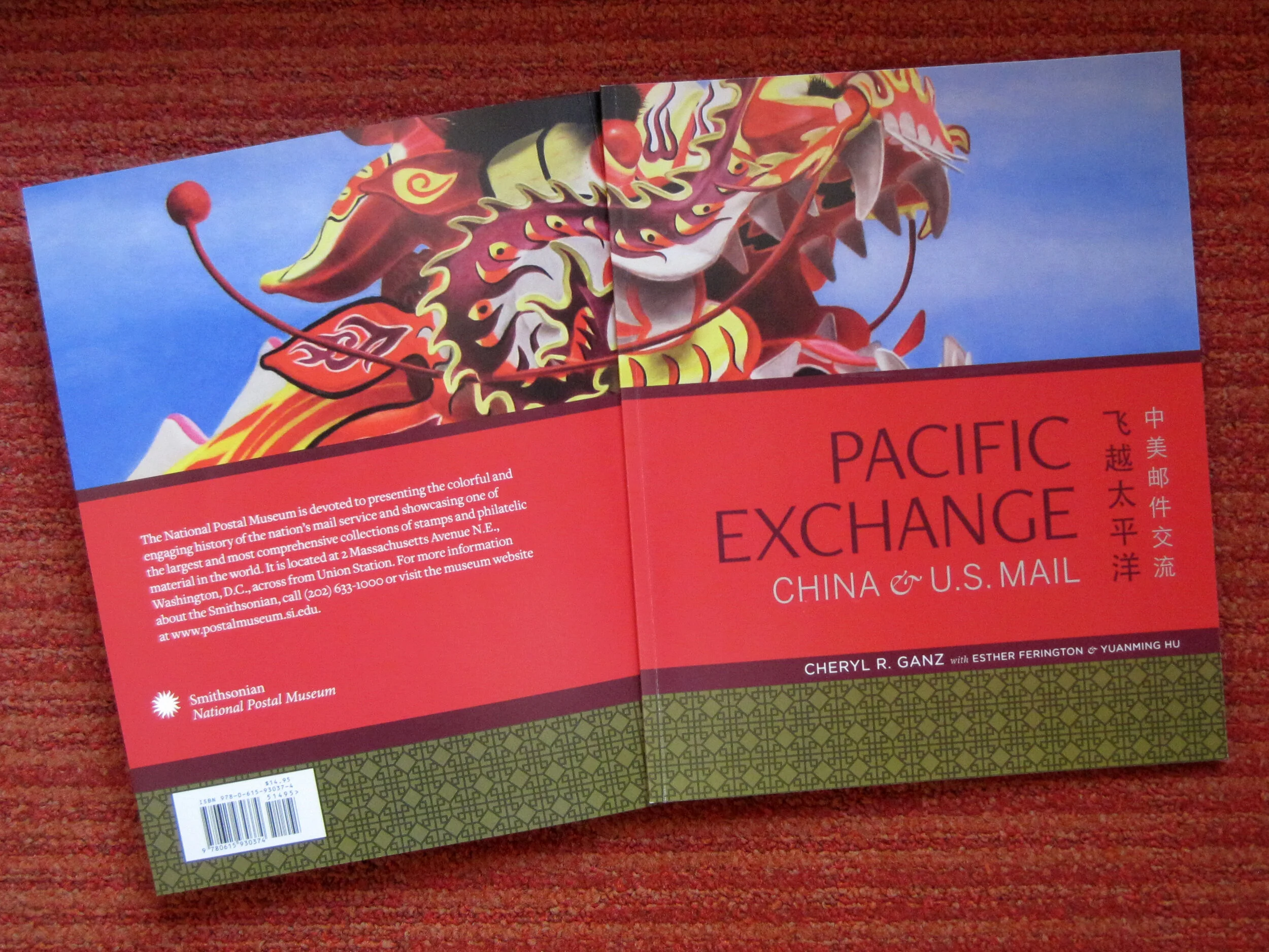
Pacific Exchange, open at the National Postal Museum

Work shown was completed while I was a designer at Gallagher & Associates.

It’s open! Okay, old news. It opened well over a month ago, on March 6. I had also planned to post about the opening reception, but that was March 20, so — old news there as well. In any case, the reception was lovely, with Chinese food served and tinkling glassware and everyone dressed quite nicely.

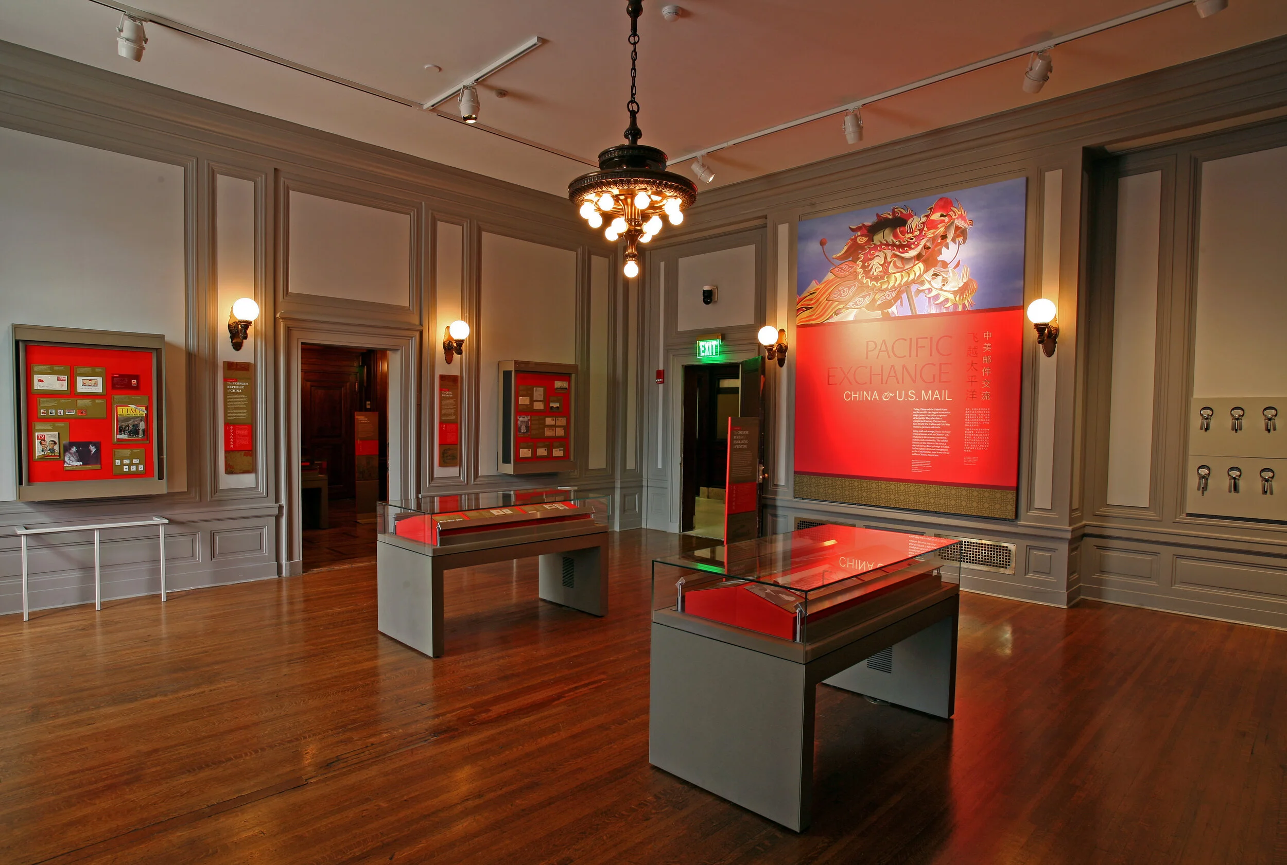
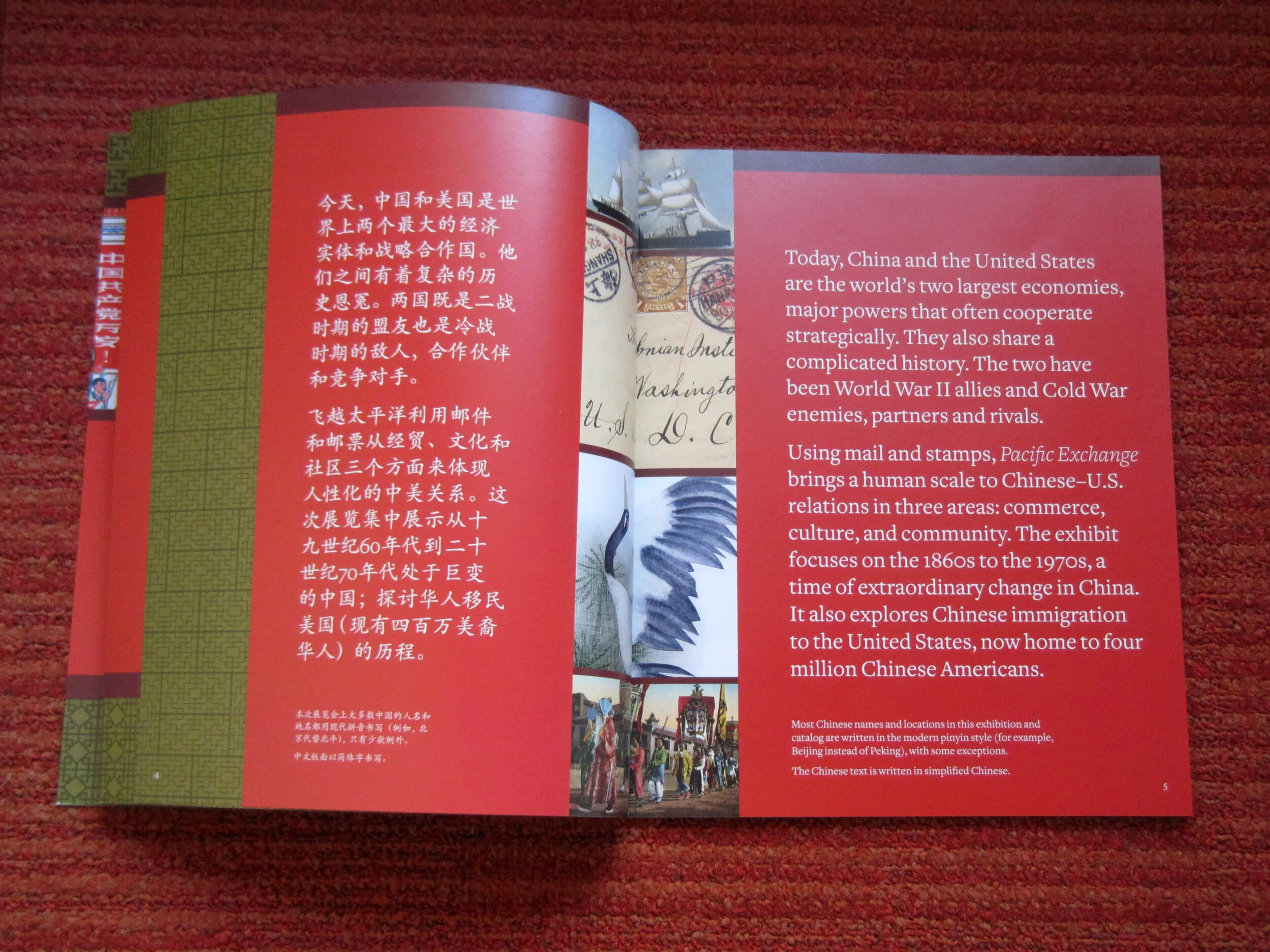
Pacific Exchange: China & U.S. Mail is the second exhibit to be on view in the Postmasters Suite gallery at the Smithsonian National Postal Museum. From the exhibit website: Using mail and stamps, Pacific Exchange brings a human scale to Chinese–U.S. relations in three areas: commerce, culture, and community. The exhibit focuses on the 1860s to the 1970s, a time of extraordinary change in China. It also explores Chinese immigration to the United States, now home to four million Chinese Americans. (Thank you to James O'Donnell of the Smithsonian for the above photo.)

Upfront: I am a bit of a stamp nerd. I have a small collection of Olympics stamps, mostly international, from the 1960s and 1970s. (You have to focus when collecting stamps!) So I really enjoyed working on an exhibit about philately.

This was my swan song at Gallagher & Associates. I handled the design myself, from designing the exhibit’s visual concept to laying out production files for all of the graphics. I also designed the exhibit plan and artifact case layouts. Even though this is a small exhibit space, it had more than 100 artifacts, so making [nearly] everything fit comfortably was a bit of a challenge!

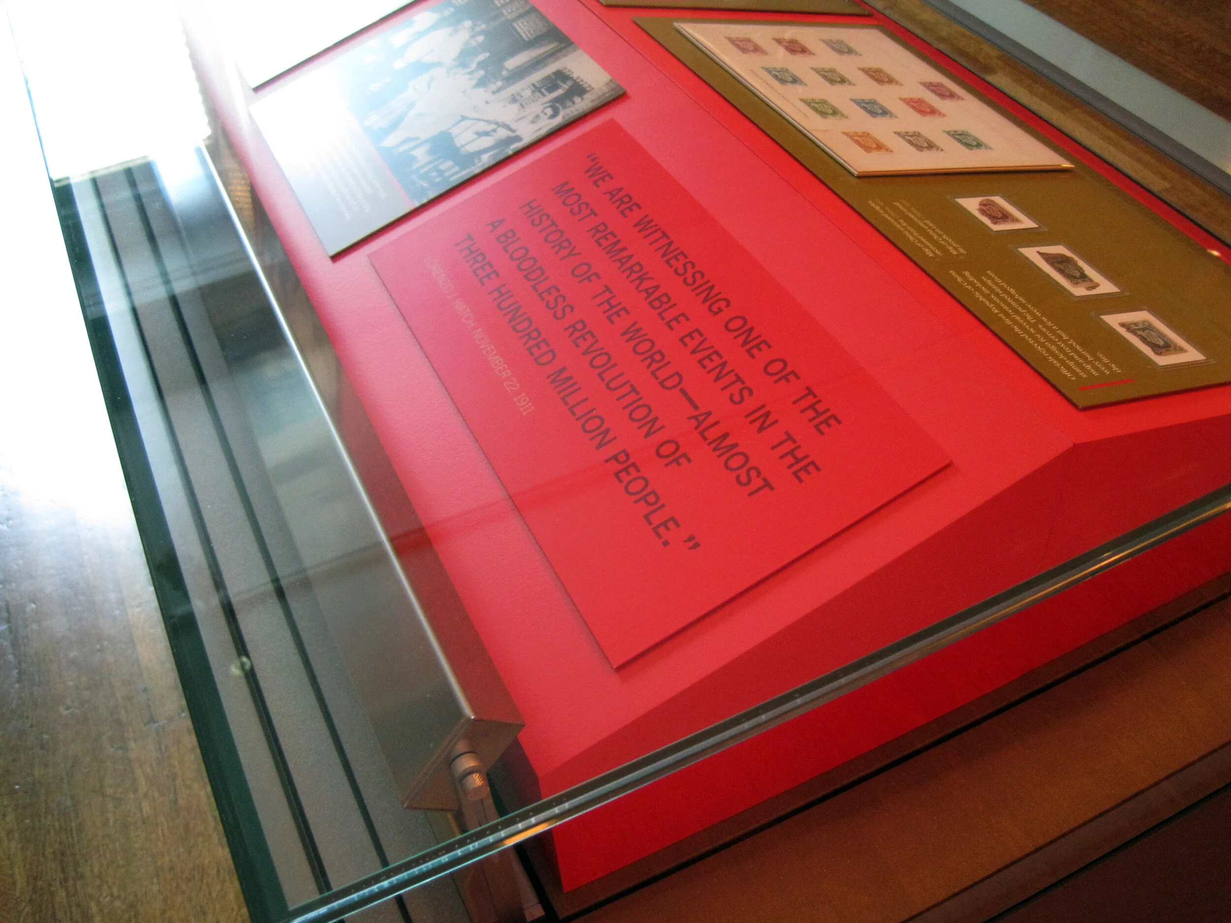
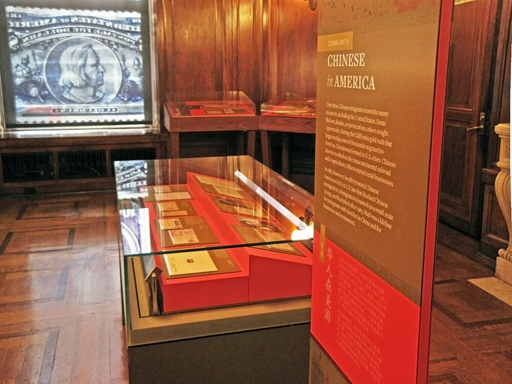
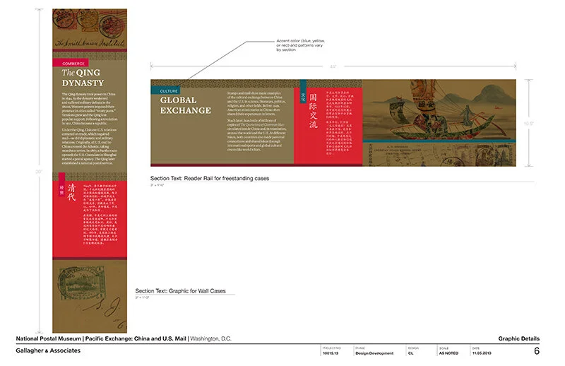
The design drawing above is an example of how a case layout looked during design development, and below are those same cases, made real:

PacificExchange_commerce-cases2.jpg

Graphics were digital output mounted on sign blank, trimmed to edges, with a matte overlaminate. The wall-mounted and freestanding graphics were backed with 1/2" MDF painted Benjamin Moore “Bonfire” to match the primary exhibit red (Pantone 1795). The freestanding graphics had duplicate panels on either side of the mdf — a panel sandwich which was held in place by adjustable metal sign bases. The Smithsonian Office of Exhibits Central printed and built the graphic components. Blair Fabrication built the case furniture.

PacificExchange_culture-case2.jpg

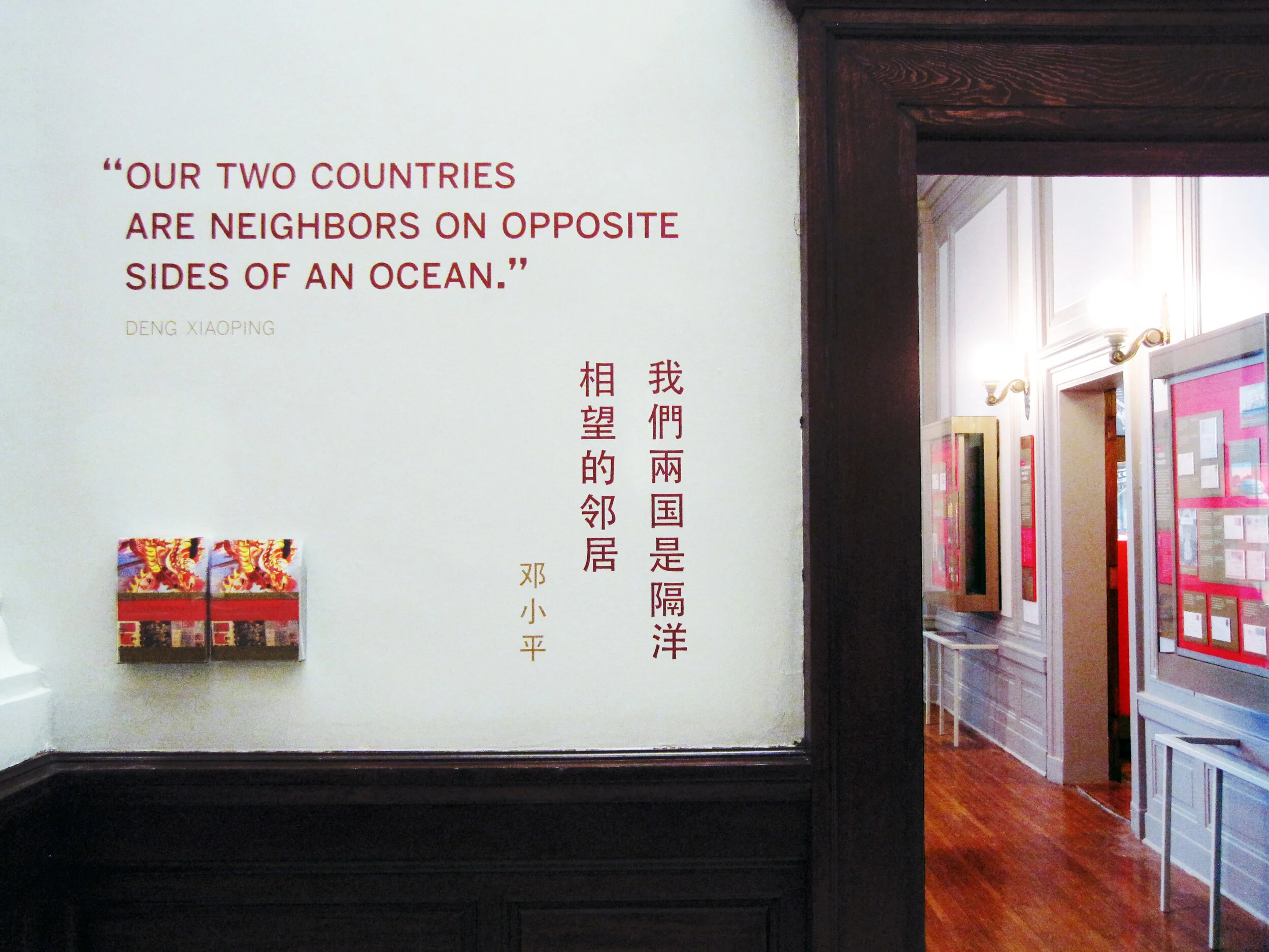
Most of the exhibit text is in English and Chinese, a design challenge I enjoyed. In the artifact case below, some of the artifacts were loans that had to be displayed flat. The other half of the plinth has a 15° rise to create a comfortable reading angle.

I arrived at the color palette after some research into significant colors in Chinese culture. I used red and gold as the dominant exhibit colors, with a deeper maroon red for accent. I used a third red, one with pink undertones — red, is the color of prosperity and good fortune, among other meanings — for the Commerce section of the exhibit; yellow, the color of heroism, for the Community section; and blue-green (or qing), to give a feeling of Chinese history and tradition, for the Culture section. I also drew distinctive vector patterns for each section.

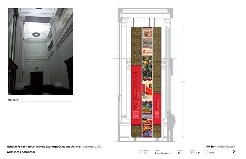
The element that most people extol is the group of banners in the entrance. There are three individual banners and they’re more than 20 feet tall! EPI Colorspace printed and installed them. (Install photos here.) They were printed on “Brilliant Banner” 12 mil. polyester banner fabric. The fabric has a very subtle canvas texture that wasn’t what I originally intended — I wanted a silken look for the banners — but the color saturation and printing quality was so good that I went with EPI’s recommendation.

PacificExchange_entrance-timeline.jpg

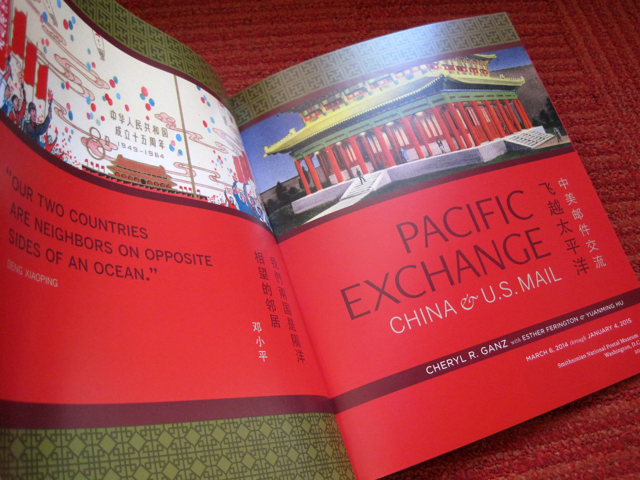
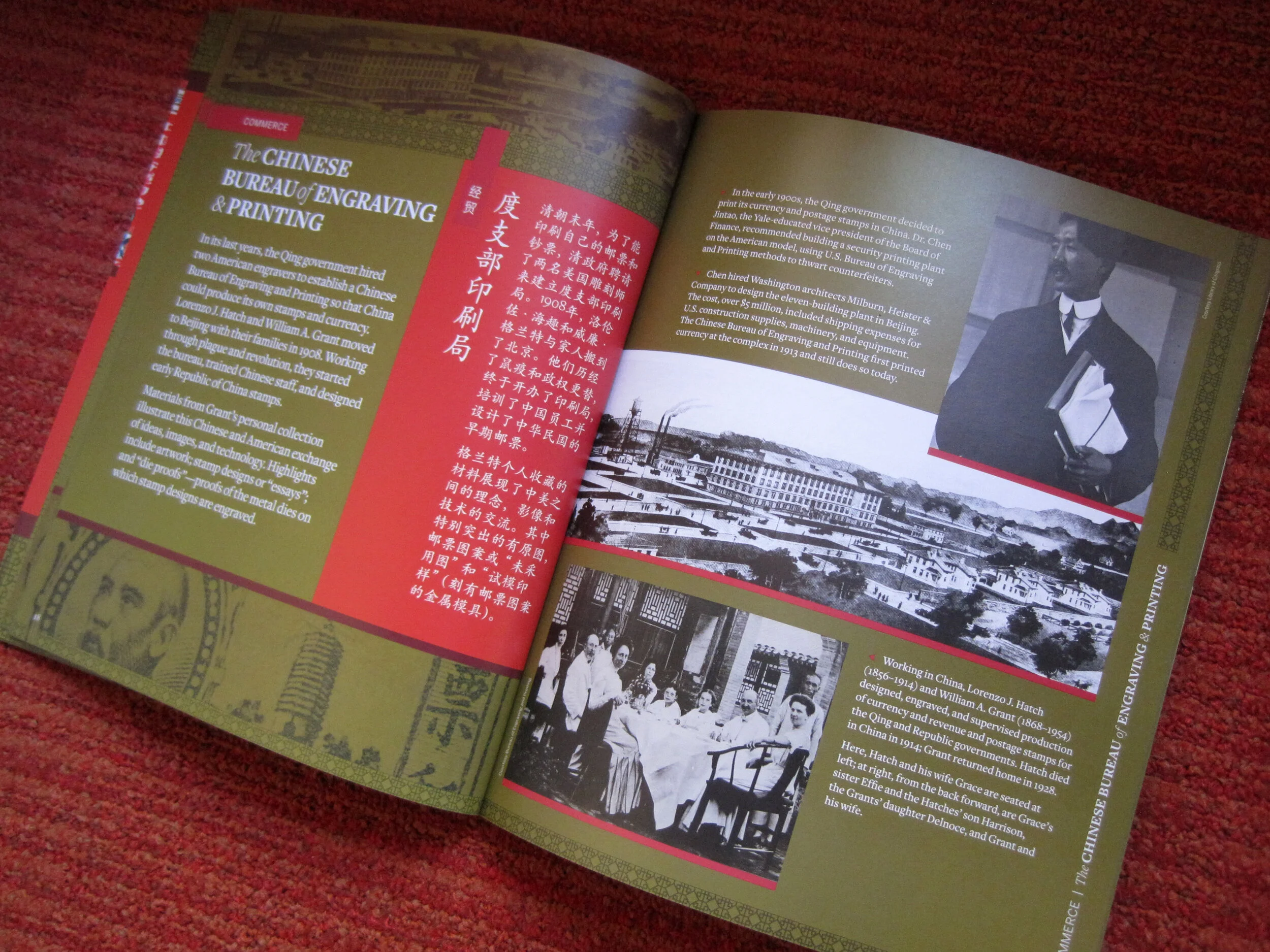
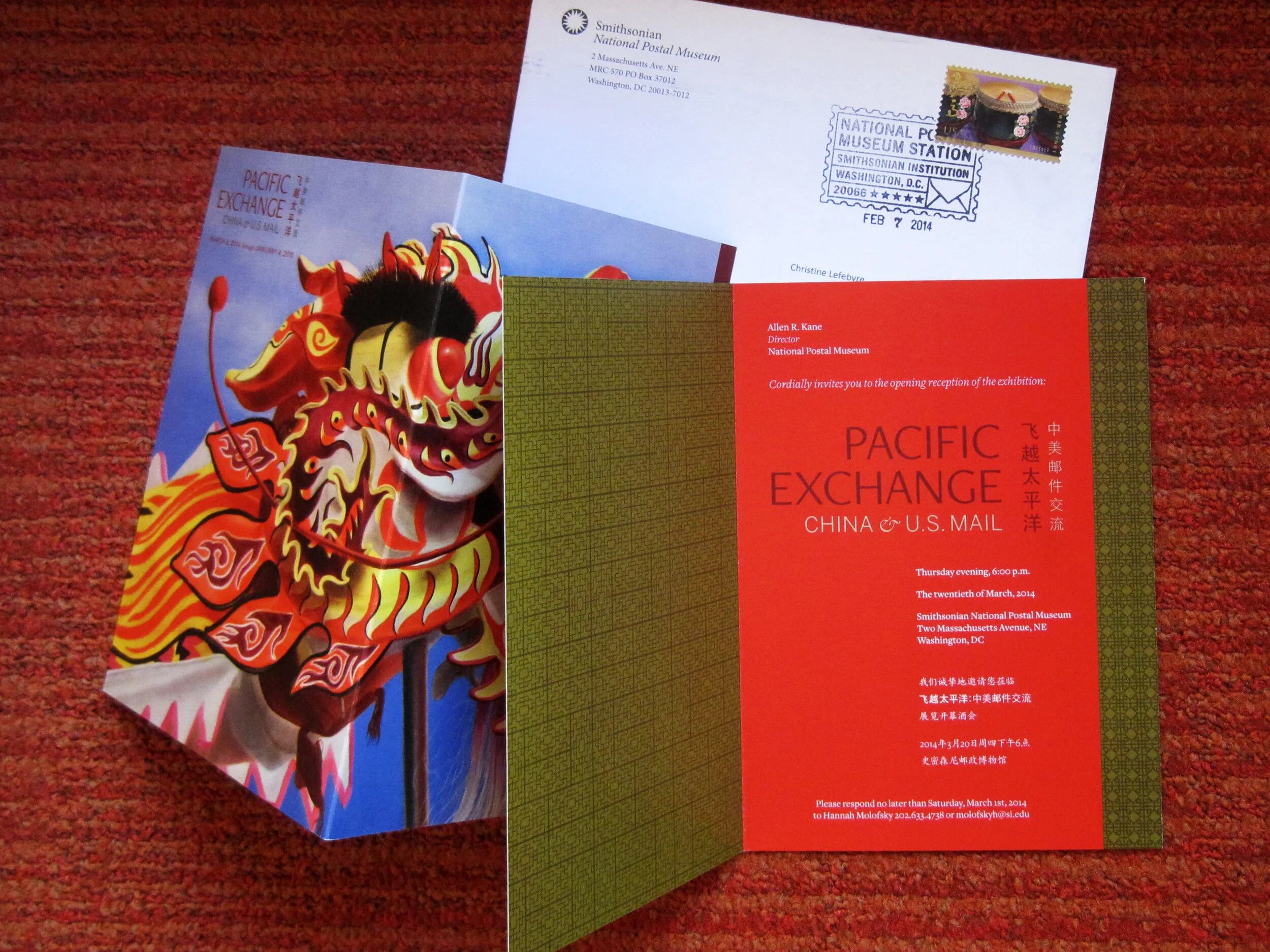
I also designed a few of the related print graphics: the exhibit catalogue, a postcard, and the invitation to the opening reception.

The exhibit has been well-received overall and I’m thrilled with how everything turned out. If you’re in DC between now and January 4, 2015, please check it out!

Post updated in January 2021 with minor text edits and additional photos. Broken links have been fixed. This post was originally published at theexhibitdesigner.com on 26 April 2014.

Gone Solo

I’ve thought about setting out on my own for a while now.

ChristineLefebvreDesign_open2.jpg

When my partner and I chose to move to a beautiful house in the woods just outside southern DC — which would make commuting up to Silver Spring onerous — the timing suddenly made sense to leave my position as a Senior Designer at Gallagher & Associates.

I am now practicing as Christine Lefebvre Design. I offer services in graphic design, museum exhibition design, and interiors. Over the past eight years I’ve had the opportunity to work on a vast assortment of design projects in various capacities. My experience has been both specialized — in museum exhibition design, all phases — and broad. (Print work? Of course. Website design? Check. Event graphics? Yep.) I am currently available for project-based contract work, so if you are interested in working together, please get in touch! Thank you all for your support, and for following along on The Exhibit Designer.

Post updated in January 2021. This post was originally published at theexhibitdesigner.com on 11 Feb 2014.

Fun projects for the National Postal Museum

Work shown was completed while I was a designer at Gallagher & Associates.

I spent the end of summer through early fall wrapping up construction administration work for the newly opened Stamp Gallery at the Smithsonian National Postal Museum. (Designed by Gallagher & Associates.)

I inherited the project from a departing colleague and had very little to do with the design of the exhibit, but I did design the museum’s gallery guide, a fun little project.

I have also been working on a temporary exhibit for the Postal Museum called Pacific Exchange, about China–U.S. relations “through the lens” of stamps and mail. The opening is set for March and I am excited. I’ve really enjoyed the content and being able to give a good amount of attention to a small exhibit. Here’s a sneak peak of the design development:

Post updated in January 2021 with minor text edits. Broken links have been fixed. This post was originally published at theexhibitdesigner.com on 19 November 2013.

BoNE Show 2011, the wrap-up

The AIGA BoNE Show — Best of New England [Design] — is a design competition for New England, hosted biennially by AIGA Boston. I was asked to direct the 2011 show, after doing a decent job of designing the exhibit for the 2009 show, and when I said “yes!” without even thinking about it, I found myself responsible for its call-for-entries, judging, meet-the-judges event, awards show, exhibition, website, catalogue ... every little thing involved in putting on a design competition. (It was also the very last thing I did before I left Boston for DC, back in June.)

First I had to create a theme. I worked with George Restrepo to brainstorm a half dozen promising directions. The eventual winner — “Wicked Problems/Wicked Solutions” — was born while myself, George, and a couple other AIGA volunteers on the BoNE committee were discussing the concept of wicked problems and how design is essential to problem solving. Keeping tongue in cheek, I also liked that if people didn’t exactly understand the deeper meaning of the theme, it could also be interpreted as simply “wicked” in the New England sense.

The call-for-entries (above), designed by Kristen Coogan, featured a playful Rube Goldberg-esque problem-solving machine. This visual identity was carried through the rest of the competition and awards show’s graphic pieces, including the website, designed by Justin Hattingh, with technical assistance from Jeremy Perkins.

Below: In keeping everything aligned to the theme, at the meet-the-judges event — held in Boston the evening before judging began — the three judges each gave a presentation related to “wicked problems.”

All event and exhibition photos by Ben Gebo Photography. More event photos, here.

When designing the exhibition, we continued to play with the problem solving theme. Katelyn Mayfield designed a component-based display system: individual displays could be arranged in any configuration to take advantage of our huge gallery space on Boston University’s campus. The displays could then be packed flat and shipped to other venues when the BoNE Show “went on the road” after its run in Boston.

Here is the exhibition, full of guests on the evening of the awards show:

Exhibit displays were located in the front third of the 808 Gallery. Each display was custom-designed for the design project it held and hand-built from corrugated plastic sheets and PVC pipes. Windows and shelves were built by cutting and folding the plastic sheets, by Katelyn and a crack team of volunteers, including BU’s student AIGA group.

WICKED PROBLEMS and WICKED SOLUTIONS were applied to the wall in giant red and cyan vinyl. Winners’ names were laser cut from thick illustration board and the edges of shelves were finished with cyan-colored tape.

Above, left: I commissioned furniture designer Seth Wiseman of ConForm Lab to design and build two sets of benches which could be moved into endless configurations — a human-sized three-dimensional tangram game. The benches were sold during the event auction and the money benefited AIGA Boston. Seth also designed and built the tangram stage, which is in a couple of photos below.

Above, right: For the media-based winning entries, we built a simple kiosk. Joe Morris designed the interface.

Below, left: Dan Watkins (aka Dan the Man Photo) manned the “photo booth.” He also shot all the photography for the show’s catalogue. Below, right: DJs Dan Riti & Kevin James in their sophomore BoNE Show appearance.

Above, left: The silent auction table. We also held a live auction for the big-ticket items. Jason Stevens and Kathleen Byrnes headed the sponsorship drive. Because the point of this entire production was to raise money for AIGA, we tried to get everything for free (or at least on the cheap), and were very thankful for all of our generous sponsors.

And then there was the gorgeous (award-winning, itself) awards show catalogue, designed by George Restrepo and printed and bound by ACME Bookbinding. The embossed covers came in both red and cyan. The keepsake entry ticket was designed by Ira Cummings and printed and foil stamped by EM Letterpress.

And … the awards show! AIGA Boston chapter president Matthew Bacon served as Master of Ceremonies. Trophies were bone-shaped and cast in aluminum (bronzed for the Judges’ Choice winners), with embossed winners’ names. Names were all punched by hand (by Bridget Sandison, who also — along with Juliana Press and Meghann Hickson — took care of receiving and sorting and tracking all the competition entries) using a vintage Dymo label maker. Same way the awards have been made since the BoNE Show’s inception in 1995.
Thank you to Tracy Swyst, AIGA Boston’s VP of operation, who has overseen many many many BoNE Shows, and to the rest of the AIGA Boston board: Heather, Jodi, Colleen, Brandon, Jillfrancis, Diane, Chiranit, Lee, Mat, Jason R, and Sarah, and to the boards from AIGA Connecticut, Rhode Island, Maine, and NH/VT, and everyone else who lent a hand in any way. It was a really great experience.
Post updated in January 2021 with text edits and minor photo edits. Broken links have been fixed. This post was originally published at theexhibitdesigner.com on 24 April 2012.