te2

Fair Play, the fourth Freedom Forum pop-up exhibit

My last post was about experiencing museum exhibits in-person when the museums themselves are closed due to Covid-19 precautions. Habitat is located outside (I shared some photos of it in the snow, but it’s really lovely to see when the weather is nice) and here’s another example, located inside, of an outside-the-museum museum exhibit.

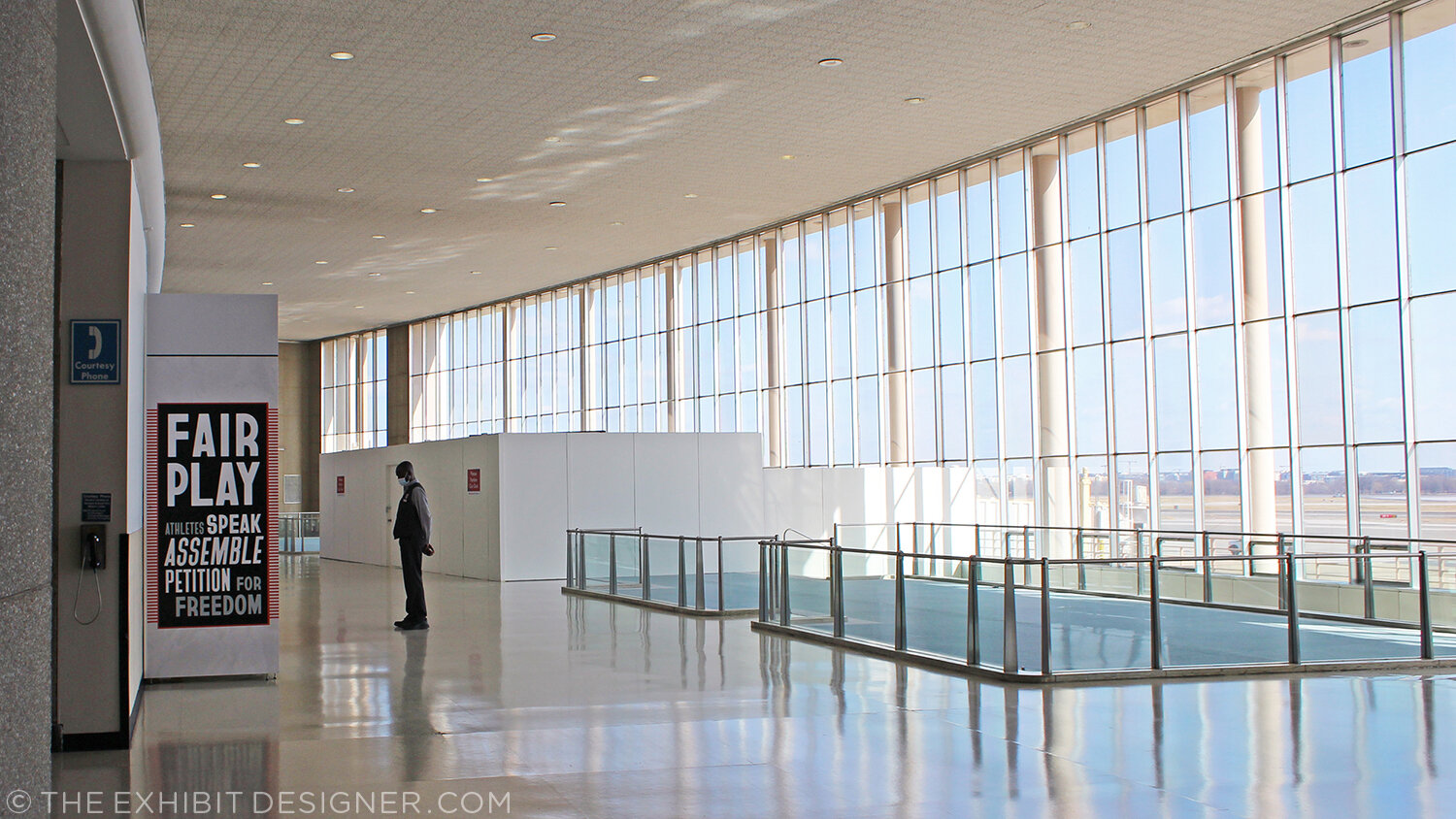
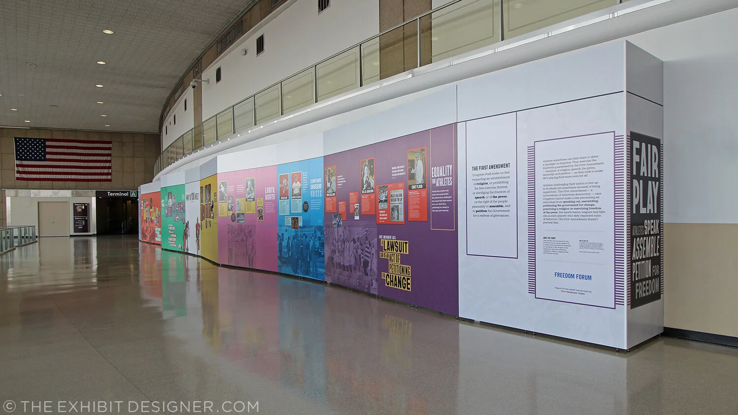
Fair Play: Athletes Speak, Assemble, Petition for Freedom just opened at Dulles International Airport and Ronald Reagan National Airport. It’s the result of a partnership between Freedom Forum (the Newseum) and the Metropolitan Washington Airports Authority; the fourth in a series designed by Christine Lefebvre Design.

CLD_FreedomForum_FairPlay7.jpg

If you’re in the DC area, it’s easy and free to see the exhibit at Reagan Airport!

And here’s how. If you’re driving, park in the Terminal A lot. I prefer to park on Level 5, close to the elevator access. Take your elevator all the way down, to Level G. From there you’ll follow the signs to Terminal A, on moving walkway after moving walkway … until you arrive at and take the escalator up to Level 1. There, you’ll turn LEFT (the signs will say Terminal A is to your right and Terminals B and C are to your left, but trust me: turn left) and you’ll almost immediately find yourself in Terminal A’s historic lobby. There it is, up above.

You don’t have to go through security, and if your visit is less than an hour, parking is free. (You can also get there by Metro.)

CLD_FreedomForum_FairPlay1.jpg
CLD_FreedomForum_FairPlay2.jpg
CLD_FreedomForum_FairPlay3.jpg

Perhaps my favorite aspect of the graphic design for this exhibit was font selection. Fonts were expressly chosen from the work of underrepresented type designers — we looked at typefaces by people of color, women, and LGBTQ people — before we ultimately settled on three typefaces by Black designers that also fit the sporty aesthetic of the exhibit. The typeface used for large headlines is called Bayard, named after Bayard Rustin, organizer of one of the most powerful expressions of freedom of assembly: the 1963 March on Washington. (Making it also fit strongly with the subject matter of the exhibit.) Inspired by protest signs used in the march, the typeface was created by Tré Seals, a Washington, DC-area designer. The other typefaces used in the exhibit are Jubilat and Halyard, by Black typographer Joshua Darden.

CLD_FreedomForum_FairPlay6.jpg

I hope you get a chance to see it!

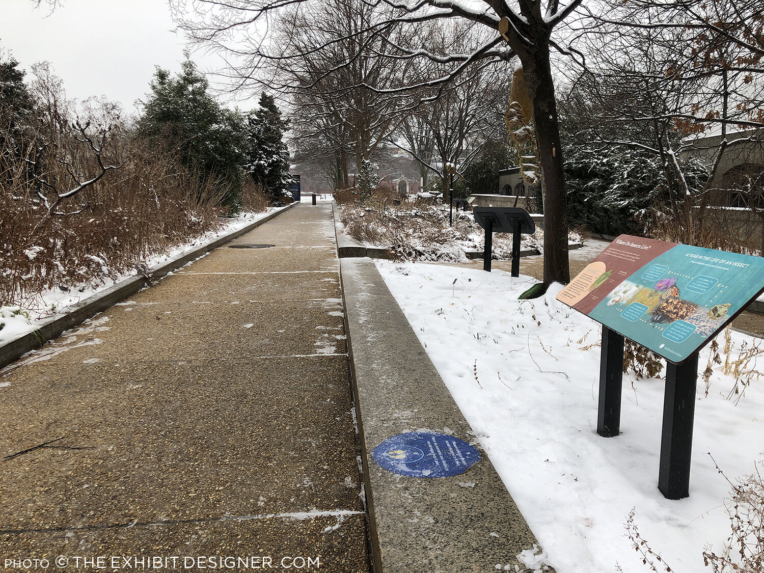
Habitat, in the snow

Before the Covid-19 pandemic disrupted everyone’s life, if the weather were terrible … well, at least you could pop into a museum and while away an hour or two.

theexhibitdesigner_habitat-in-snow1.jpg

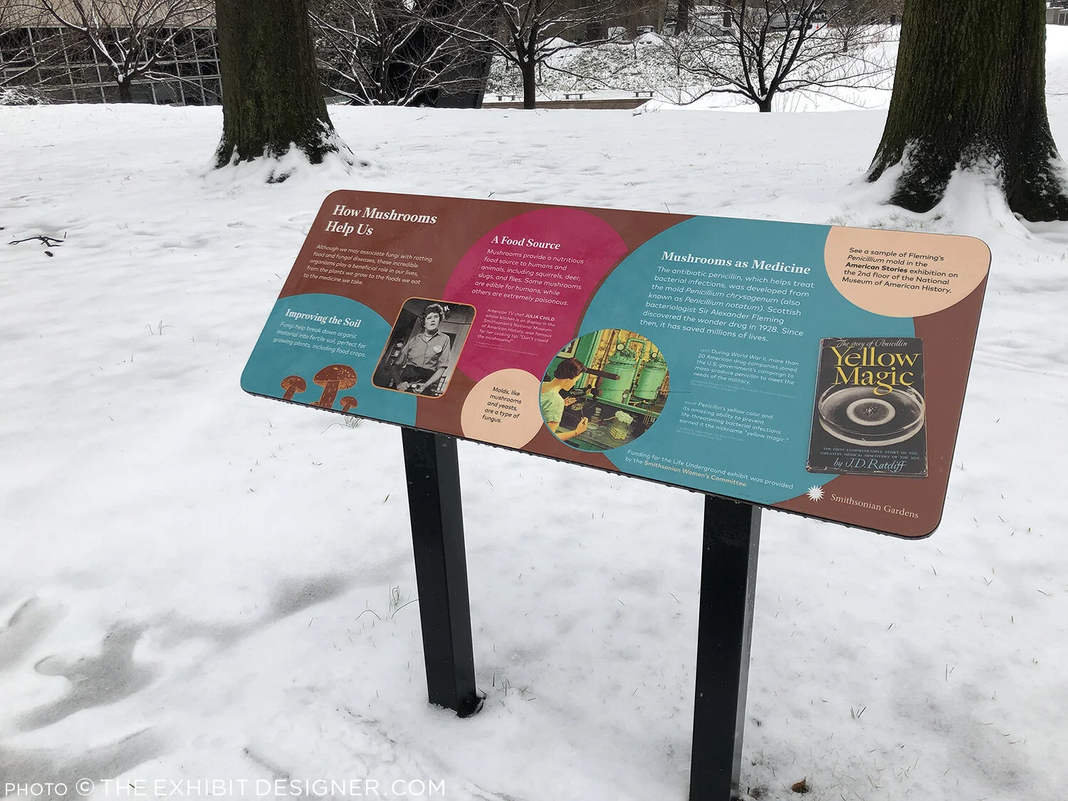
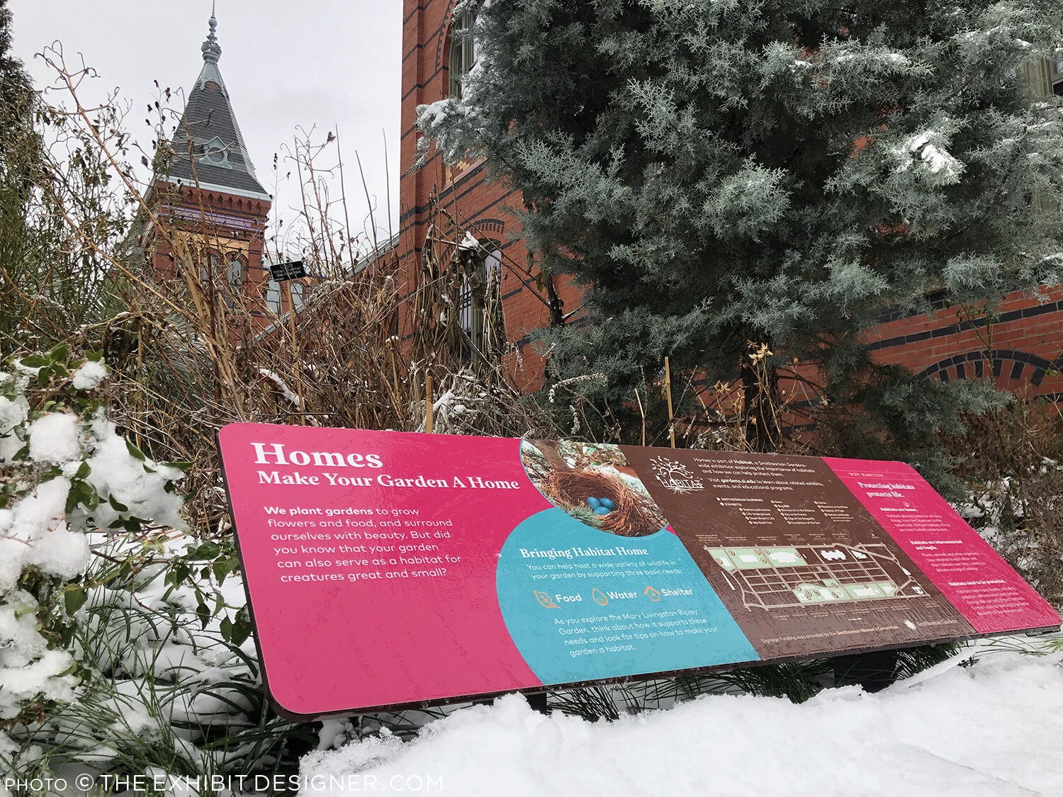
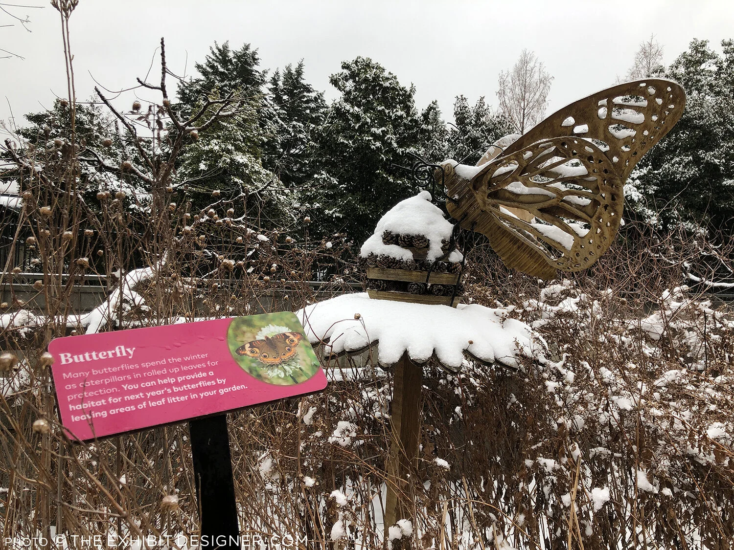
Museums in the Washington, DC region are currently closed to the public, but there is still opportunity to see outdoor exhibitions — even in terrible weather. I took these photos yesterday, of the exhibition, Habitat, that I designed for Smithsonian Gardens. (More photos, taken in warmer times, along with a project description.)

theexhibitdesigner_habitat-in-snow2.jpg

If you’re interested in exploring the Habitat exhibition, on the National Mall in Washington, DC, here is the wayfinding map to help you locate the different exhibits:

Christine Lefebvre Design - Habitat wayfinding map
theexhibitdesigner_habitat-in-snow4.jpg

What interesting outdoor exhibitions have you seen recently? Let me know in the comments!

Openings and Closings: The past seven months

It’s been busy, busy, busy here at Christine Lefebvre Design since I last posted — seven months ago! — about the Baselitz and Lozano-Hemmer exhibitions at the Hirshhorn.

clefebvredesign_newseum_digital1.jpg

Around the same time, and since, we’ve seen a bunch of openings: Five Communities at the National Law Enforcement Museum; Digital Disruption and A Deadly Attack at the Newseum; Habitat for Smithsonian Gardens; Hoops at the National Building Museum; Wíwənikan…the beauty we carry at the Colby College Museum of Art; and Man Walks on the Moon for the Newseum, at Dulles and Reagan Airports.

A few are already nearing the ends of their runs! If you have a chance to visit any, I would love to hear from you about what you thought of them.

The Newseum will close its doors on December 31, 2019 (though the Freedom Forum and the Newseum’s collection will carry on). It’s your last chance to see Digital Disruption in the News History gallery, and the rest of the museum’s incredible exhibitions.

I worked with the Newseum on three “pop-up” exhibitions, on view concurrently at Reagan National Airport and Dulles International Airport. The first of these, Man Walks on the Moon, is closing this week.

cld_newseum_manwalksonmoon.jpg

Another pop-up at Dulles and Reagan airports will soon take its place — the exhibitions are currently being installed — followed by a third in the spring.

Also closing soon is Hoops: Community Portraits by Bill Bamberger at the National Building Museum. Hoops will close on December 1, 2019, after which the museum will close temporarily from December 2 until March 2020. The gist of a glowing review from a friend: “I thought this wouldn’t interest me because I could care less about basketball, however … this is a really great exhibit!” That sounds underhanded, but I assure you they really liked it.

4-2019_03_21_nbm_hoops_cld-0150_be-1.jpg

When the Building Museum reopens, you can look forward to my next exhibition for them, Alan Karchmer: The Architects’ Photographer.

Wíwənikan…the beauty we carry at the Colby College Museum of Art will close on January 12, 2020. If you find yourself in the Waterville, Maine area please pay a visit.

cld_wiwenikan-1.jpg

And that takes us through the end of 2019! If you miss the exhibitions that are closing soon, Smithsonian Gardens’s Habitat will remain on view (all over the National Mall) through at least December 2020, and of course there are those three upcoming openings. Until our next check-in....

Post updated in January 2021 with minor text edits. Broken link has been replaced with archived URL, courtesy of archive.org. This post was originally published at theexhibitdesigner.com on 29 October 2019.

Two more at the Hirshhorn Museum

Phew! It has been a busy 14+ months since I last posted. (14 months?! Oh my....) In that time, I’ve designed seven exhibitions of varying size and scope, four print projects, and three large production jobs. I am currently in early design development for an exciting project in Maine, and then there is the typical day-to-day of running a small design studio. Yep, just sitting around eating bon-bons.

In an attempt to get back into posting on The Exhibit Designer, I am kicking off with a book-end to my last post: two more exhibitions at the Hirshhorn Museum. These two were both located in the same gallery, and were on view one right after the other.

the-exhibit-designer_christine-lefebvre_Hirshhorn_Baselitz-escalator
the-exhibit-designer_christine-lefebvre_Hirshhorn_Baselitz-entrance

Baselitz: Six Decades ran from June 21, 2018 through September 16, 2018, then Rafael Lozano-Hemmer: Pulse opened in its place on November 1. Pulse is on view for another month, if you’d like to check it out.

the-exhibit-designer_christine-lefebvre_Hirshhorn_Pulse-entrance

The title treatment for Pulse played on the visual of the pulsing incandescent light bulbs hanging from the ceiling in Lozano-Hemmer’s installation Pulse Room …

the-exhibit-designer_christine-lefebvre_Hirshhorn_Pulse-detail

… while the title for Baselitz was a straight-forward title lockup. An early concept, in which “George” and “Baselitz” were alternately flipped upside down (Baselitz is known for his “inverted” paintings) was rejected, and I am a little sad for what could have been.

the-exhibit-designer_christine-lefebvre_baselitz-concept
the-exhibit-designer_christine-lefebvre_Hirshhorn_Baselitz-escalator2

In the end, the final title lockup and entry wall treatment created a neat refraction effect when ascending the escalator, as the letters reflected in the glass.

Post updated in January 2021 with minor text edits. This post was originally published at theexhibitdesigner.com on 25 March 2019.

The Utopian Projects and What Absence Is Made Of

The Markus Lüpertz exhibition I shared in my last post is no longer on view at the Hirshhorn — it came and went so quickly! — but the museum has two other exhibitions currently on view for which I designed the graphics. First, Ilya and Emilia Kabakov: The Utopian Projects:

the-exhibit-designer_christine-lefebvre_Hirshhorn_Kabakov-entrance
the-exhibit-designer_christine-lefebvre_Hirshhorn_Kabakov-entrance2

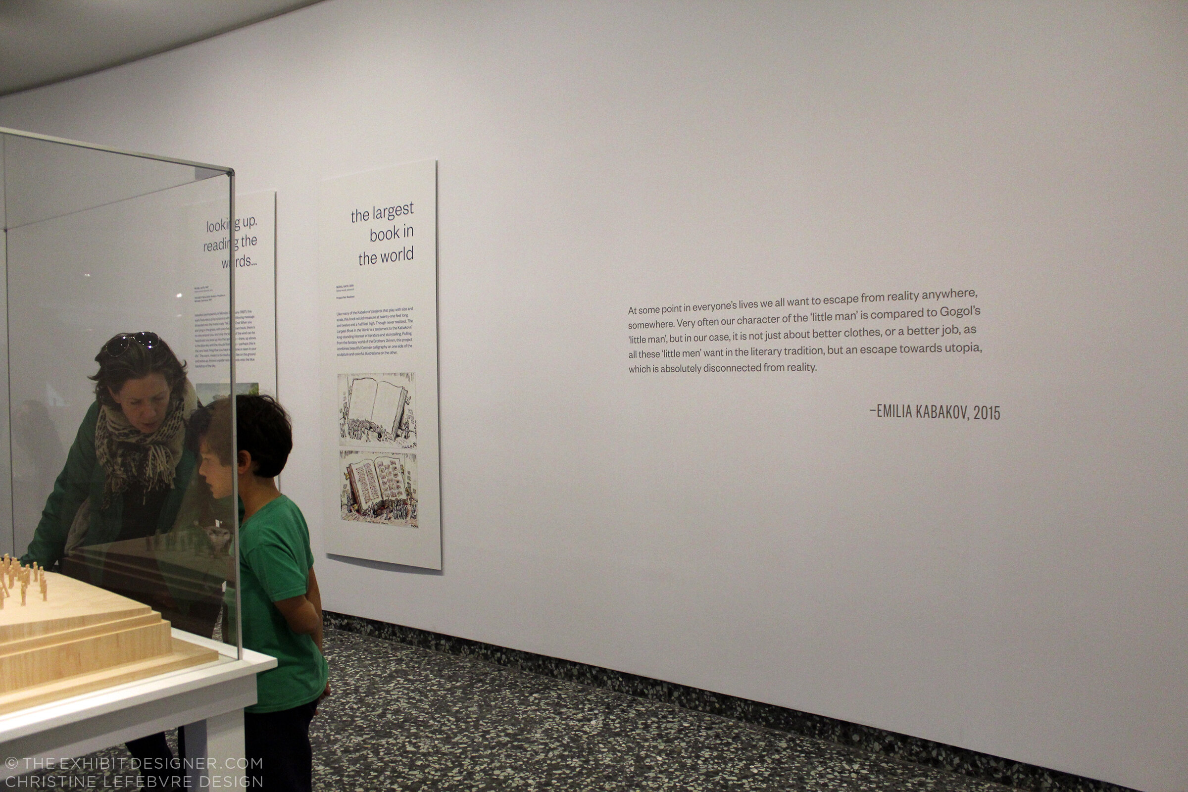
Working in collaboration with the museum’s design department, I designed the exhibition’s title wall, didactic graphics, and wall quotations.

The title wall graphic is printed on DreamScape’s self-adhesive wallcovering, Caviar texture. I like the print quality of DreamScape wallcoverings — I first spec’ed them for the exhibits at the FDR Museum, and have used them a few times since. The wallcovering was installed using butt seams. The installers (Blair, Inc. in Virginia, also the graphics fabricator) wrapped the wallcovering around the wall’s edges, a tricky detail that would have looked terrible if done poorly.

the-exhibit-designer_christine-lefebvre_Hirshhorn_Kabakov-exhibition2

The graphic panels are digital prints wrapped on sign blank with a matte over-laminate. They are hung on French cleats (simple but strong), which is an easy way to hang nearly anything. Also on the panels’ backsides is MDF blocking that provides rigidity for the sign blank fronts. Here’s a photo I snapped during installation, of the backsides:

the-exhibit-designer_christine-lefebvre_Hirshhorn_Kabakov-panel-backs
the-exhibit-designer_christine-lefebvre_Hirshhorn_Kabakov-quote
the-exhibit-designer_christine-lefebvre_Hirshhorn_Kabakov-exhibition1

The Utopian Projects is on view through March 4. The Kabakovs’ work is fascinating — their models are so cool. Check it out if you can!

The other exhibition at the Hirshhorn, for which I designed the graphics, is What Absence Is Made Of, on view through Summer 2019. For this exhibition I designed the title wall, didactics, and an exterior advertising poster for the National Mall.

the-exhibit-designer_christine-lefebvre_Hirshhorn_WAIMO-entrance

The curator requested reflective vinyl. In addition to layout experiments, I played with color combinations (silver on white? silver on black? on gray? which gray?). I love the way the selected title design looks in silver vinyl — it catches reflections and disappears, then reappears, as you walk by it.

the-exhibit-designer_christine-lefebvre_Hirshhorn_WAIMO-entrance2
the-exhibit-designer_christine-lefebvre_Hirshhorn_WAIMO-didactic

Post updated in January 2021 with minor text edits. Broken links have been fixed. This post was originally published at theexhibitdesigner.com on 5 January 2018.

Markus Lüpertz: Threads of History

A quick check-in here. I stopped by the Hirshhorn Museum and Sculpture Garden this past weekend for Sound Scene X, and to take some photos of a project I currently have on view in the museum’s lower level: the exhibition Markus Lüpertz: Threads of History, on view through September 10.

the-exhibit-designer_christine-lefebvre_Hirshhorn_Lupertz_entrance.jpg

I developed the concept for the exhibition graphics, and after many rounds of refinement, handed over template files for the museum’s designers to produce final graphics (with the exception of the timeline graphic, which I laid out). I much prefer to handle the layout of final production files but aligning the museum’s schedule with mine was tough in this instance.

the-exhibit-designer_christine-lefebvre_Hirshhorn_Lupertz_entrance_timeline.jpg
the-exhibit-designer_christine-lefebvre_Hirshhorn_Lupertz_timeline-details.jpg
the-exhibit-designer_christine-lefebvre_Hirshhorn_Lupertz_section.jpg

I also designed two exterior signs advertising the exhibition, for display outside the museum. The blue sign has already been replaced with one for another exhibition — things move fast on the Mall sometimes! Additional information about the exhibition can be found on my portfolio.

the-exhibit-designer_christine-lefebvre_Hirshhorn_Lupertz_exterior-signs

Please check out the exhibition if you're in the DC area! And if you like it, there is a concurrently-open exhibition to see, Markus Lüpertz at the Phillips Collection. I have become a fan of Lüpertz’s work — particularly the Donald Duck paintings, one of which is visible through the exhibition’s entrance (in the first photo) and on the blue sign above.

Hirshhorn_SoundSceneX.jpg

This weekend was a good time to be a kid (of any age) at the Hirshhorn—the galleries were full of interactive sound installations, live museum, and sound-related activities, all part of Sound Scene X: Dissonance.

While there, I took the opportunity to also check out the newly-opened, Ai WeiWei: Trace at Hirshhorn.

Hirshhorn_AiWeiwei

I am currently working with the museum on another exhibition, Ilya and Emilia Kabakov: Utopian Projects, set to open in a month. Stay tuned for that!

Post updated in January 2021 with minor text edits. This post was originally published at theexhibitdesigner.com on 10 July 2017.

Mr. Toilet House and Nam June Paik

In April I spent two weeks in South Korea and a week in Japan. While there, I did what I always do while touristing — visited many museums. Some of them were forgettable, but many are worthy of a post, including these two that are thematically very different but, geographically, neighbors; they are both located in Suwon, about 20 miles south of Seoul. First up is the Toilet Museum (Haewoojae) also known as “Mr. Toilet House.”

theexhibitdesigner_MrToiletHouse-exterior1.jpg
theexhibitdesigner_MrToiletHouse-exhibits1

The story behind Mr. Toilet House: Suwon’s late mayor Sim Jae-Duck was given the nickname “Mr. Toilet” for his passionate leadership of the “Toilet Culture Movement” to improve public toilets. In 1996 he started the Beautiful Toilet Culture Campaign, and the city declared its intent to build the most beautiful public toilets in the world (motivated also in part by the then-upcoming 2002 FIFA World Cup which they were to host). Mr. Toilet took things a bit further than merely creating government departments and task forces, however, when he rebuilt his own house in the shape of a toilet and named it Haewoojae, which means “a room where you can relieve your worries.” It features a central toilet room as the “core of living,” with transparent glass walls that turn opaque with the flip of a light switch. The house was completed in 2007, and upon Sim’s death in 2009, it was willed to the city of Suwon. The city then converted it into a museum and culture park.

theexhibitdesigner_MrToiletHouse-exhibits2

The museum is small and has clear, simple graphics (nearly all with English translations) that earnestly convey information about the history and global spread of modern sanitation, and other toilet-related subjects. There are also lighthearted illustrations of poops and flies (including on the floor, used as a navigational device) and hilarious double entendres in the writing.

Outside, there is a culture park. A meandering path leads you past examples of toilets, used throughout Eastern and Western history, that give an understanding of how toilets have physically changed over time.

theexhibitdesigner_MrToiletHouse-exterior2

Next door you can visit the Haewoojae Culture Center for a birds-eye view of the Toilet Museum.

theexhibitdesigner_MrToiletHouse-exterior3
theexhibitdesigner_NamJunePaikCenter-exterior2.jpg

Our next stop in Suwon: the Nam June Paik Art Center. The Nam June Paik Art Center opened in 2008 and holds 248 pieces of video installations and drawings, mostly of Nam June Paik’s but also of other contemporary artists. The art center hosts changing exhibitions of Paik’s work, special exhibitions of contemporary artists, performances, events, and educational programs. It also houses Paik’s archives and a library, undertakes research, and publishes scholarly journals and monographs.

theexhibitdesigner_NamJunePaikCenter-exhibits1

The art center changes exhibitions regularly; they use their Nam June Paik-focused exhibitions to focus on different aspects of his work. While I was there, the exhibition was called Point-Line-Plane-TV, which “explored Nam June Paik’s canvas including intermedia [sic] such as television, score, film, and video, in notion of flatness.”

theexhibitdesigner_NamJunePaikCenter-exhibits2.jpg
theexhibitdesigner_NamJunePaikCenter-exhibits4

On the mezzanine level is the Education Room, seen in the photos below; a quiet place to have a seat and read some tables about the artist’s life.

theexhibitdesigner_NamJunePaikCenter-exhibits3

Upstairs was Imaginary Asia, a special exhibition of 23 pieces in the motion images genre. Many of the videos were projected onto large walls, with small bench nooks that could sit 2–3 people for viewing.

theexhibitdesigner_NamJunePaikCenter-exhibits6.jpg
theexhibitdesigner_NamJunePaikCenter-exhibits7

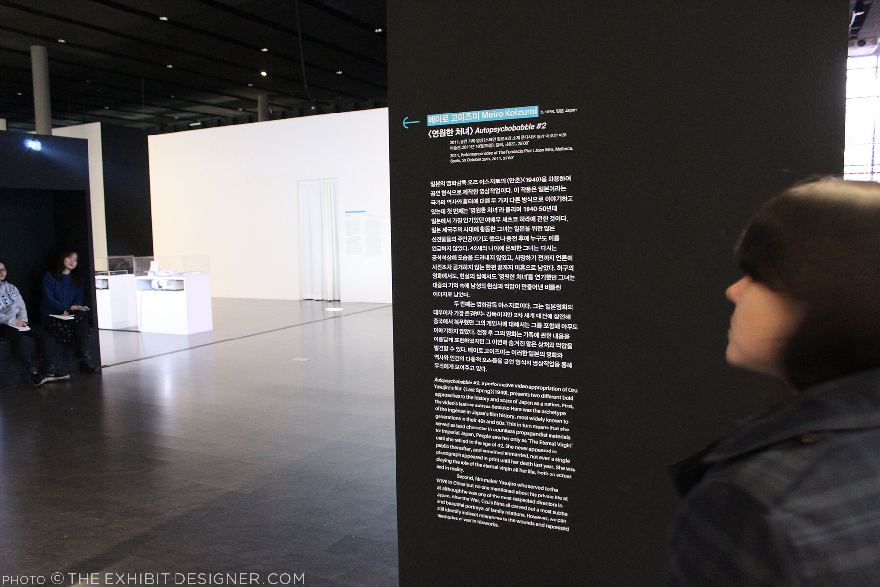
Like at Mr. Toilet House — and actually at many, many places I visited in South Korea — navigational cues and directions were applied directly to floors. In the Point-Line-Plane-TV exhibition as well they applied interpretive text to the floor. Interpretive text was in both Korean and English.

theexhibitdesigner_NamJunePaikCenter-exhibits5

Outside, the curved glass exterior of the the art center is modeled on the form of a grand piano, a common motif in Paik’s work, and on the letter P. But that is only apparent when you look at the museum map — the actual experience from outside is simply of an impressive modernist building.

theexhibitdesigner_NamJunePaikCenter-exterior

There is a small park just beside the museum — perfect for a rest after an afternoon’s museum visit — and nearby are the Gyeonggi Provincial Museum (which has limited English translations) and the Gyeonggi Children’s Museum.

Post updated in January 2021 with minor text edits. Broken links have been replaced with archived URLs, courtesy of archive.org. This post was originally published at theexhibitdesigner.com on 24 May 2017.

Letters With Wings sneak peek at the National Postal Museum

If you stop by the Smithsonian National Postal Museum during the next couple of months, you’ll be able to see two exhibitions that I’ve designed. One is New York City: A Portrait Through Stamp Art (on view through May 14; full project view here); the other just opened.

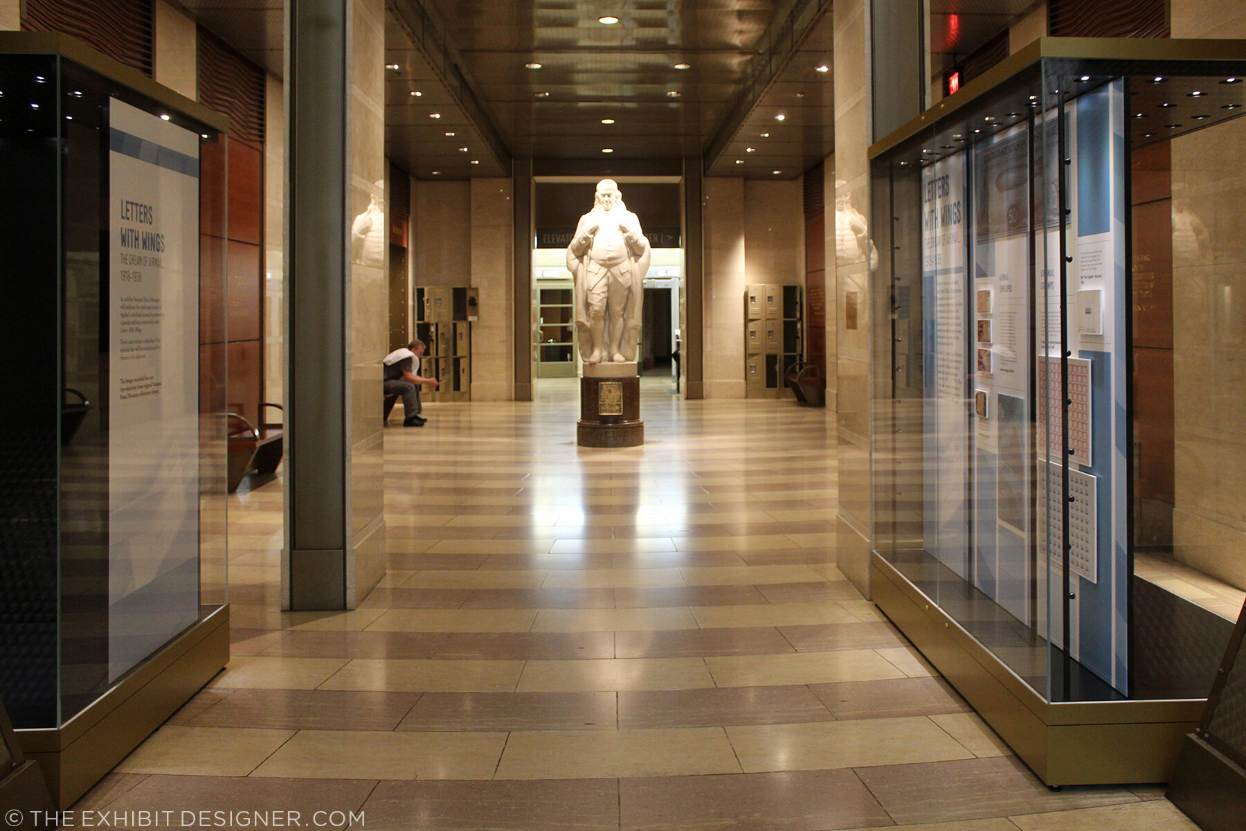
theexhibitdesigner_NPM-FranklinFoyer

Beneath the museum’s escalators, in the Franklin Foyer, are two cases for temporary exhibitions. The museum intends to change these cases often with displays of recent acquisitions, favorite objects, niche subjects, and the like.

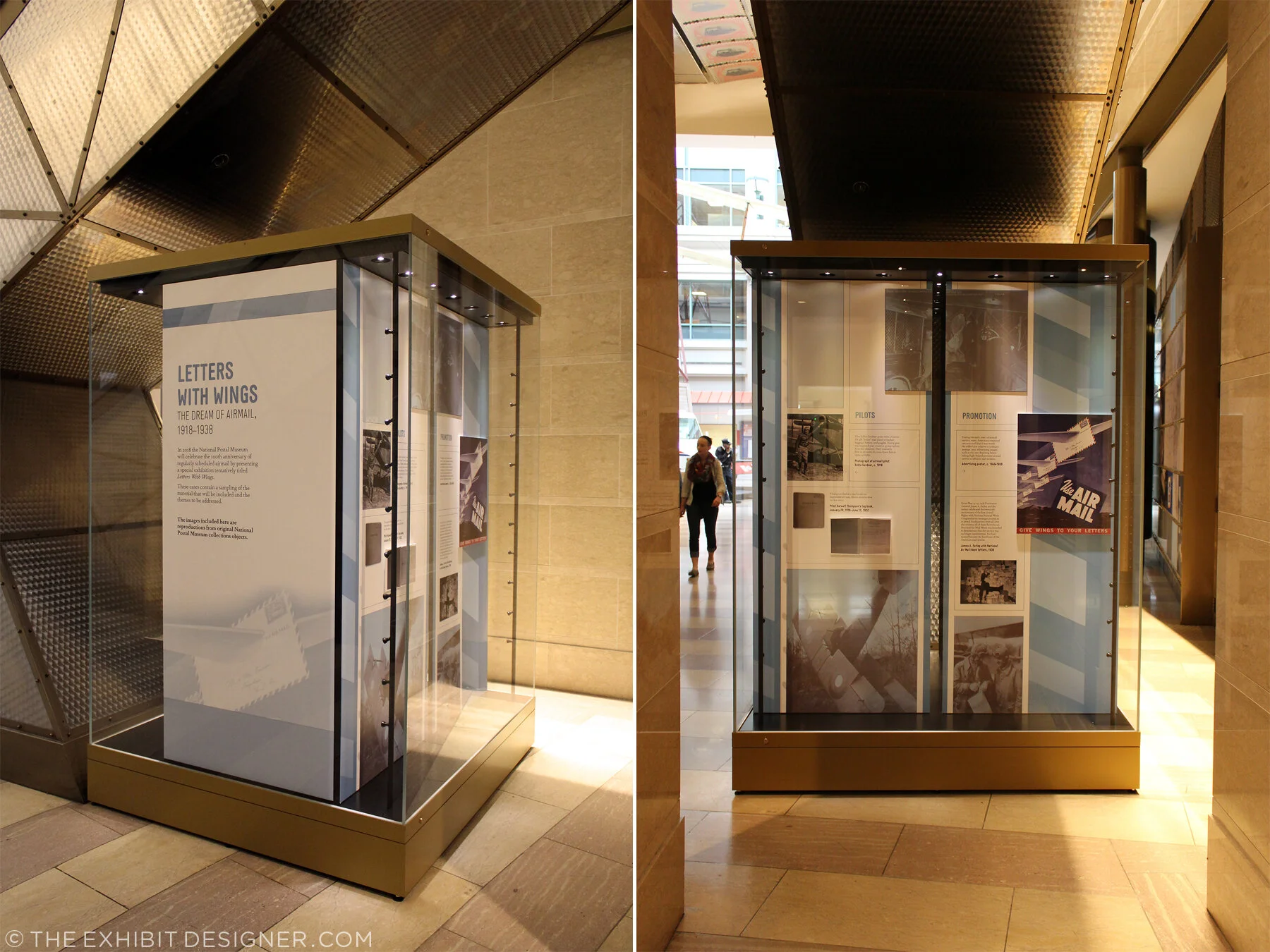
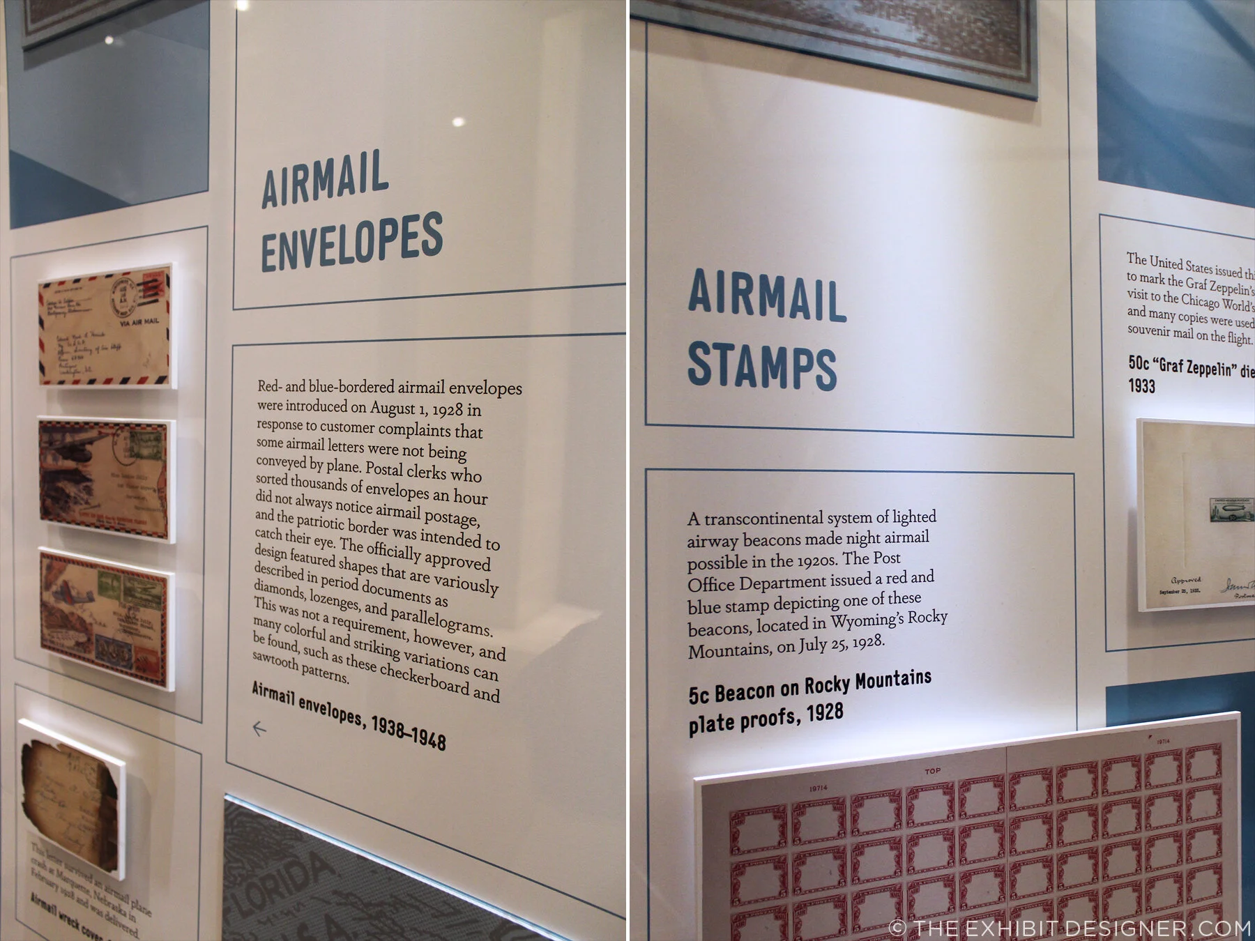
I created a design system for the museum’s in-house use when putting together these quick little exhibitions, and I designed the first exhibition to use the system: a “sneak peek” of an upcoming exhibition about WWII airmail tentatively called Letters With Wings.

theexhibitdesigner_NPM-FranklinFoyer_case1
theexhibitdesigner_NPM-FranklinFoyer_case2

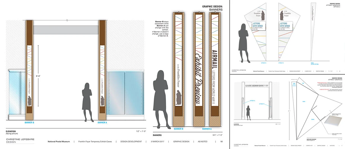
The design system included color palette, guidelines for layout of didactic and label graphics, sets of case furniture and graphic panels, and examples of case arrangements.

theexhibitdesigner_NPM-FranklinFoyer-system1
theexhibitdesigner_NPM-FranklinFoyer-system3

I also designed a series of banners and an “attract graphic” to brand the Franklin Foyer space. The attract graphic will be a geometric, cone-like acrylic structure with a changeable title panel; two will be installed in the open triangles of space between the artifact cases and the undersides of the escalators. (You can see the “open triangles of space” in the photos above.) They will protrude slightly into the space, above head level, and draw visitors’ attention from the atrium space. They’re not currently installed, but I look forward to seeing them there in the future.

theexhibitdesigner_NPM-FranklinFoyer-system2-1

There are no physical artifacts in either case of the currently installed exhibition, so objects are represented as printed graphics. (Docents will occasionally bring out the real objects for visitors, which are being prepared for the larger exhibition.) The printed representations are mounted to sintra (a lightweight, yet rigid, PVC sheet) to give them depth.

theexhibitdesigner_NPM-FranklinFoyer_case1_details2.jpg
theexhibitdesigner_NPM-FranklinFoyer_case1_details

If you’re in the Washington, DC area, please check out this little exhibition — and New York Stamp Art, too — while they’re still on view!

theexhibitdesigner_NPM-FranklinFoyer_case1_2

Post updated in January 2021 with minor text edits. Broken links have been fixed. This post was originally published at theexhibitdesigner.com on 28 March 2017.

Pointe-à-Callière: Crossroads, Building Montréal, Snow

My final post about the Montréal museums I saw during my visit to the city in September 2015 — see also the Insectarium, the Biodôme, and Lazy Love at the Biodôme — here’s a look back at Pointe-à-Callière, Montreal’s Archeology and History Complex.

theexhibitdesigner_Pointe-a-Calliere_lobby-banner.jpg

The Pointe-à-Callière complex is built on archeological sites that span the city’s history. Exploring the museum is very interesting, and a lot of fun — you take passageways, bridges, and stairs over and through the archeological remains. Like the museum building itself, which was built on pilings to protect the site, exhibition elements tread lightly among the artifacts, and visitors are asked repeatedly via signage not to touch the remains. Like most places in Montréal, museum graphics are in French with English translations. I like the way the two languages are interwoven on the red lobby banner above.

theexhibitdesigner_Pointe-a-Calliere_passageways

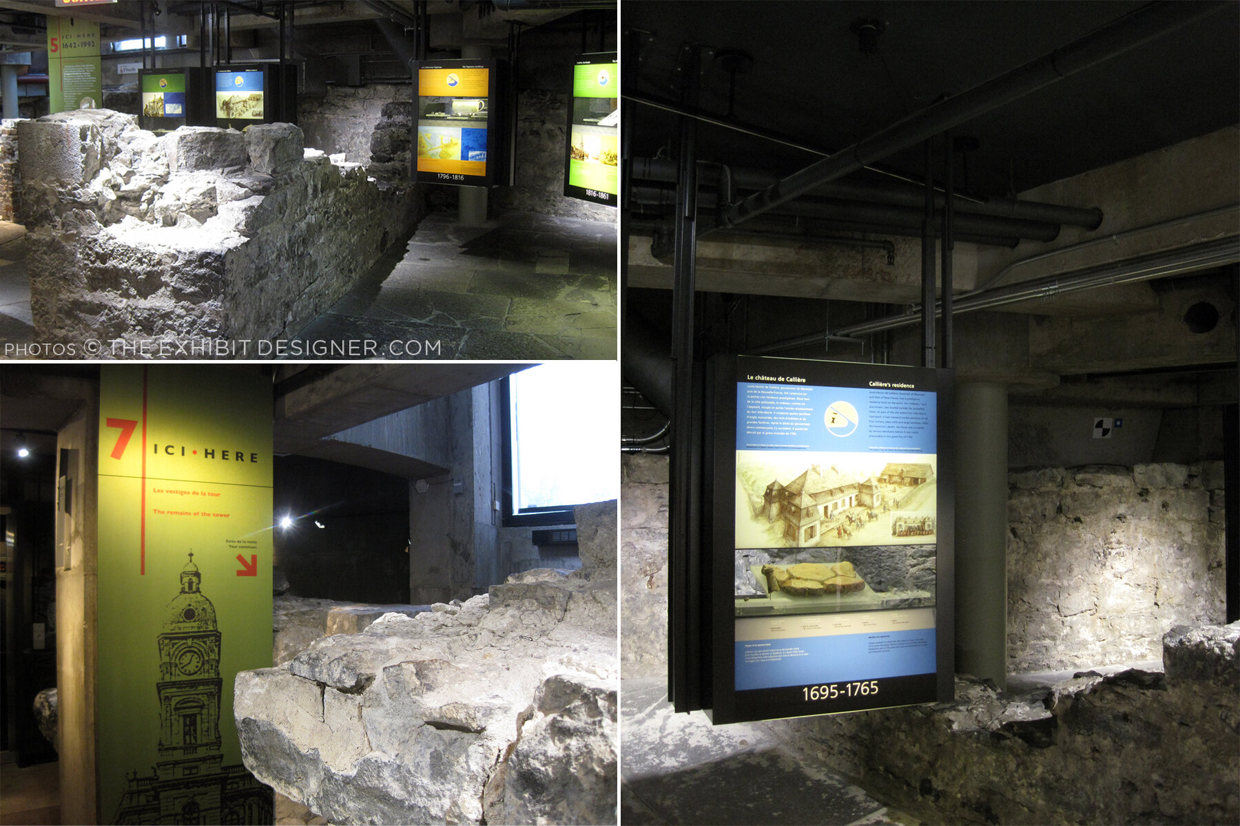
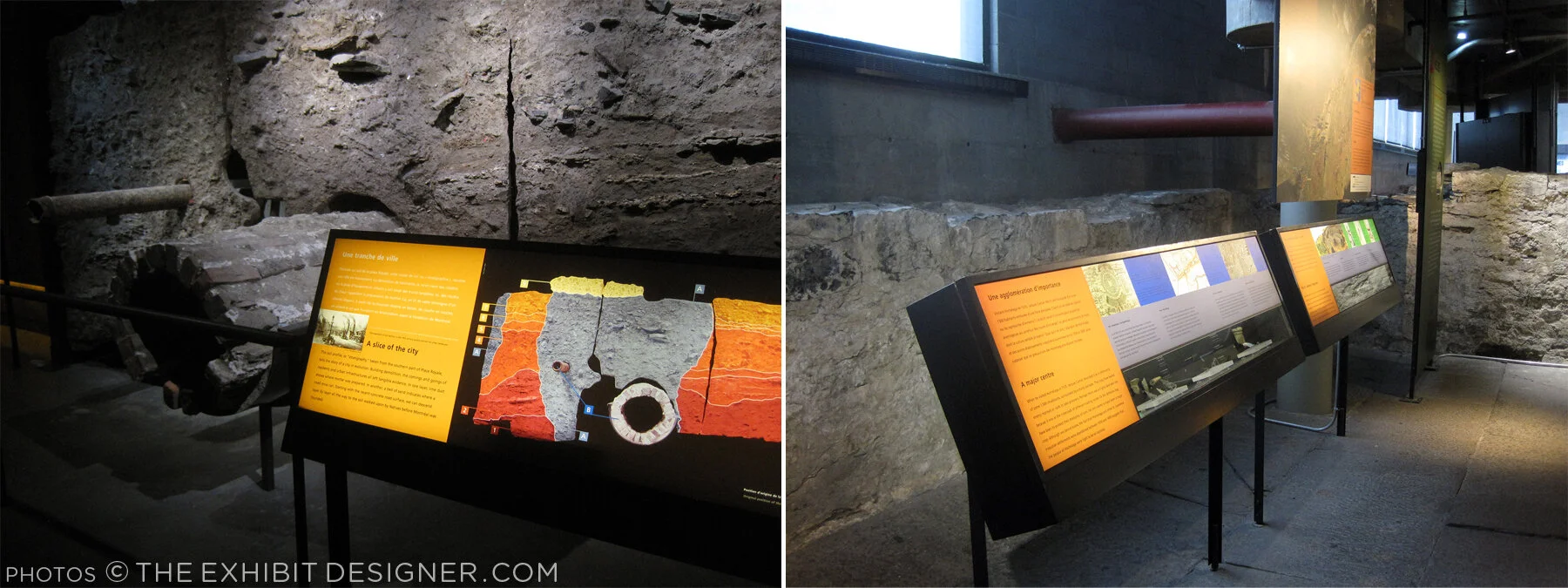
The permanent exhibition in the basement, Crossroads Montréal, takes you through 1,000 years of the city’s remains, including the first Catholic cemetery (dating from 1643), and the foundation of the Royal Insurance Building (dating from 1861). Excavations continue and more exhibitions are planned to interpret what is unearthed. On the one hand: very cool premise, and very cool space to explore. On the other, I had trouble getting and keeping my bearings. Perhaps because the graphics didn’t hold my attention? The ruins themselves were more intriguing.

theexhibitdesigner_Pointe-a-Calliere_graphics2

I would have liked more information directed at the museum “streakers” like myself: the people who move quickly through exhibitions, and only read titles and very selective [random] bits and pieces of labels. (On my best days, I can be a “stroller.”) Perhaps a printed guide map would have helped me to understand where I was within the museum and what I was looking at. Perhaps I should have taken a guided tour.

theexhibitdesigner_Pointe-a-Calliere_built-in-graphics

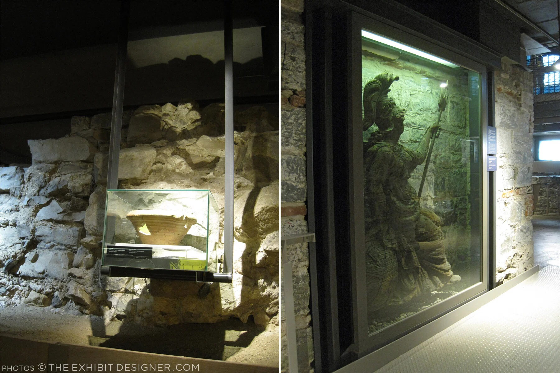
I did like the graphics’ integration into the museum’s building structure, particularly the ceilings, and the minimalist construction-site aesthetic of their structures. Artifact cases, too, were carefully integrated into the site.

theexhibitdesigner_Pointe-a-Calliere_built-in-cases
theexhibitdesigner_Pointe-a-Calliere_pipes
theexhibitdesigner_Pointe-a-Calliere_reader-rails

Most graphics were rear-illuminated, which worked perfectly with the museum’s underground atmosphere.

theexhibitdesigner_Pointe-a-Calliere_graphics3
theexhibitdesigner_Pointe-a-Calliere_graphics

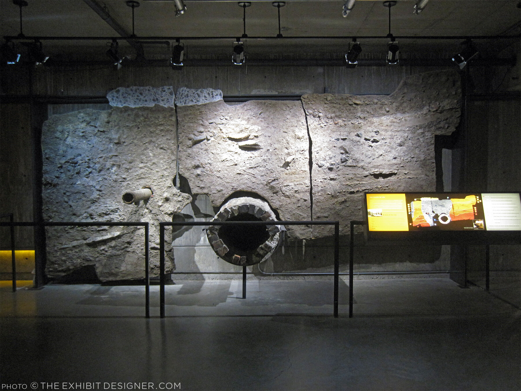
Also below-ground is the Building Montréal exhibition, where you’ll find the museum’s archeological crypt. The photos below are of the vaulted stone tunnel built on the bed of the Saint-Pierre River. See what I mean about the museum being fun to explore?

theexhibitdesigner_Pointe-a-Calliere_passageway
theexhibitdesigner_Pointe-a-Calliere_archeological-crypt

Set into the floor of Building Montréal are more than a dozen dioramas that show the city at different points in time. I love this use of space, and the vantage point it gives visitors. (I wrote this post about exhibition flooring, seven years ago, and Bridget mentioned the Pointe-à-Callière in the comments. I finally saw it for myself!)

theexhibitdesigner_Pointe-a-Calliere_floor-dioramas
theexhibitdesigner_Pointe-a-Calliere_floor-models
theexhibitdesigner_Pointe-a-Calliere_building-montreal

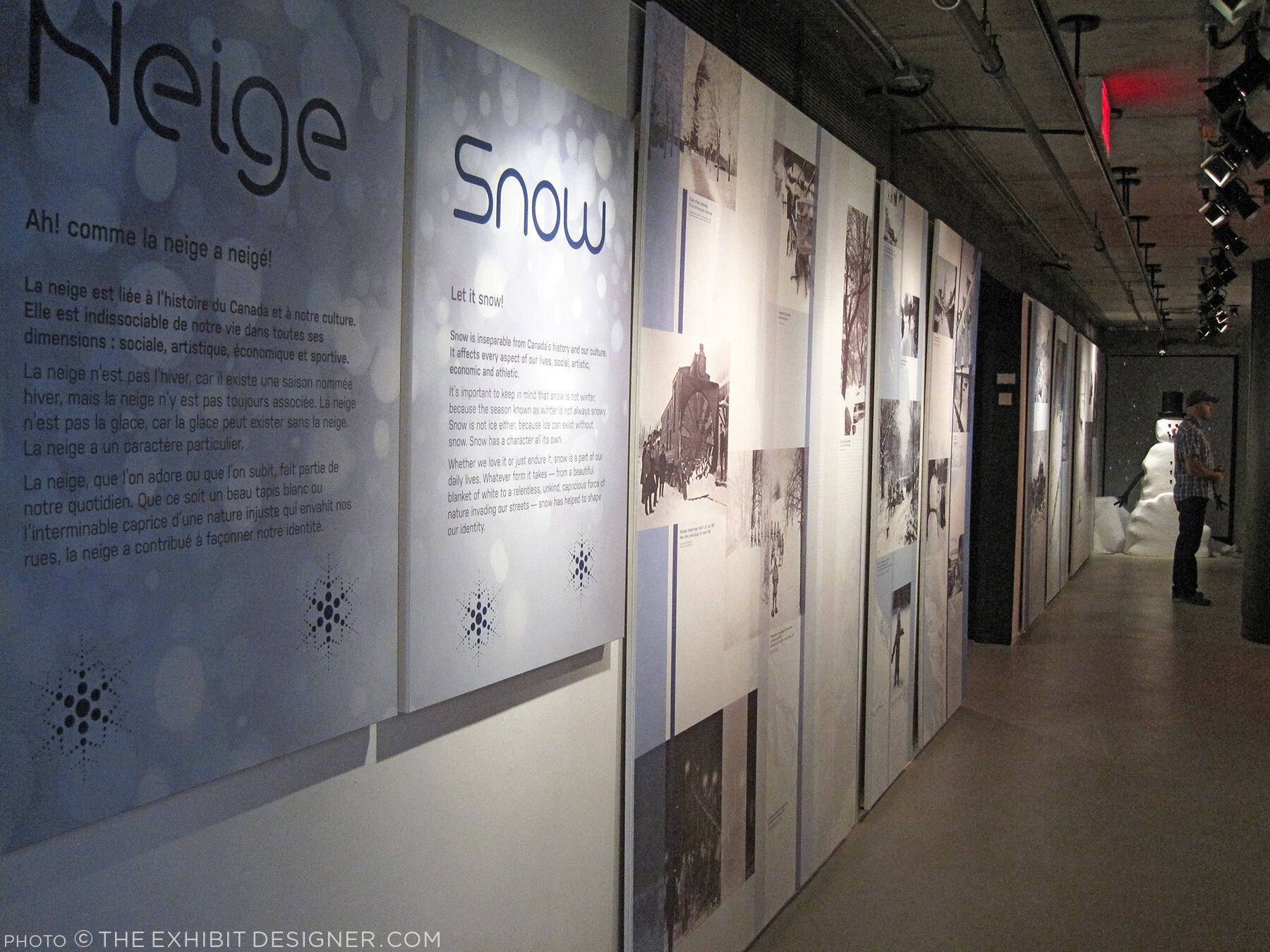
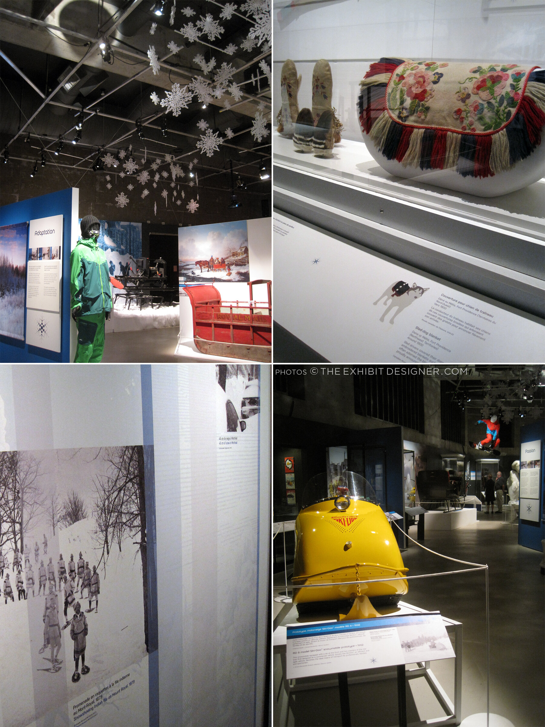
At the time, the museum also had a temporary exhibit on view called Snow, a fun look at winter culture in Canada. Notice the snowflakes cut from the apron fronts of reader rails!

theexhibitdesigner_Pointe-a-Calliere_snow1
theexhibitdesigner_Pointe-a-Calliere_snow2
theexhibitdesigner_Pointe-a-Calliere_snow3

Post updated in January 2021 with minor text edits. This post was originally published at theexhibitdesigner.com on 25 March 2017.