PROJECTS
EXHIBITION DESIGN | EXHIBITION GRAPHICS
Smithsonian National Postal Museum
Washington, DC
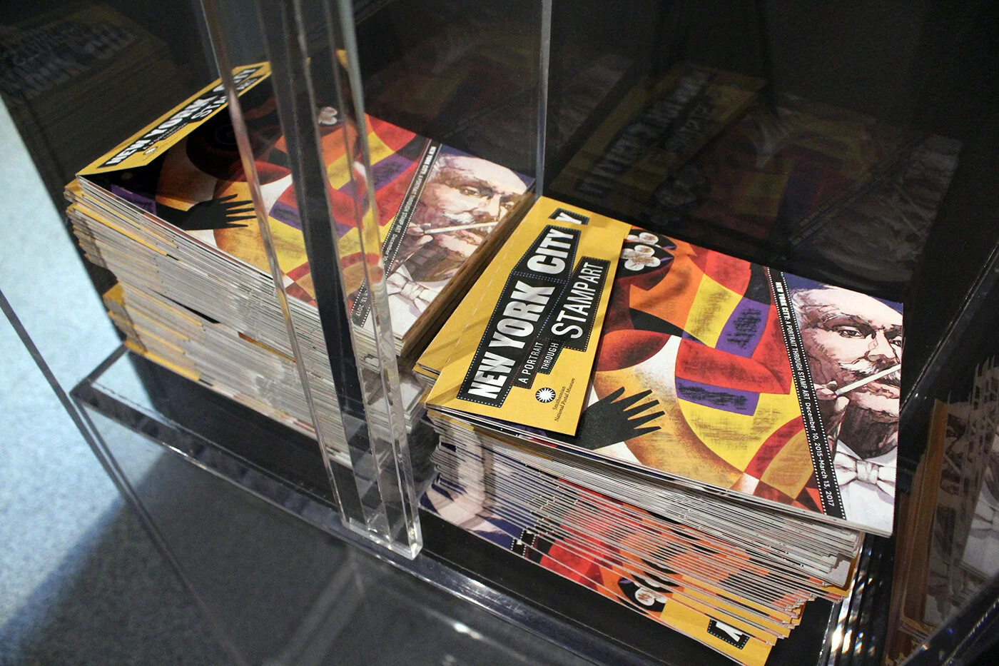
New York City: A Portrait Through Stamp Art
December 2015 – May 2017
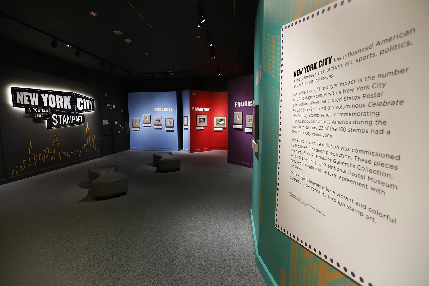
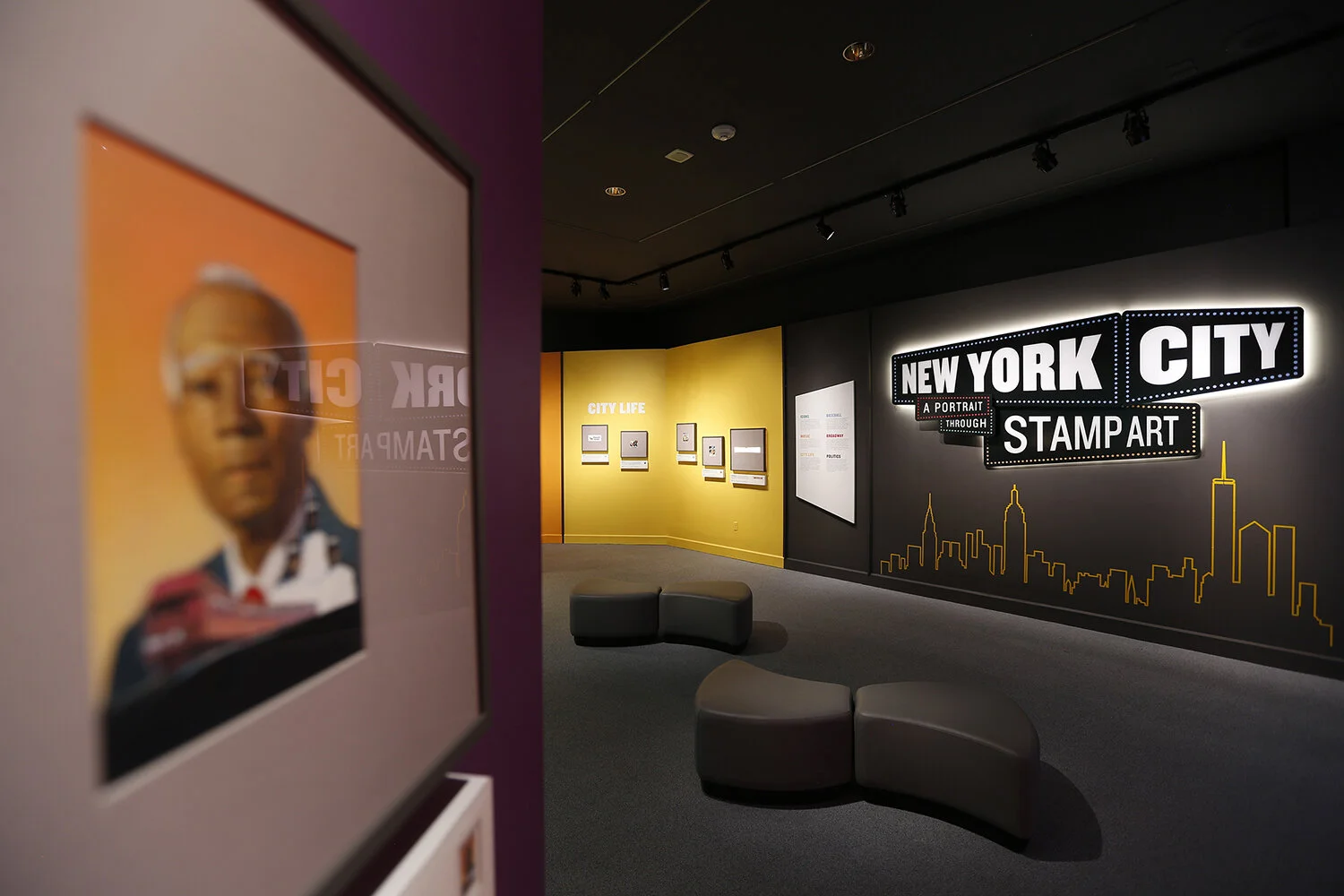
Christine Lefebvre Design provided comprehensive exhibition design services for New York City: A Portrait Through Stamp Art, an exhibition at the Smithsonian National Postal Museum that explored the cultural heritage of New York City as depicted on postage stamp artwork. Thirty pieces of original artwork were on display, grouped by topics ranging from baseball to politics.
CLD developed the exhibition’s graphics system — including color palette, typography, visual identity, and visual hierarchy — as well as space planning, elevations, and floor plans. CLD wrote production/fabrication specifications and artwork matting specifications, delivered final production artwork, and shepherded the design from concept through final production.
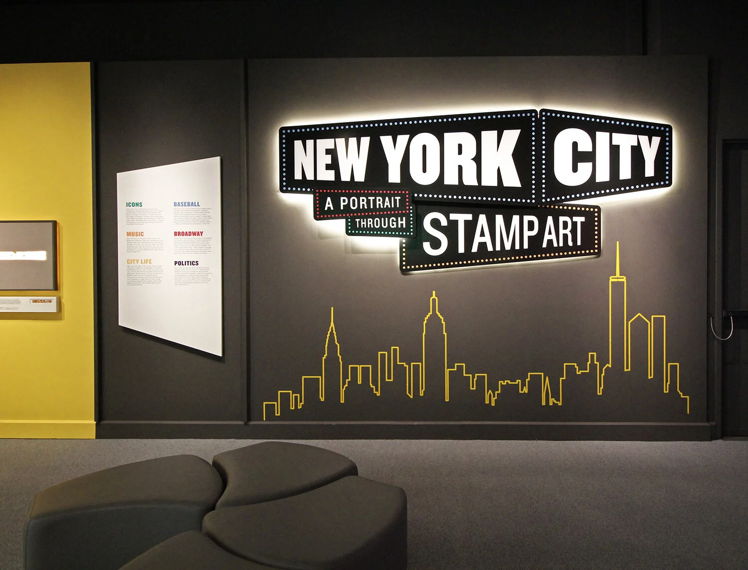
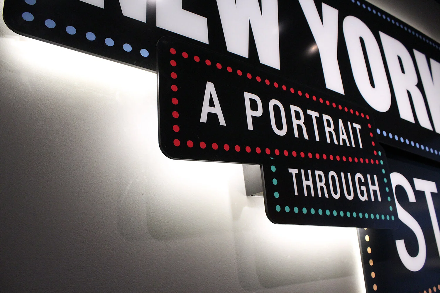
TITLE & PRIMARY TEXT The exhibition’s title signage pays homage to the bright lights of Broadway. The sign is made of layered panels and rear-illuminated by LED lights. Below the title sign, a stylized New York City skyline — cut from reflective yellow vinyl — catches and reflects the light.
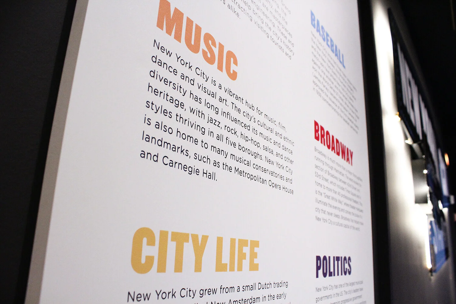
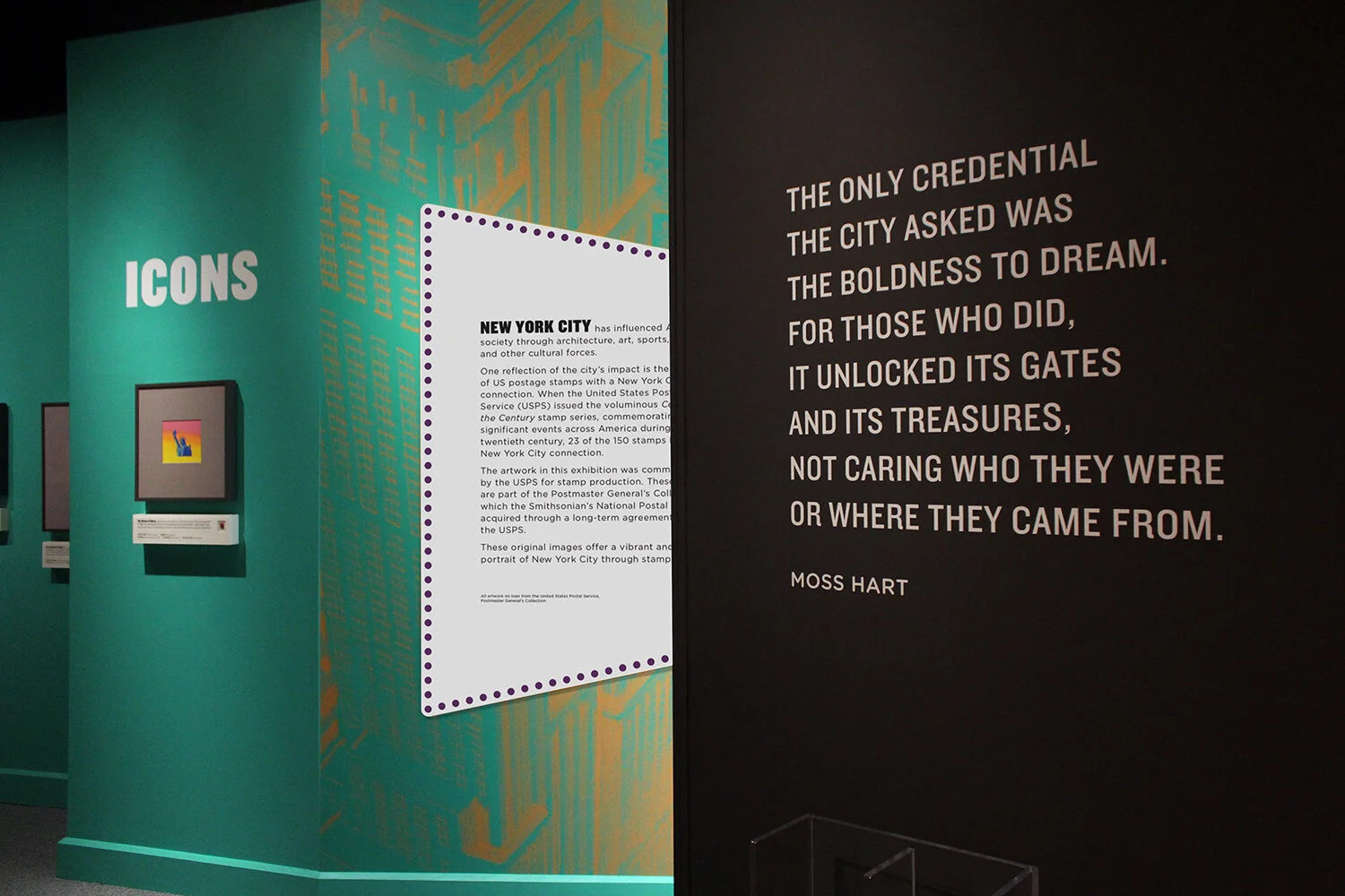
In lieu of individual panels for each of the six exhibition sections, all subject text was gathered onto one graphic. This solved for space limitations in the gallery and allowed the real star of the exhibition — the original artwork on display — to be the focus.
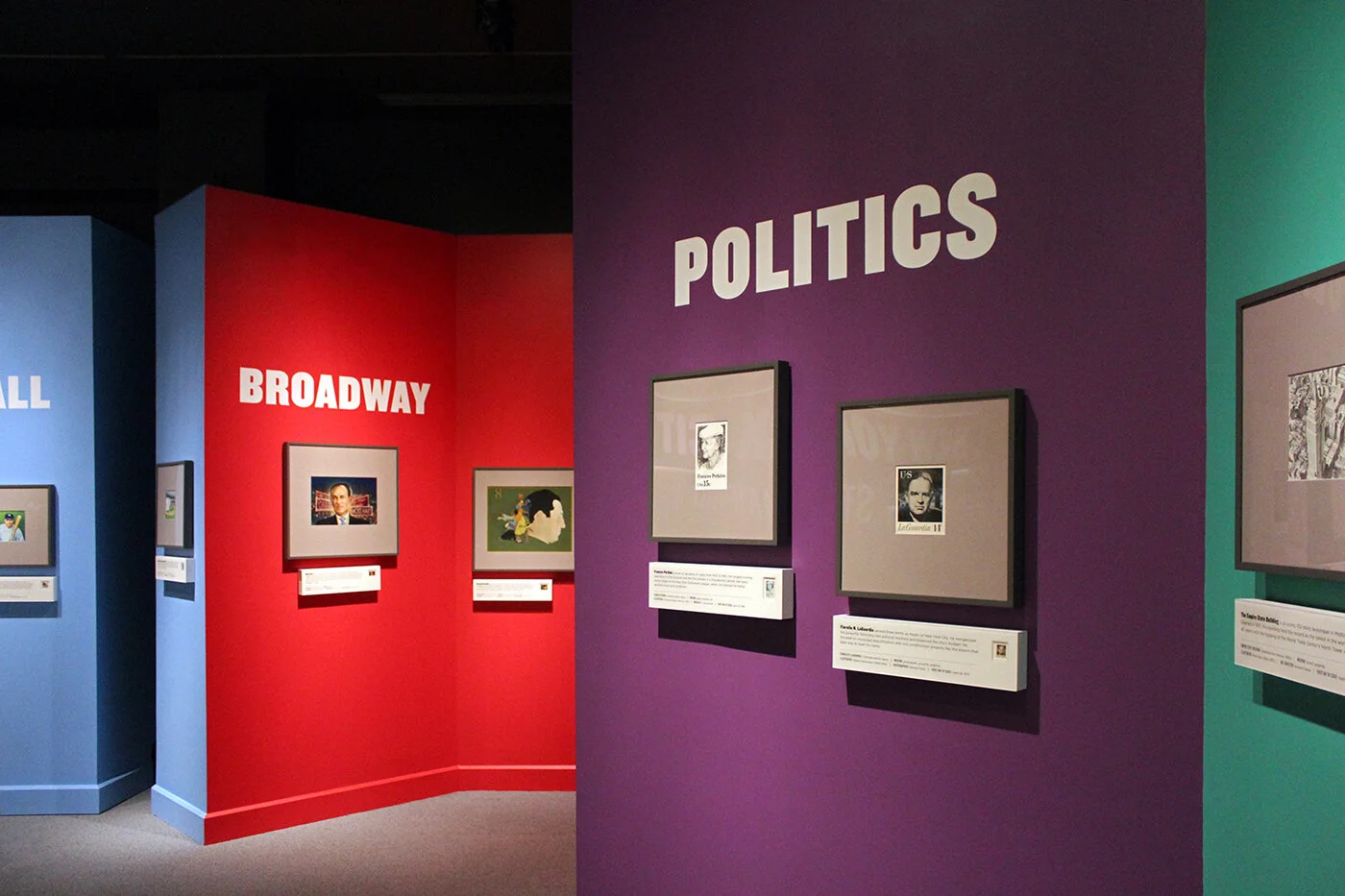
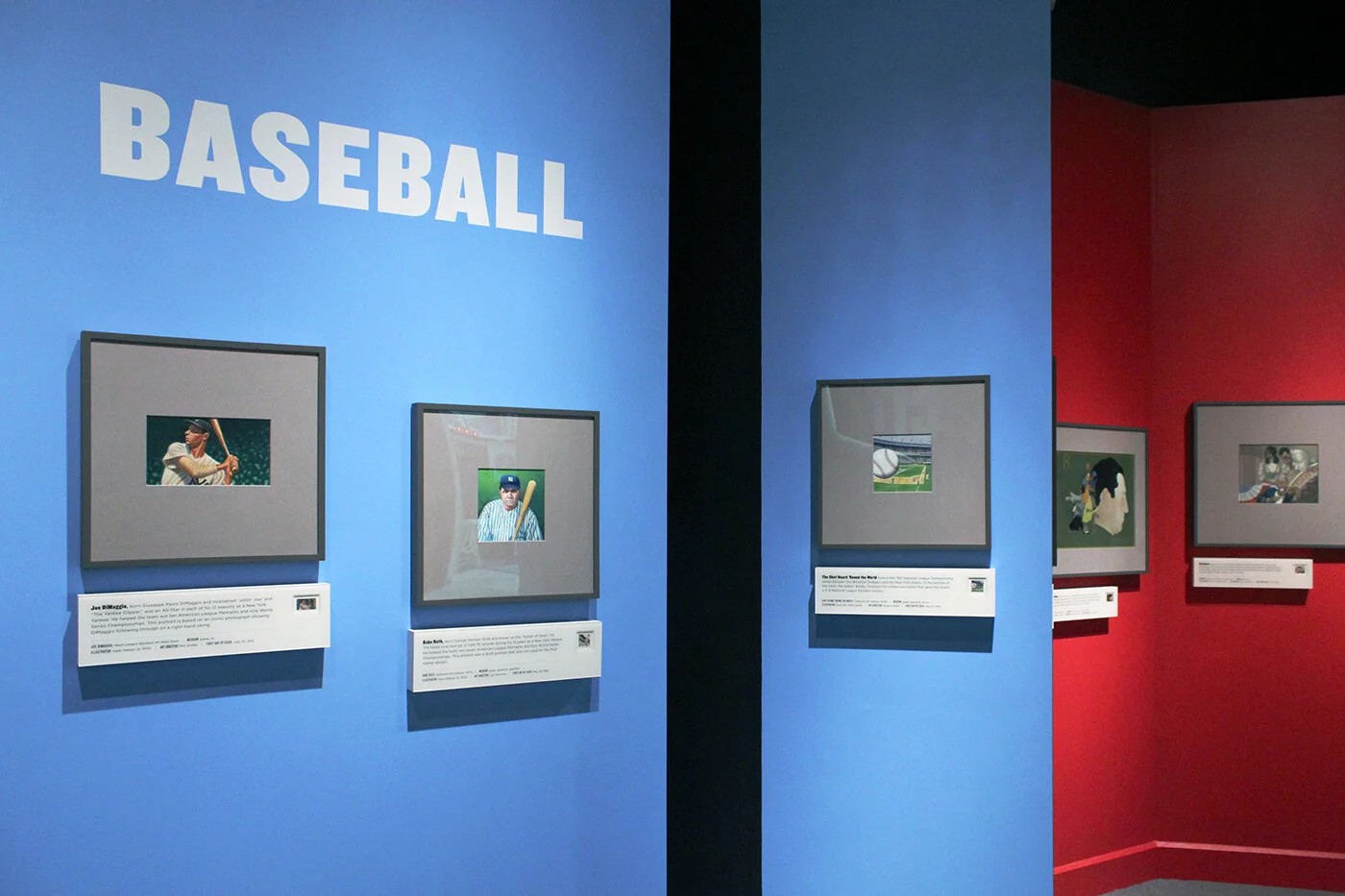
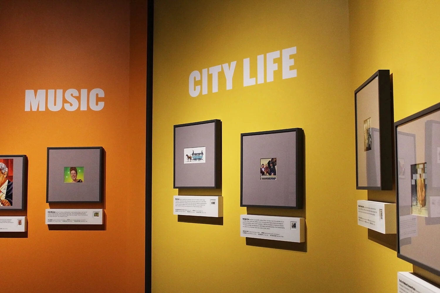
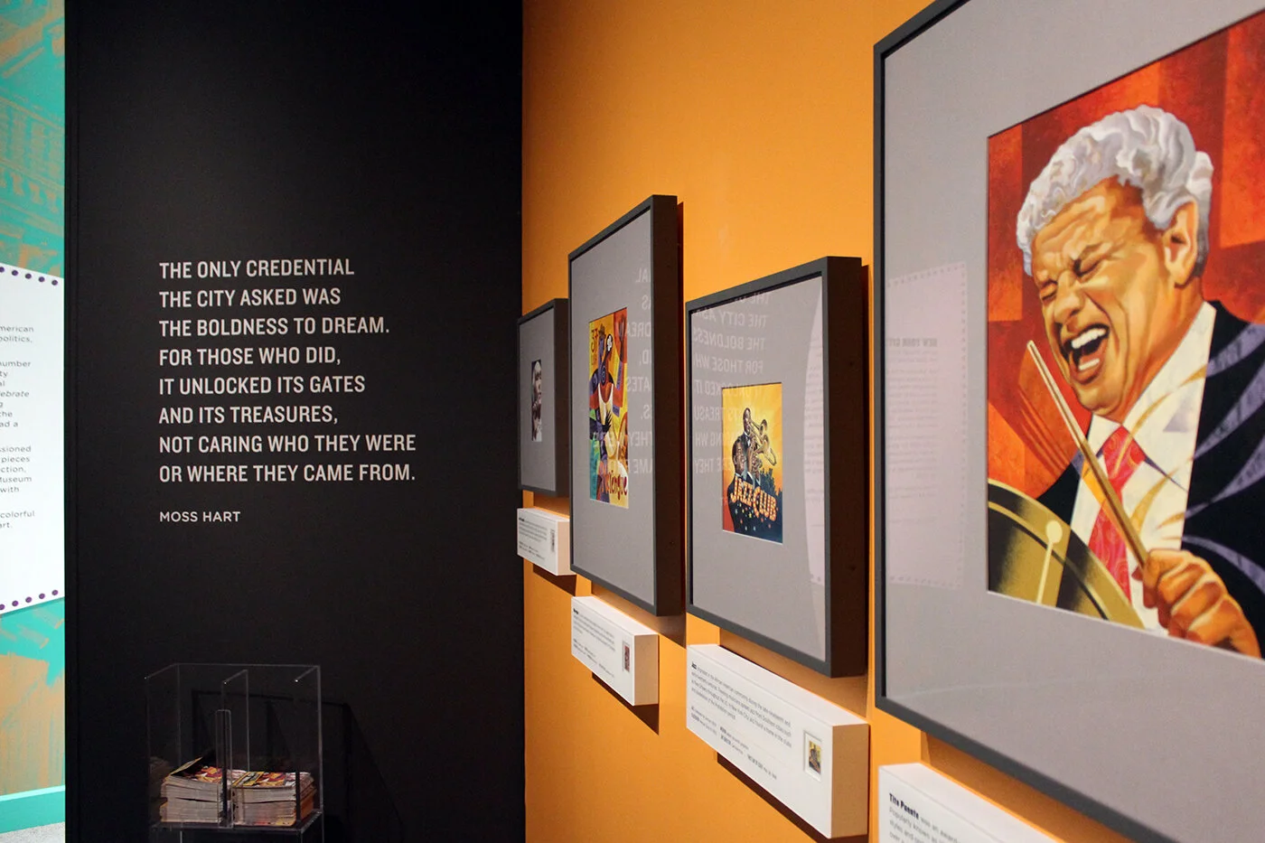
WALL COLORS One highly-saturated, energetic paint color was chosen for each section. Colors were chosen to both evoke a section’s subject matter and coordinate with its artwork. A third consideration during the color selection process was transitions between sections and their bold juxtapositions.
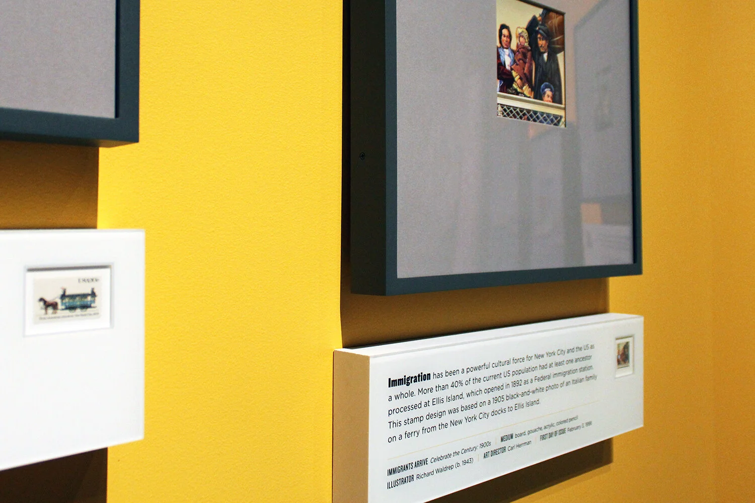
LABELS Artwork labels were made up of four layers: two layers of 19mm-thick Sintra board, a layer of mat board with cut window, and a layer of rear-printed acrylic. The depth of the labels equaled the depth of the artwork frames.
Each label included a “prop” postage stamp to illustrate how the artwork was eventually used by a stamp designer. A prop postage stamp is an actual postage stamp that is not in the museum’s collection.
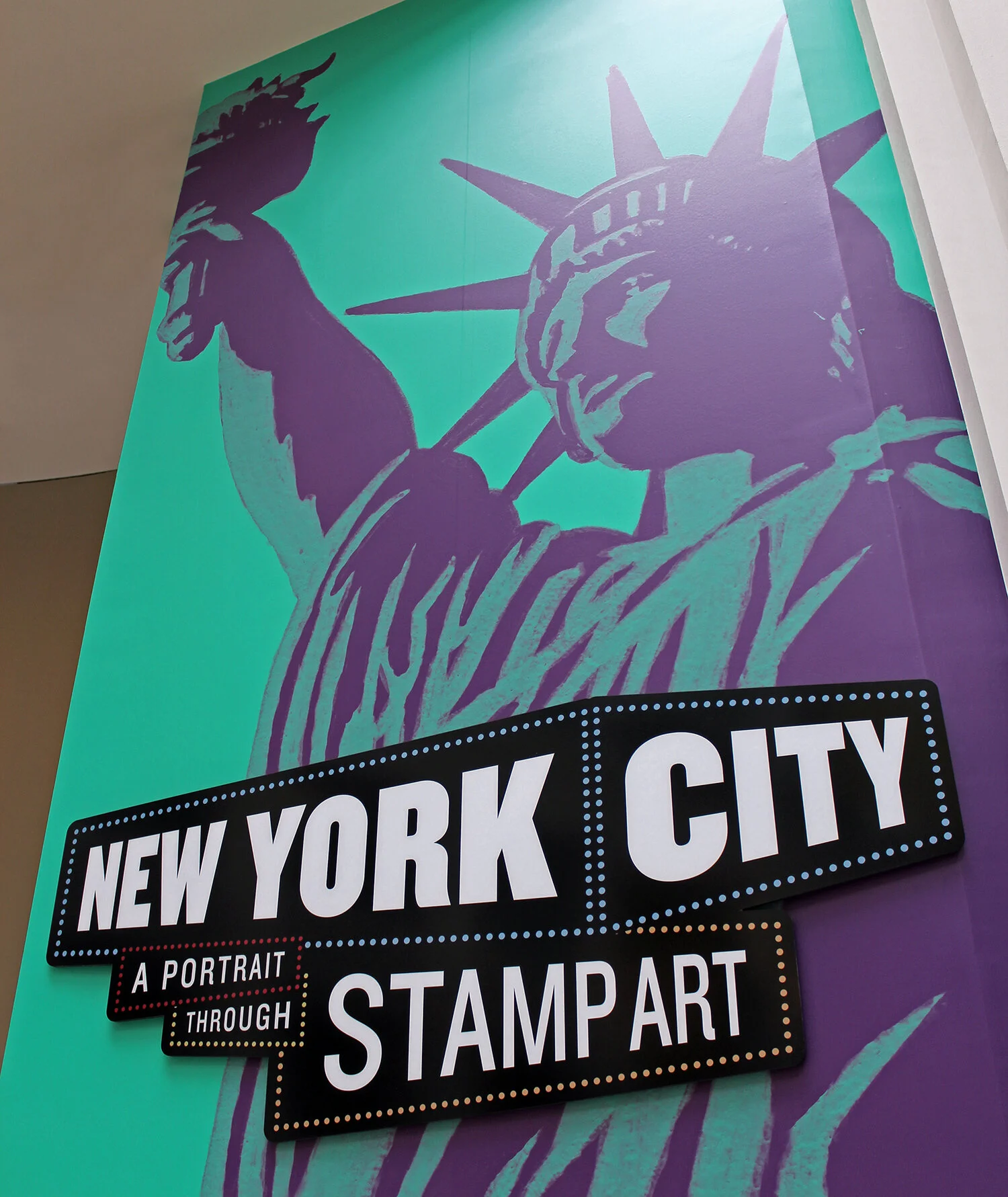
ATRIUM ENTRANCE A mural of the Statue of Liberty — artwork adapted from the 1994 stamp shown in the exhibition — welcomes visitors as they enter the exhibition.
Credits: Exhibition Design and Graphic Design by Christine Lefebvre Design. Exhibition Development/Curation by National Postal Museum. Graphics were printed and installed by Colours Imaging (Falls Church, VA). Custom framing by Archival Art Services (Alexandria, VA). Lighting by Available Light (Raleigh, NC). Additional exhibit installation by National Postal Museum.
First two photographs and second to last photograph by FotoBriceno, courtesy National Postal Museum.
RELATED PROJECT
NYC: A Portrait through Stamp Art (print)

