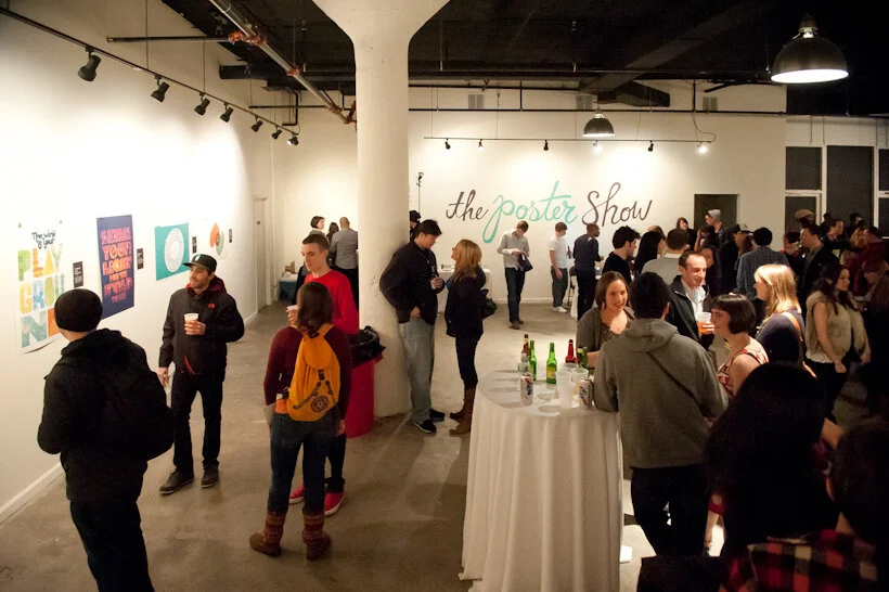
I was honored to be involved with the Say Something Poster Project* by lending my exhibit design services to the first ever Poster Show, a fundraiser for Boston-based nonprofit The Home for Little Wanderers.
This was a case of less being much more. Initially I started with grand ideas to incorporate elements from the website branding into the three-dimensional exhibit space, but gradually I whittled down the exhibition design to its essence, to give the 25 poster finalists all the attention (and to make the installation manageable).
Posters were hung using 1.25" bulldog clips held to the wall with L pins. Labels were laser prints mounted to black illustration board and attached to the wall top and bottom with L pins. (And because I’m quite particular, you bet all the white paper edges were hit with a deft stroke of gray marker.) The large script title (“the poster show”) was drawn by illustrator Chris Piascik. I put it on the wall in contour-cut vinyl.
Guests voted for their ten favorite posters from the 25 finalists on view at the event. I designed the voting sheet.
Below is Mat Budelman, with his poster Think Half Full, one of the winning entries. Kudos to the finalists and winners, the volunteers, and to organizer Jason Stevens. Ben Gebo shot these event photos, and was also, incidentally, the photographer for the event I organized for Friday, AIGA BoNE Show’s “Meet the Judges.”
Post updated in January 2021. Broken links have been fixed or replaced with archived URLs, courtesy of archive.org. This post was originally published at theexhibitdesigner.com on 4 March 2011.
*Archived website leads to the second Say Something Poster Show; the first is no longer available online.


