The legendary Charles and Ray Eames are perhaps best known for their design of a certain lounge chair, but let’s not forget their architecture, print design, photography, film, textiles — and exhibitions. During their career they designed more than a dozen, of which only Mathematica: A World of Numbers ... and Beyond — from 1961! — is still on view.
Three versions were created and two of them remain open to the public: one at the New York Hall of Science and the other at Boston’s Museum of Science. Update: There is now a third at The Henry Ford Museum.
Probability, Topology, Boolean Algebra, Geometry, Calculus, and Logic ... I don't feel particularly moved by any of those, but inarguably this exhibition, with all its quirks and charms, makes math accessible and interesting. I have been to it a number of times, and it’s usually packed with people happily learning about mathematics and engaging with the interactive exhibits.
The photos above are of my favorite part of the exhibit: the case about projective geometry. I like the colors of the geometric shapes, the way that the pieces are held in position by Inspector Gadget-like hinged poles, and the grid on the bottom of the case. The graphics perched on black blocks are simple and handsome.
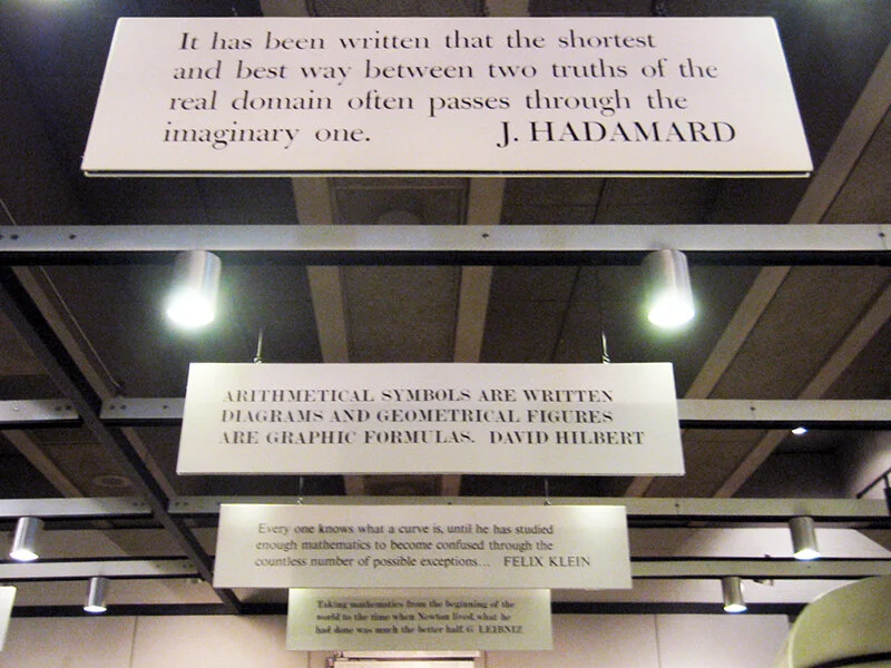
The photo below is of another element in the exhibit that I like: math-related quotation panels overhead, playing nice with the track lighting frame.
Mathematica is successful as an exhibit about math, but more importantly, from an exhibit-design standpoint it is an incomparable artifact, a fascinating time capsule of an exhibit designed during the 1960s.
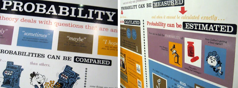
I’m a sucker for retro graphic design, but I have to say that I don’t like the illustrations. They’re cute and fun, I suppose, but they annoy me.... I ... hate them. There, I said it.
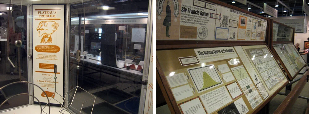
I also don’t like that some parts of the exhibit look as though they were pasted together for a high school statistics class presentation. Picture below, on the right: I'm talking to you. This encased collage is deadly boring and it’s often skipped in favor of the fun hands-on interactives, which are fantastic.
The other part of the exhibit that doesn’t do it for me is the math history wall. I have heard it described as wallpaper, or an art piece. The black and white bars do create a graphically interesting pattern, but then the wall is cluttered up with other bits of browning paper and artwork.
The capitalized, justified serif font used is extremely difficult to read, if you were inclined to try. It makes me dizzy. And yet the darnedest thing: people do sometimes read it. (I have no idea....) Another (obvious) issue with this wall is that the timeline ends in 1961, and the MOS’s solution, a poster, is not well integrated. NYSCI’s solution, an interactive monitor, is a better one, at least in theory. (I haven't been to the New York Mathematica to see it firsthand.)
I like the “probability machine.” The full text reads: THE T/HEORY/OF PR/OBABI/LITIES/IS NO/THING/MORE/THAN/GOOD/SENSE/CONFI/RMED/BY CA/LCULATION. :LA/PLACE/1796
Balls fall from above and form a bell curve. Simple, elegant — and if the text is a little wonky, it does force you to read it over a few times to understand, maybe making you internalize its message.
I feel like quite the curmudgeon with my criticisms of Mathematica. The exhibit is nearly fifty years old, after all — it’s miraculous that it still exists. And despite its literal dustiness, it is an exhibit beloved and cherished by many, a vintage exhibit that allows us to step back in time to experience firsthand a 60s era exhibit full of the Eames’s joie de vivre, fun, and humor. I think any designer would agree that that in itself is pretty cool.
If you have been, what do you think?
—
Post updated in January 2021 with minor text edits. Broken links have been fixed or replaced. This post was originally published at theexhibitdesigner.com on 16 February 2010.


