I wrapped up June — oh, wow it’s August! — with a trip to Yosemite (happy birthday, National Park Service) and San Francisco, where I spent a day parade-watching and a couple days museum-going.
One museum that filled nearly an entire day was the California Academy of Sciences in Golden Gate Park. Below is a photo of the museum’s exterior and its brilliant Living Roof, as seen from the de Young Museum.
There are so many exhibits within “the Academy” (and so many photos to show) that I’ve broken this post into two parts. Part 1 here covers the Aquarium on the lower level, designed by Thinc Design, and the Rainforest on Level 1.
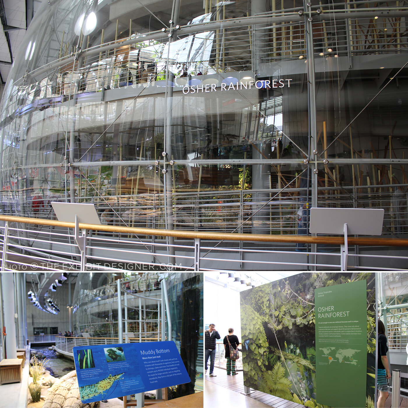
After entering the museum I was swept up with the crowds heading to the 4-story, 90-foot-diameter Rainforest Dome. Inside, the rainforest visit begins on a Bornean forest floor, winds upward through a Madagascan mid-story and a Costa Rican canopy, then ends on the lower level in an Amazonian flooded forest.
As a designer, I liked the dome’s juxtaposition of glass and steel and abstracted jungle motifs against living flora and fauna, and the changing vistas as I moved further up the dome. As a nature enthusiast, I enjoyed its subject matter; as a weary museum visitor, I appreciated its delivery: not too much, not too little; brief, interesting, and useful.
The bright, straightforward graphics make use of vivid photographs, and the occasional illustration of an animal signals your arrival in a new area of the jungle. Bamboo- or vine-like vertical posts give a stylized–naturalistic element to exhibit tanks. The light touch with exhibit elements gives the rainforest dome a feeling of exploration and discovery (just ignore the school groups).
At the top of the dome, look out over the three stories you’ve just visited, and down, through a 100,000 gallon tank, to the flooded forest floor. Take an elevator down, then enter the tunnel you were just looking through from afar. Everyone says “oooh.”
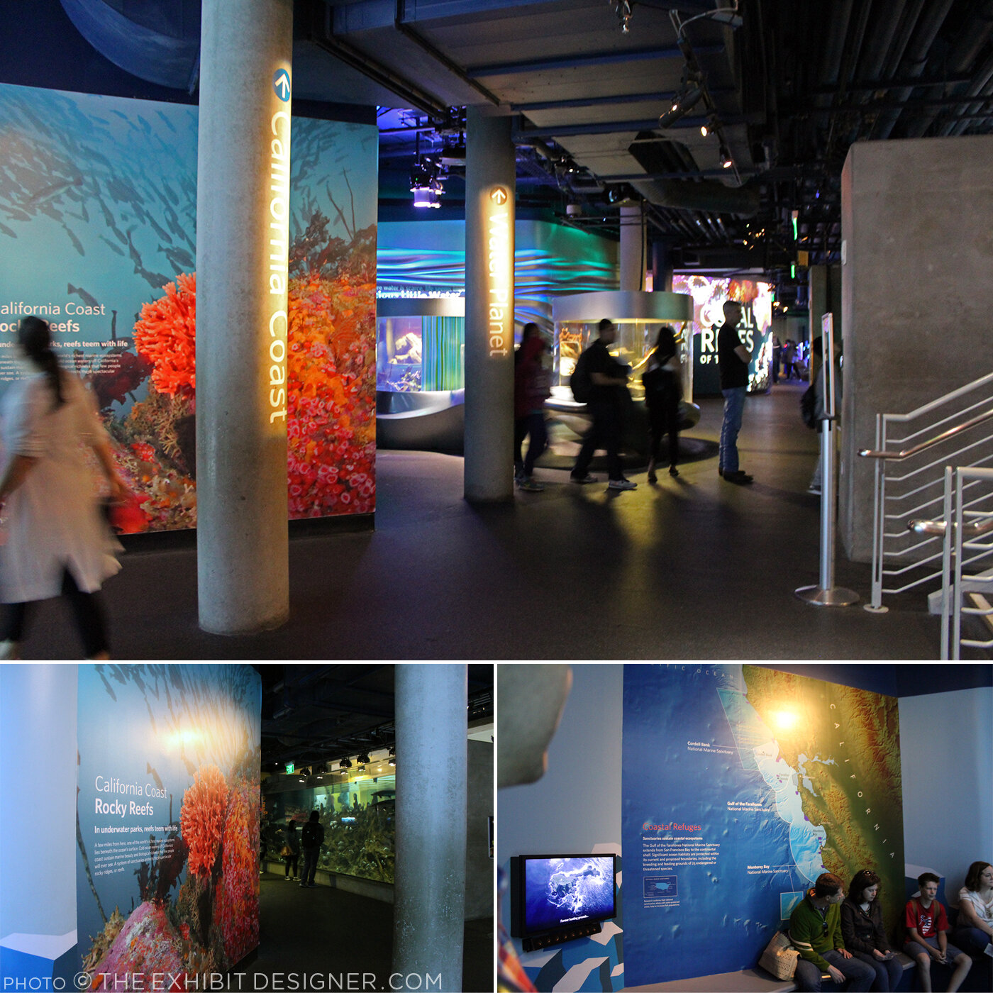
The aquarium level felt jam-packed and massive; it’s where I spent most of my time during a 3 hour + visit. There were many exhibitions to see: Amazon Flooded Forest, Water Planet, California Coast, Coral Reefs of the World, Twilight Zone, and more.
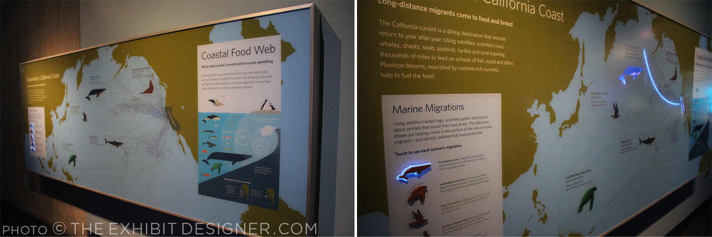
Down here, animal identification is found on digital touchscreens. They were intuitive and fun to use, and had just the right amount of information: an animal’s common name, its scientific name, diet, and a one-sentence fact about it.
Below are some photos of the Water Planet exhibition, which groups underwater animals by adaptations. Projected blue and green lighting casts an underwater glow on the sculptural wave walls (similar material here). In the center of the room are curvilinear tanks. (I was reminded of the Van Cleef & Arpels traveling exhibition, circa 2012. It must be the bubbles.)
The highlight of the Coral Reefs of the World exhibition is the 25-foot deep Philippine Coral Reef tank (above). The exhibit graphics in this area are large image-based wallpapers.
The exhibition Twilight Zone: Deep Reefs Revealed had just opened on June 10. It’s memorable for its tanks filled with the most incredible jellies and vivid deep sea fishes.
Post updated in January 2021 with minor text edits. Broken links have been fixed. This post was originally published at theexhibitdesigner.com on 23 August 2016.


