The Harvard Museum of Natural History was founded not too long ago, in 1998, yet it is one of the oldest natural history museums in the country — older than both the National Museum in DC (founded 1910) and the American Museum in New York (1868).
Harvard’s museum was established as “the public face” of three museums: the Museum of Comparative Zoology (founded 1859), the Harvard University Herbaria (1858), and the Mineralogical and Geological Museum (1784). I included all those dates to impress on you that this is an old museum.
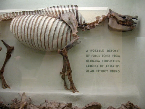
Old natural history museums have old funky taxidermy and old funky graphic design. I am not here to pick on HMNH — on the contrary. I’m focusing this post on their older exhibits — the botanical, the zoological, and the mineralogical galleries — because I think their outmoded displays of minerals and glass flowers, and their similarly outmoded specimen labels within, are beyond charming. The labels say as much about the history of the museum, and exhibit design as a whole, as they do about the taxidermy they're identifying.
The Glass Flowers gallery is a perfect example of that. It is mesmerizing. In a smallish, dimly-lit room are displayed the 4,400 life-size glass models made between 1886 and 1936 by father and son glass artists Leopold and Rudolph Blaschka. Every single flower, leaf, and seed, is made out of colored or hand-painted glass. Some have wire armatures. It is a beautifully illustrated botany book in three dimensions — all crafted in glass. The labels are modest and straightforward, without extraneous decoration, which feel just right here. It’s an incredible presentation and a must-see.
Most of the taxidermy displays in the older sections of the museum are like that: charmingly antiquated little labels with nothing more than a common and a Latin name, maybe a genus, a species; maybe a sentence about what an animal likes to eat, or where it likes to live. I just love these bird displays:
Every display looks different from the others because each one was put together at a different time and made in a different way by different people. Even within a single display there can be a lack of consistency, based, maybe, on when the museum acquired different specimens. Take the photographs below. It might be hard to tell (none of my close-up photos turned out, unfortunately) but trust me — there is quite the smorgasbord of type represented here.
Do I think these old galleries needs an upgrade? Yes, with a ‘but.’ On the one hand, a redesign is exactly what is needed to revive these rather gloomy collections of musty stuffed animals (among other things, like better lighting, and ventilation). And alongside the “charmingly-antiquated” graphics are a lot of ugly, unfortunate graphics. (Much of that is found in the relatively-recently designed parts of the museum.)
Those old, neglected galleries can be dark, creepy, and stinky — all in marked contrast to the museum’s newly-renovated Hall of Mammals (below). The Hall of Mammal’s historically-sensitive renovation was completed in October of this year. Original nineteen-century paint colors were restored, the animals were given a good dusting (conservation), and energy-conserving light bulbs were thrown in for good measure. After making my way through the narrow maze-like hallways of the previous galleries, it was a relief to come out into this lovely light-filled room:
This is a good direction for the museum: thoughtful renovations that retain the character and charm of the old exhibits. But here’s the on-the-other-hand: The new graphics in the Hall of Mammals are simple, nice, and unoffensive, yet they are missing that old natural history museum je ne sais quoi.
It could have been worse, true. The overhaul of a museum’s labeling, giving it a true “graphic system,” does not necessarily result in great graphics. Couldn’t the graphics have been done in such a way as to be both fresh and cabinet-of-curiosities; given some personality and a nod to the museum’s history? Obviously, the answer is yes. I hope that when the museum renovates other galleries (rumor has it that the mineral gallery might be next), it keeps that in mind.
To wrap this up: In the fossils hall, there are some fantastic dimensional letters. Cut out by hand, undoubtedly. In a shade of green you don’t often see anymore. I believe Crayola calls it “Old Natural History Museum Green.” (It’s in the 120 pack.)
Post updated in January 2021 with minor text edits. Broken links have been fixed. This post was originally published at theexhibitdesigner.com on 24 November 2009.


