PROJECTS
EXHIBITION GRAPHICS | EXTERIOR GRAPHICS
Smithsonian Hirshhorn Museum and Sculpture Garden
Washington, DC
Hirshhorn | Collection 2
2018
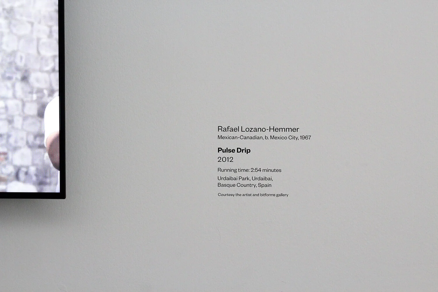
Christine Lefebvre Design has developed graphics for several exhibitions at the Hirshhorn, the Smithsonian’s contemporary art museum. These design packages included entrance graphics, didactic graphics, timelines, and labels, as well as exterior posters to promote the exhibitions, and in some cases, print and digital graphics such as event invitations. Graphics fit the subject of the individual exhibitions and adhered to the Hirshhorn’s institutional design style.
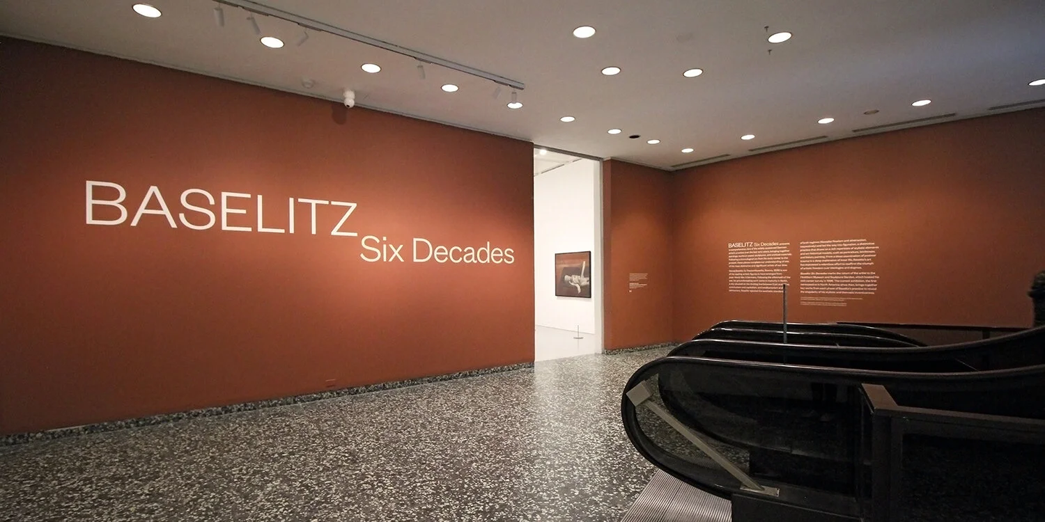
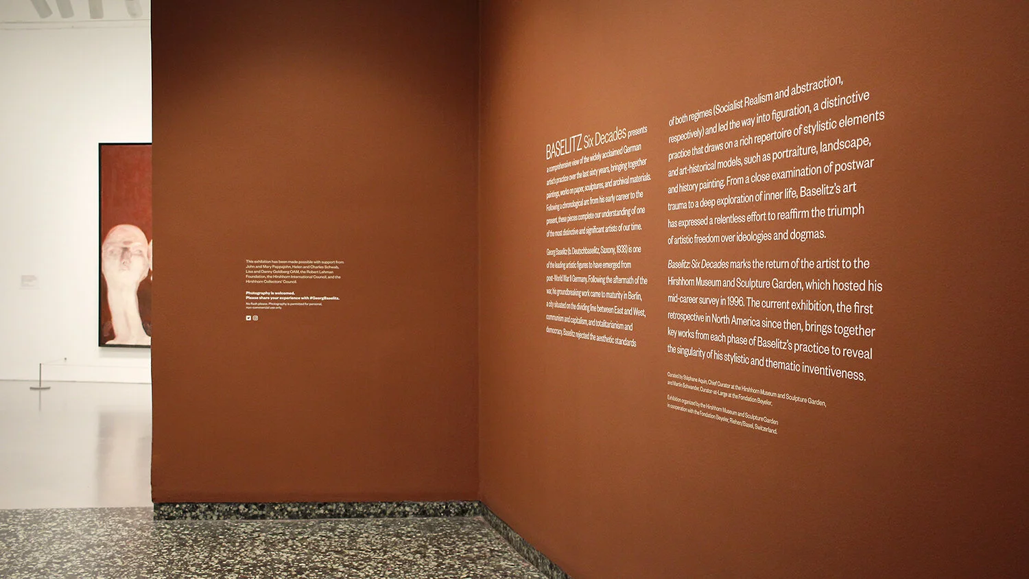
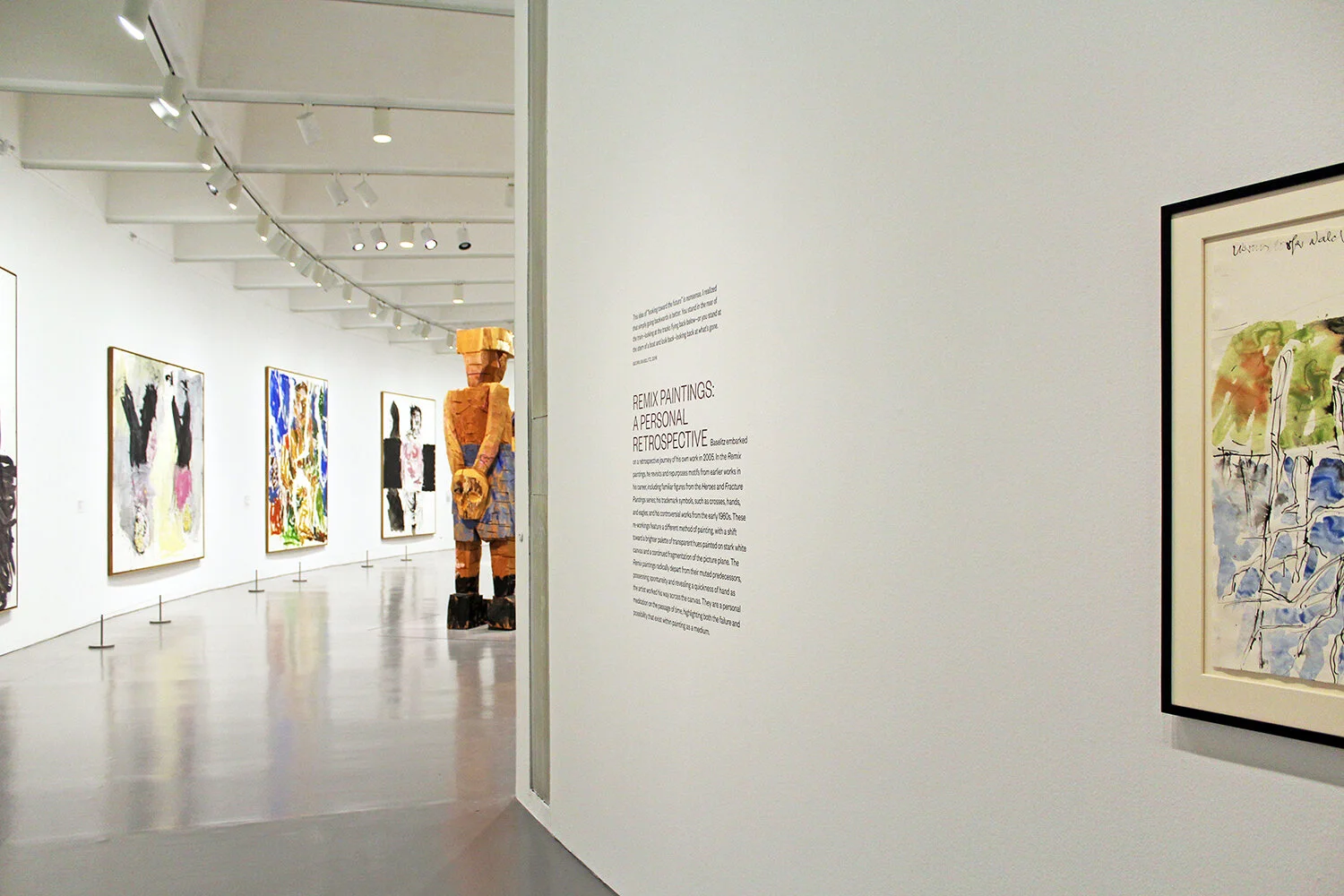
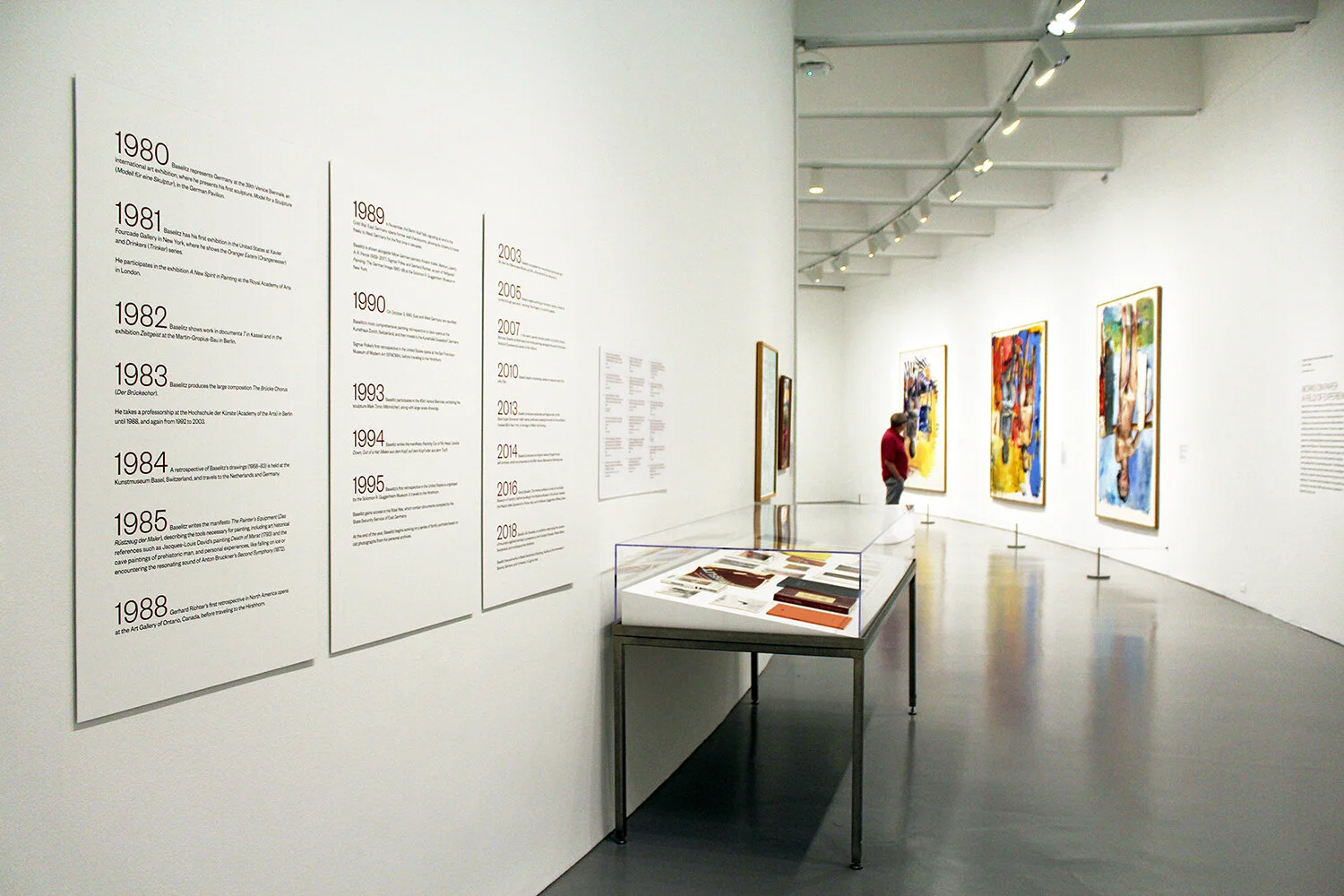
Baselitz: Six Decades
June 2018 – September 2018
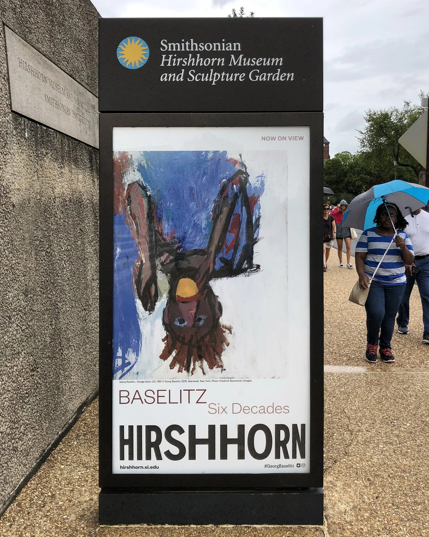
After rounds of design explorations that played on the idea of “upside-down” (the artist was known for his “inverted” paintings), the museum chose instead to proceed with a straightforward treatment for the title. The walls were painted a brownish-burgundy to coordinate with paintings visible in the first gallery. Clean, modern typographic timelines presented events from the artist's life and relevant world events; they were direct-printed to panels painted the same white as the gallery walls.
Rafael Lozano-Hemmer: Pulse
November 2018 – April 2019
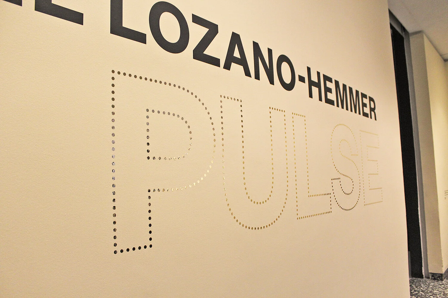
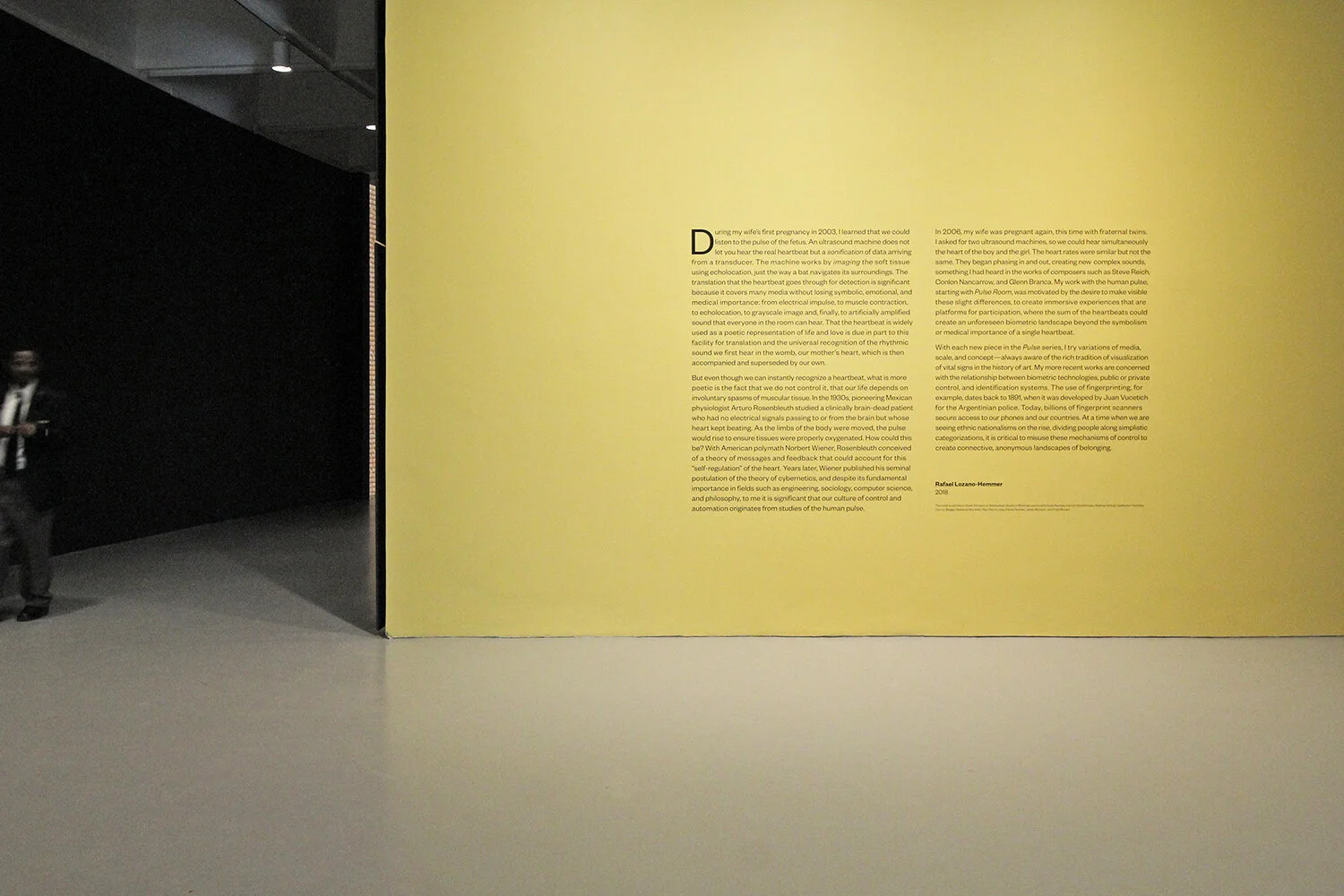
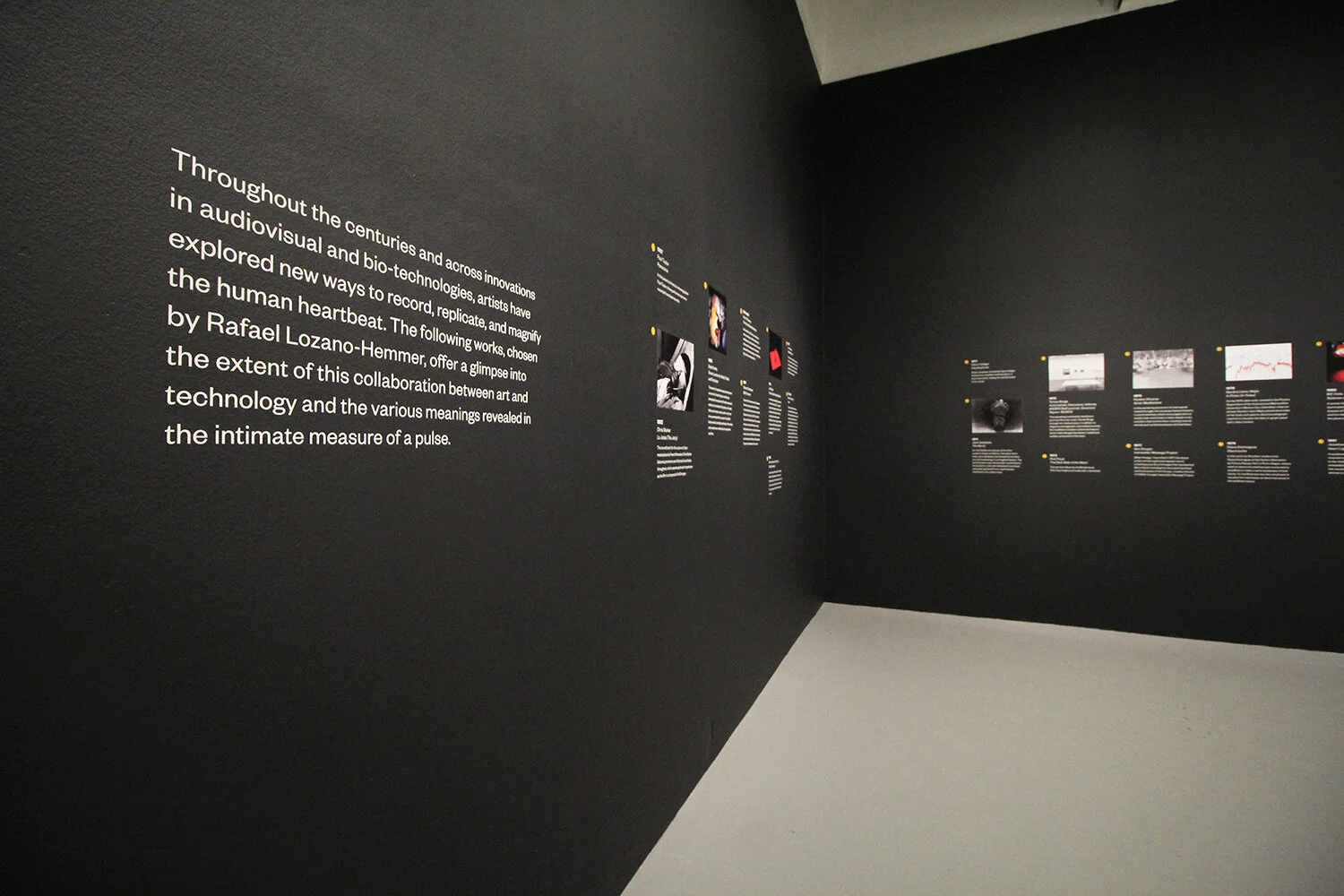
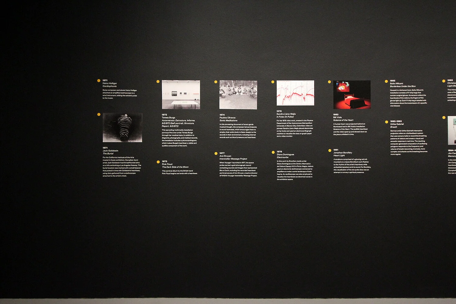
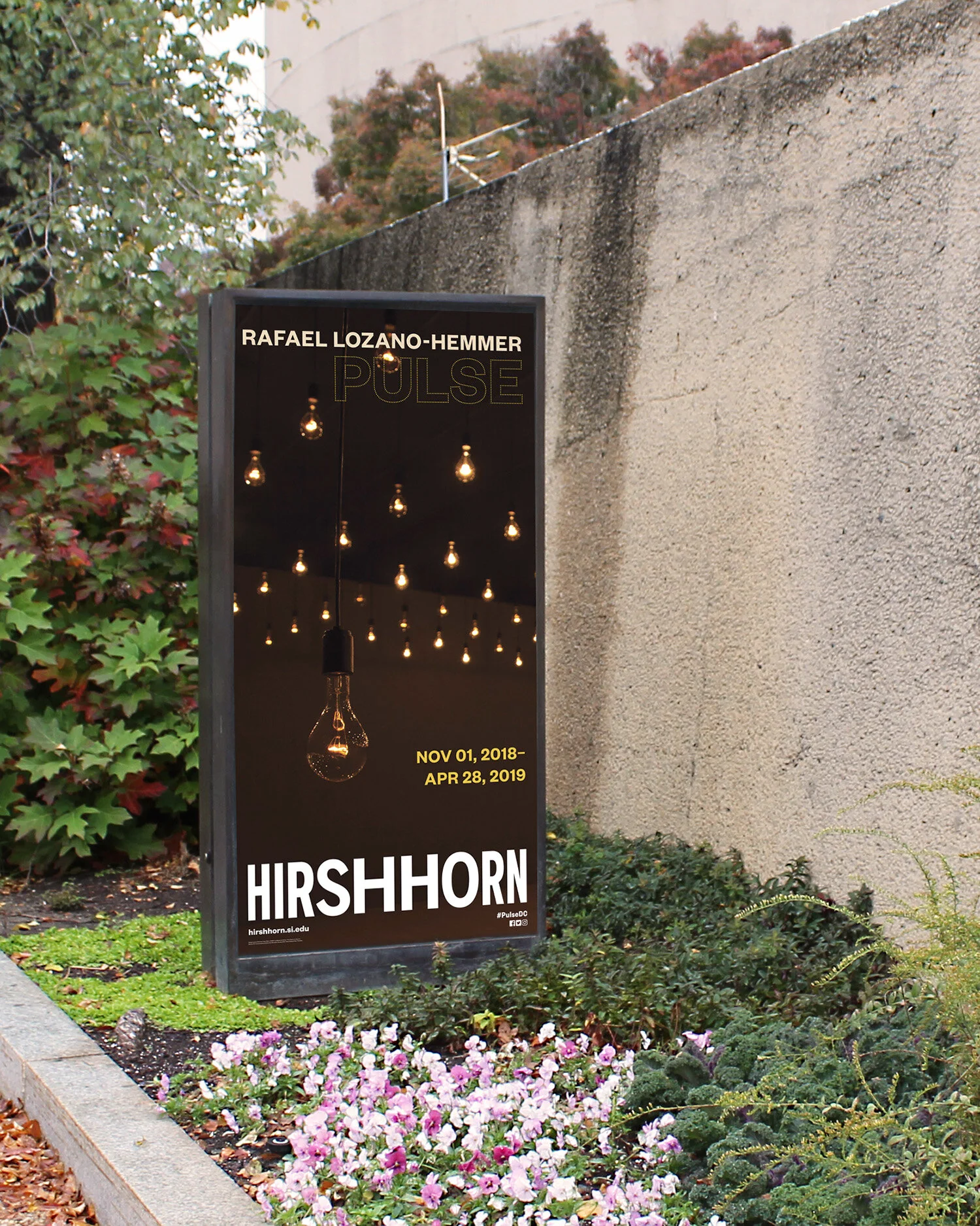
The dotted outline and shimmering gold of the title lockup evoked the hanging incandescent light bulbs in Lozano-Hemmer’s Pulse Room installation. Upon entering the galleries, visitors found the Artist’s Statement — an exercise in typesetting — displayed prominently on a bright yellow wall, and a timeline of artworks relevant to the theme of the show, on a black-painted wall. The timeline wall led directly into a darkened gallery that housed the first installation. The dot icon from the title lock-up was used as a subtle graphic motif throughout.
Credits: Exhibition Graphic Design by Christine Lefebvre Design. Exhibition Design and Curation by Hirshhorn. Graphics printed and exhibition installation by Hirshhorn.

